4 ways this Figma plugin helps my UX writing workflow
Just like any product designer, my work as a UX writer involves shaping experiences that are centered around the user and their needs. I therefore need to use many of the same tools as a product designer, one of those being Figma.
Two weeks ago, our team launched story.to.design’s little twin, html.to.design. This free Figma plugin converts any webpage’s HTML into fully editable Figma designs. And while the use cases for html.to.design are many, I decided to highlight a few ways this plugin helps me as a UX writer in my day-to-day work:
Pitch copy improvements in a visual way
When joining a new team, the first thing I’ll often do is go through everything that exists and identify any areas for improvement. However, this task is often a hassle. Old design files are rarely organized or, more importantly, up to date. html.to.design is perfect for this kind of work, as I can import everything that’s currently live, and then suggest copy improvements from the most up-to-date version. Also, I have the advantage of pitching new copy in the most visual way possible: exactly as it will look on the site. This is often key for winning over stakeholders who may not be able to visualize new copy unless they see it in the final design.
Faster A/B testing for copy
When A/B testing different copy, it’s often the case that we’re only changing a single element, or even word, on a given screen. Plus, it’s most likely that I want to test copy on an old or existing webpage. So why dig around in Figma to find the old designs (which are probably outdated), when I can import exactly what is in production today? html.to.design makes the process much easier. I can import the webpage I want to perform A/B testing on, change the piece of copy we want to test (even try out a few versions), and then handover to development with all designs and specs intact.
Explore new copy ideas with full context and UI
When crafting microcopy, UX writers and content designers need full context. Before Figma existed, I would often work on new copy in a separate word document (zero context of where the copy appears in the design, or at what point in the user journey). And even with Figma, I often have to go digging through designers’ different files to find the right screens, which aren’t always up to date. With html.to.design I can import the full design for a screen and start exploring new copy ideas right away. I have full context to explore new copy independently, without bugging a designer for their files.
Create benchmarks without taking a single screenshot
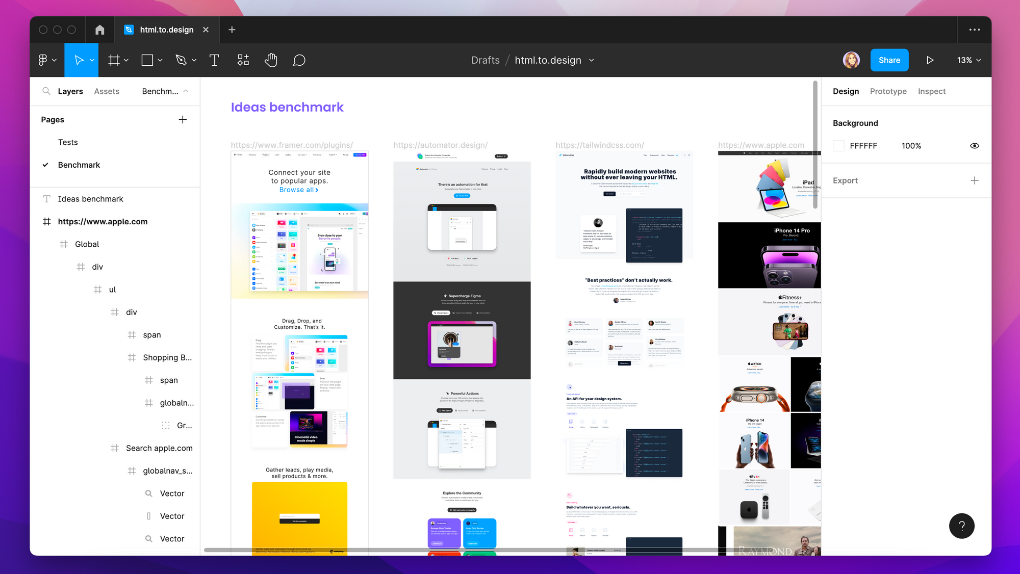
In the words of Pablo Picasso: “Good artists copy, great artists steal”. Nothing in design is 100% original, and everything has already been invented or created to some extent. This applies just as much to digital products! So, in order to “steal like an artist”, a crucial part of any project I do is benchmarking. I look for copy ideas everywhere, in competitors and non-competitors alike. To create these benchmarks, I would typically have to screenshot parts of websites or apps that I found interesting and then upload them into Figma. html.to.design now makes this whole process much easier (and I no longer have hundreds of screenshots sitting on my desktop!). With the plugin I simply paste the URL of the site I want to include in my benchmark and directly import it into Figma. I can then pull out the blocks or sections that are most interesting to me, if need be.

Which tools improve your UX writing and content design workflow? Have you tried html.to.design? Let us know how it helps you on Discord or X (previously Twitter)!
👋 Hi there!
We built the Figma plugin that keeps your Figma library true-to-code.
story.to.design imports components from Storybook to Figma in seconds.
Try it for free