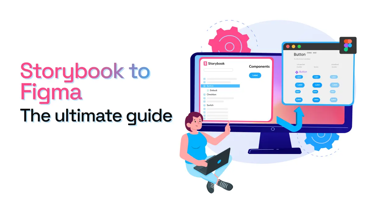
Storybook to Figma - The ultimate guide
Keeping a Figma library in sync with Storybook is a lot of work for both developers and designers. It often requires a lot of back-and-forth, messy screenshots and time-consuming maintenance (especially when you start having hundreds of variants for a button).
All of this only keeps designers from focusing on designing new features. Design teams shouldn’t be wasting time maintaining UI libraries to stay in-sync with code. There should be ways to automatically bring design system components from Storybook to Figma, so that designers can focus on research and designing new, outstanding experiences.
In this post, we’ll dive into the importance of connecting Storybook to Figma, how to keep your design system assets aligned and some tips to get the most out of story.to.design.
What is Storybook?
Storybook is a free, open-source frontend workshop for building UI components and pages in isolation. It offers a way for teams to expose their design system’s components in a web environment that everybody can interact with, and is often used to document the technical aspects of coded components.

What is Figma?
Figma is a collaborative vector graphics editor and prototyping tool. It is mainly used by product, UX and graphic designers for designing mobile and web products, as well as illustration and graphic design work. Figma began to stand out in the design industry due to its real-time editing features, good prototype interactions and the management of component libraries.

Why connect Storybook to Figma?
For a design system to be an efficient source-of-truth for design decisions, it’s important to keep both design and development assets in-sync. Maintaining these assets in different tools leads to problems such as:
- Double maintenance of the same assets in multiple tools that requires a lot of manual, repetitive tasks.
- Inconsistencies and diversion between assets. A change in code is not automatically rendered in Figma for designers, leading to discrepancies and confusion about which component is the latest version. Plus, because design teams can’t spend hours updating Figma libraries by hand, components become out-of-date and out-of-sync with code.
- Communication issues between teams because designers and developers often don’t have the same references, due to different naming conventions in their respective sets of tools.
Why not design-to-code?
While there has recently been a boom of design-to-code tools that aim to solve these issues, many of these tools are not yet perfect and come with their own set of problems:
- Accessibility features for visually impaired users require a specific set of details that design-to-code tools can’t currently offer or create.
- SEO requirements sometimes clash with visual design, and the way design-to-code tools generate code sometimes makes it difficult for search engines to index our site.
- Code performance, maintenance and readability are also issues with the tools that exist today. While it’s sufficient for prototypes or MVPs, the quality isn’t there yet for top performing, well-ranked, quality sites.
This is why we believe in a code-to-design approach; automatically bringing Storybook into Figma.
How to link Storybook to Figma
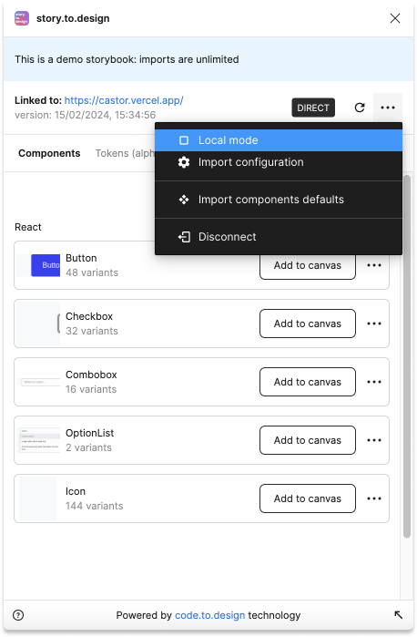
story.to.design is a Figma plugin that imports components from Storybook to Figma to transform stories into a full Figma UI library. In just a few clicks, design and code are in-sync across your entire organization. This leads to fewer discrepancies between code and design assets, faster designing and prototyping; and better communication thanks to a shared language between developers and designers.
-
Open your Storybook and copy the link.
-
Launch story.to.design in Figma.
-
Paste your Storybook link in the plugin and click
Connect. -
Click
Import componentsto select a component to import from Storybook to Figma. -
Select your variants by ticking the args you want for your component. These are what will make your Figma component come with variants mapped to the corresponding properties.
-
Click
Importto bring the component and its variants from Storybook to Figma. -
You can also import certain Design Tokens to apply them as Figma styles.
-
Once the component is marked as
(Ready), drag-and-drop it onto the canvas. -
A new frame with your component appears, together with any documentation.
-
You’ve successfully imported your first component from Storybook to Figma! It’ll be ready in the
Assetspanel for designing and prototyping.
story.to.design is compatible and up-to-date with all Storybook releases from 6.x to 8.0.
Keep Figma in sync with Storybook
Once you’ve imported your components from Storybook to Figma, now the key is to keep those Figma components in sync with code. With story.to.design, because your Figma components are linked to their Storybook equivalents, any time there is a code update you can instantly bring these changes from Storybook to Figma and update your Figma component with the new styles, variants, etc.
Typically, your components will be labelled with the status (Synced), as they are in-sync and mapped to the coded components in Storybook. Anytime there is a code change, you’ll be notified that a new Storybook version is available and your components will appear as Outdated. Updating to the new version will update your Figma components with the latest code changes.
👉 Learn more about syncing updates from Storybook to Figma
Tips and best practices
How to incorporate story.to.design in your workflow
Teams often struggle shifting to a code-to-design approach, but bringing your component library from Storybook to Figma doesn’t mean that everything starts with code. Design can tell developers what should be built at the very beginning, and is an important phase for research and exploration. Here’s an overview of how story.to.design can fit into the design and development process for your design system.

👉 Learn more about the ideal workflow with story.to.design
How to write stories to import from Storybook to Figma
story.to.design relies on Storybook args in order to extract variants of a component. In our example of how to write a story with args, we set specific argTypes and args default values for the Button components on a story called ForFigma.
import { Button } from './Button';

export default {
  title: 'Button',
  component: Button,
};

export const ForFigma = {
  argTypes: {
    disabled: { control: 'boolean' },
    type: { control: 'select', options: ['primary', 'secondary'] },
  },
  args: {
    // Default values
    children: 'Label',
    disabled: false,
    type: 'primary',
  },
};How to set up variants
A variant in Figma will correspond to one instance of the component in Storybook. When importing components from Storybook to Figma based on story args, you can select a list of variants that will be generated and incorporated into a single Figma component. story.to.design offers three ways to set up your variants:
- Basic method: Manually selecting all args and values you want to import as variants.

-
Advanced mode: Allows you to import variants directly from story args, giving you more control. This method requires a
JSONfile in order to define the Figma variant properties. -
Programatically defining variants in your stories’ code: By adding the special
s2dparameter to your stories in code, story.to.design will automatically detect these stories to automatically load them, pre-configured, into Figma. This means you can simply add the component to your Figma canvas; zero manual selection of variants required.
export const Playground: StoryObj<ButtonProps> = {
  ...
  parameters: {
    s2d: {
      variantProperties: [ /* Figma variant properties definition here */ ],
    },
  },
};
story.to.design also simulates pseudo-states such as :hover: and :focus: so you can visually represent these in Figma as variants, even if you haven’t defined them in your Storybook.
👉 Learn more about variants and simulated states
How to see code changes in Figma, without republishing your Storybook
Sometimes you want to experiment with a few changes to some components, and instantly see them reflected in your generated UI library in Figma without re-building and re-publishing your entire Storybook. The release process can be slow, and is often not practical for these small changes and experimentation.
Local Mode allows you to connect story.to.design to a local version of your Storybook so that developers can make fast iterations in code and almost instantly see these changes in the Figma components and Figma variant properties.
A final word…
While design systems make our products better and more consistent, they are also messy and difficult to maintain. Keeping design and development assets aligned is key to avoiding some of the chaos. A code-to-design tool like story.to.design can help streamline your workflow by automatically bringing components from Storybook to Figma, then keeping the two in sync.
To get started with story.to.design, install our Figma plugin and try it out for free! If you need help getting set up, or would like a demo for your team, reach out to us on Discord or via support+s2d@divriots.com.
👋 Hi there!
We built the Figma plugin that keeps your Figma library true-to-code.
story.to.design imports components from Storybook to Figma in seconds.
Try it for free