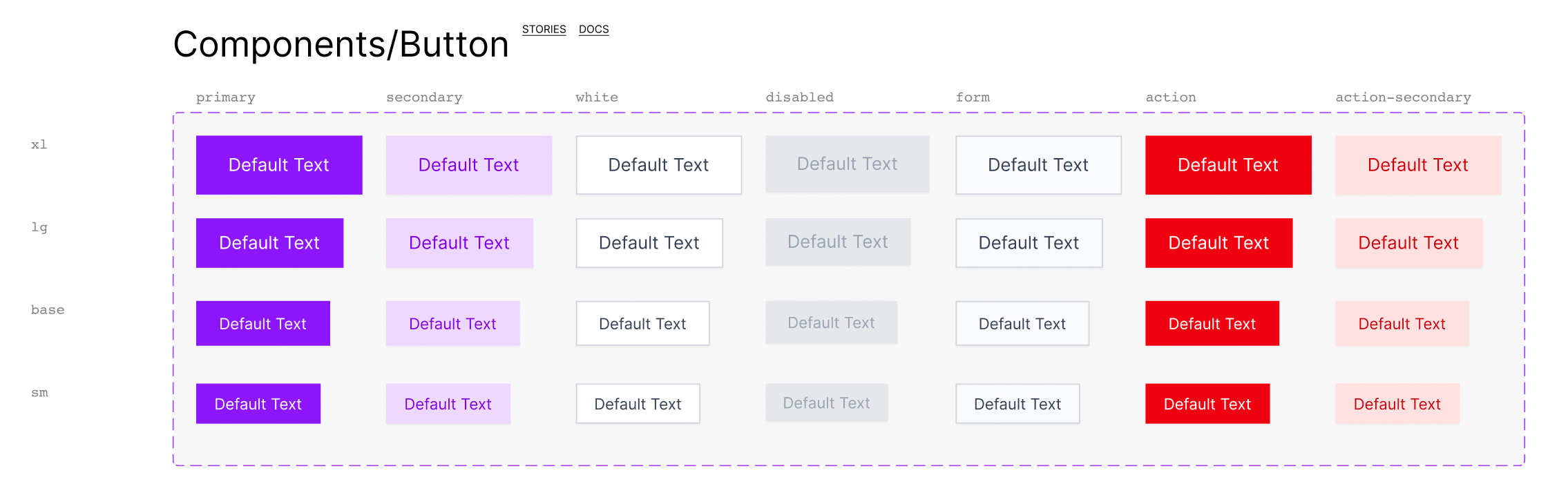
Documentation of variants
When you import your component from Storybook to Figma with story.to.design, we also generate any documentation for that component that was created in Storybook, Backlight or Histoire, as well as all links related to this component.