story.to.design
  • Features
  • Pricing
  • Docs
  • Blog
  • Discord Logo
  • Twitter Logo
  • Mail Logo
  • Features
  • Pricing
  • Docs
  • Blog
  • Discord Logo
  • Twitter Logo
  • Mail Logo
  • Getting started
    • What is story.to.design?
    • Our vision
    • Basic concepts and definitions
    • Incorporate it in your workflow
    • Compatibility
  • Set up Storybook
    • Connect your Storybook
    • Connect a private Storybook
    • How to write stories
    • Extend stories with Figma variants
  • Import components
    • Import your first component
    • Understand a component's status
    • Set up variants - Basic
    • Bring in Storybook updates
    • Simulated states
    • Documentation of variants
  • Advanced features
    • Set up variants - Advanced
    • Nested components
    • Matching styles
    • Prototype with components
    • Import defaults
    • Developer Mode
  • Reference
    • Storybook args
    • variantProperties API
  • Troubleshooting
    • Report an issue
    • Missing fonts
    • No Args found
    • No supported Args found
    • Storybook variants misrendered
  • Pricing
    • Paid plans
  • Downloads
    • Agent
    • Figma plugin
  • Contact us
    • Send us an email
    • Message on Discord
    • Tweet @story_to_design

Prototype with components

Prototyping relations for the pseudo-states in Figma

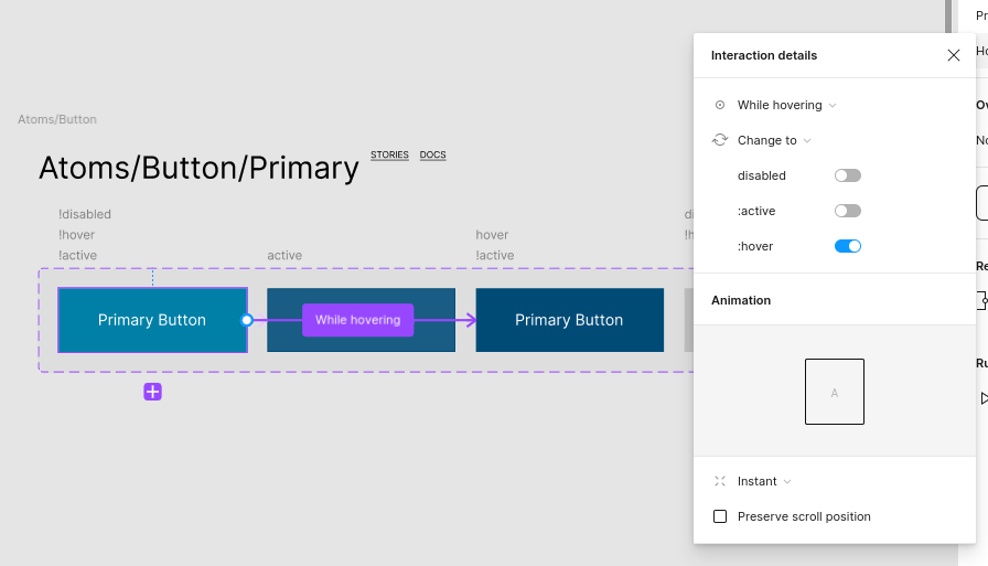
story.to.design will automatically generate prototyping relations for some variants:

Prototyping interactionVariant selected
While hovering:hover=true
On press:active=true
On click:tap=true
checked=true
isChecked=true

Demo

Previous page

Matching styles

Next page

Import defaults

On this page

  • Overview
  • Demo
story.to.design logo story.to.design
  • Discord logo
  • Twitter logo
  • Youtube logo
  • Email icon
  • Features
  • Pricing
  • Docs
  • Blog
  • Storybook to Figma
story.to.design © 2022-2023
Brought to you by ‹div›RIOTS logo
  • Terms & Conditions
  • Privacy Policy