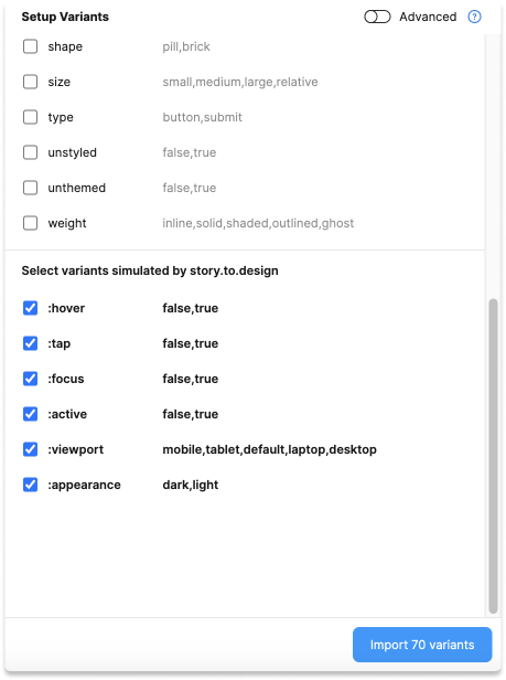
Simulated states
story.to.design can simulate states that are not args in Storybook and create variants for these states.
Available simulated states
| Pseudo arg | values | Description |
|---|---|---|
:hover | true/false | When a pointing device (such as a mouse or trackpad) is used to move over the component. |
:tap | true/false | When a stylus or finger “touches” the component (on touch-screens). |
:focus | true/false | When the component has received focus. |
:active | true/false | When using a mouse, “active” typically starts when the user presses down the primary mouse button. |
:viewport | (*) | Size of the browser viewport. Component with CSS media queries will react to it. |
:appearance | light/dark | This will set the prefers-color-scheme |
(*) Possible values of :viewport are configurable in Import defaults
How to use them in basic set-up
In basic set-up, check the pseudo args:

How to use them in advanced setup
In advanced setup, use the pseudo args like args in the Variant Properties API.
Prototyping
Some of these states will automatically set up the component for prototyping.
Example
For instance for a button, you can have all those pseudo-states generated, and see the CSS impacting the button when story.to.design interacted with this button.
