Configuring defaults for imported variants
There are cases where you will want to have defaults applied to all variants, for example if you need a custom :selector for all your stories.
How to set it up
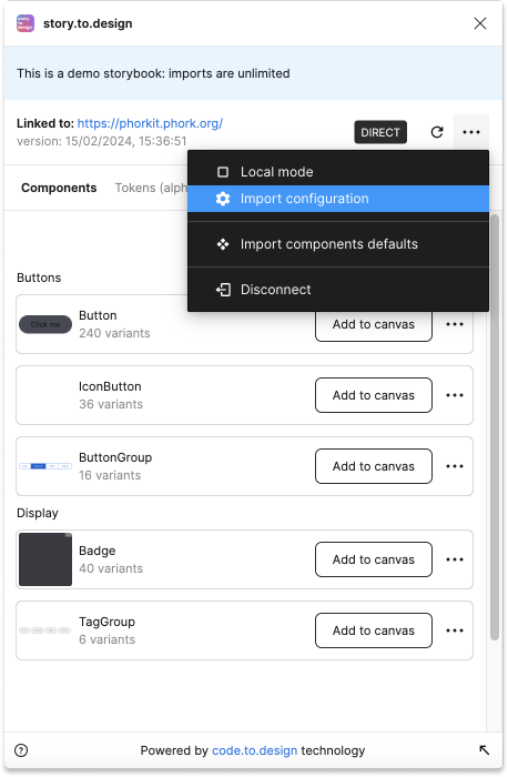
This can be set up in the configuration screen associated to your Storybook. To access it go to Import configuration under the top-right menu of the main screen:
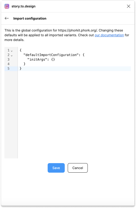
You’ll see the following empty configuration out-of-the-box:
Available options
defaultImportConfiguration
Follows the same configuration as the variantPropertiesAPI. VariantProperties of components will be merge into this one.
viewports
List of viewports breakpoints for the :viewport simulated state.
Can be in the form of width only (in pixels):
{
  "defaultImportConfiguration": {
    "initArgs": {}
  },
  "styleMapping": {},
  "viewports": {
    "desktop": 1440,
    "mobile": 390
  }
}
or with width and height:
{
  "defaultImportConfiguration": {
    "initArgs": {}
  },
  "styleMapping": {},
  "viewports": {
    "desktop": {
      "width": 1920,
      "height": 1080
    },
    "mobile": {
      "width": 390,
      "height": 800
    }
  }
}
Styles mapping
You can configure mappings and filters your tokens (css variables) to local styles in Figma
{
  "defaultImportConfiguration": {
    "initArgs": {}
  },
  "styleMapping": {
    "prefix": "myprefix", // <= Choose the prefix to for all your local styles from tokens
    "ignores": [
      // <= Filter tokens configuration
      "--color-txt", // <= ignores tokens starting with
      {
        "regex": "--color-internals-.*" // <= ignores tokens with this regexp
      }
    ],
    "colors": {
      // <= This is the specific configuration for paint styles
      "replaces": [
        // <= replace tokens' names configuration
        {
          "regex": "color-palette", // <= replace from regexp
          "replace": "basics" // <= replace to
        },
        "color-" // <=  replace all matching substring with empty
      ]
    }
  }
}
Use cases
Import all your stories with a custom :selector
{
  "defaultImportConfiguration": {
    "initArgs": {
      ":selector": ".my-provider-class :first-child"
    }
  }
}
Create an additional variant theme for all imported components
This will import two different stylesheets present in your Storybook and create different variants
{
  "defaultImportConfiguration": {
    "initArgs": {},
    "variantProperties": [
      {
        "fromArg": ":css",
        "name": "theme",
        "values": [
          {
            "name": "dark",
            "argValue": "<link rel=\"stylesheet\" href=\"/css/dark.css\">"
          },
          {
            "name": "light",
            "argValue": "<link rel=\"stylesheet\" href=\"/css/light.css\">"
          }
        ]
      }
    ]
  }
}