Axis options
This page describes the axis option for the variantProperties
API.
Options axis="x" and axis="y"
Default configuration
By default, story.to.design will lay out variants vertically, like this:
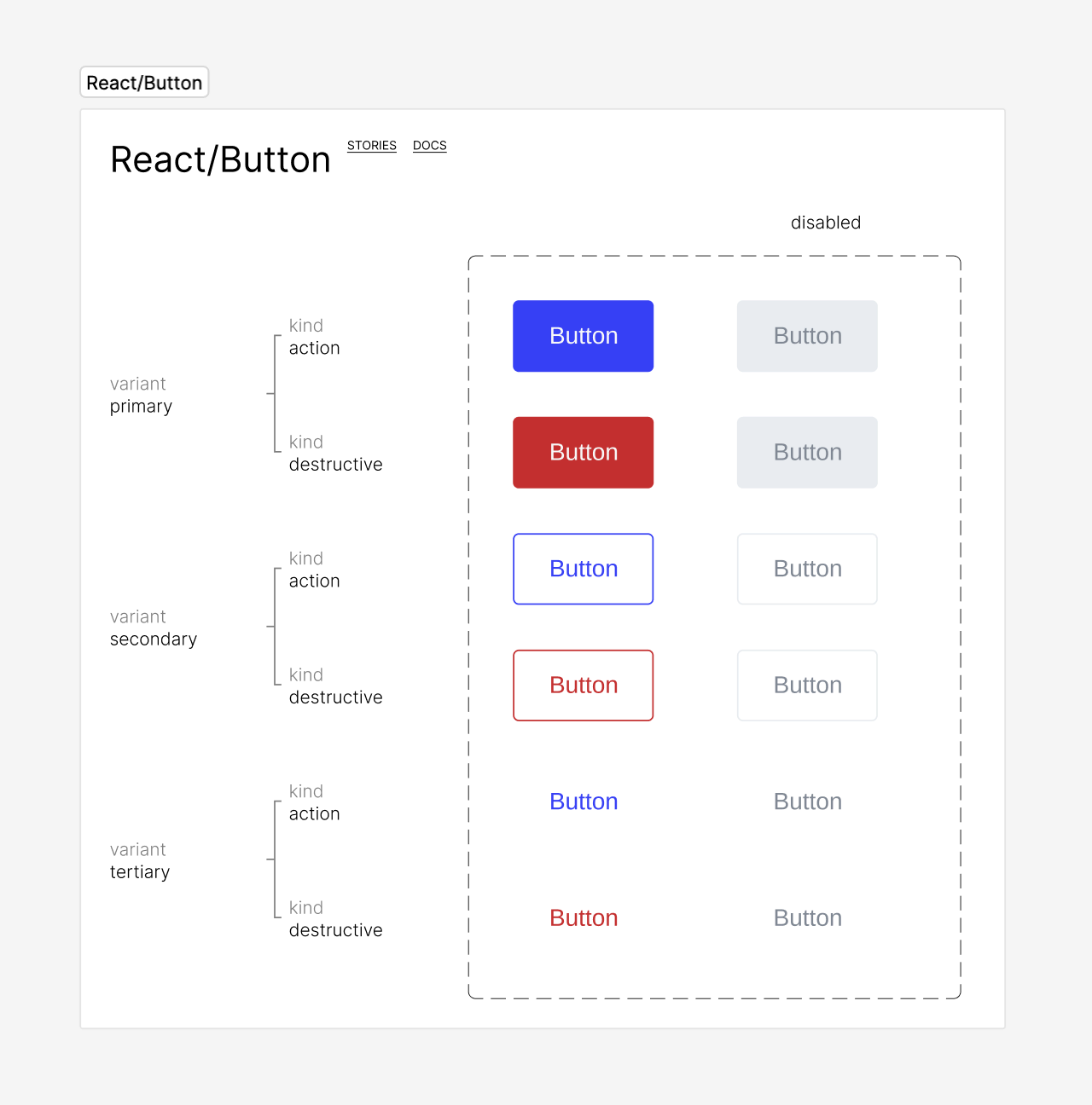
And the default configuration will be:
{
  "initArgs": {},
  "variantProperties": [
    "disabled",
    "kind",
    "variant"
  ]
}
However, if you are not happy with the default layout of a variant,
it can be ajusted in Advanced setup with the axis option.
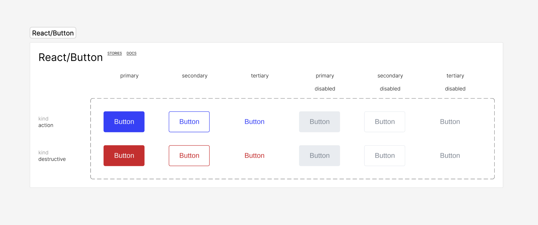
Using axis="x"
{
  "initArgs": {},
  "variantProperties": [
    "disabled",
    "kind",
    {
      "fromArg": "variant",
      "axis": "x"
    }
  ]
}
Result
Using axis="y"
{
  "initArgs": {},
  "variantProperties": [
    "disabled",
    "kind",
    {
      "fromArg": "variant",
      "axis": "y"
    }
  ]
}
Result
Option axis="split"
With the axis="split" option, you can create groups of individual components.
This is particularly helpful if you want to split icons into multiple components to use them in instance swaps.
Icons as variants default
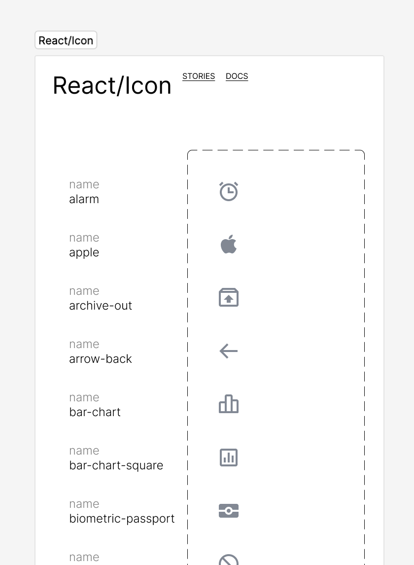
Using axis="split"
{
  "initArgs": {
    "color": "neutral-500"
  },
  "variantProperties": [
    {
      "fromArg": "name",
      "axis": "split"
    }
  ]
}
Result
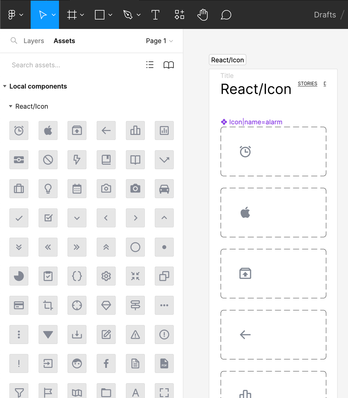