Import your first component
Getting started with the story.to.design Figma plugin is simple. Follow these steps to get your components directly from Storybook to Figma.
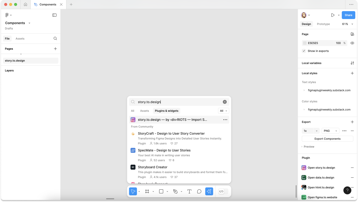
1. Run the story.to.design plugin
To start using story.to.design, go to the plugin page in Figma Community or search for it under plugins directly in your Figma canvas. Open the plugin in the page and design file where you would like to import your components.
2. Connect Storybook to Figma (or Histoire)
Connect the Storybook or Histoire library you would like to import components from by entering the URL in the field provided and click Connect.
In this example we’ll use Phorkit’s public Storybook at:
https://phorkit.phork.org/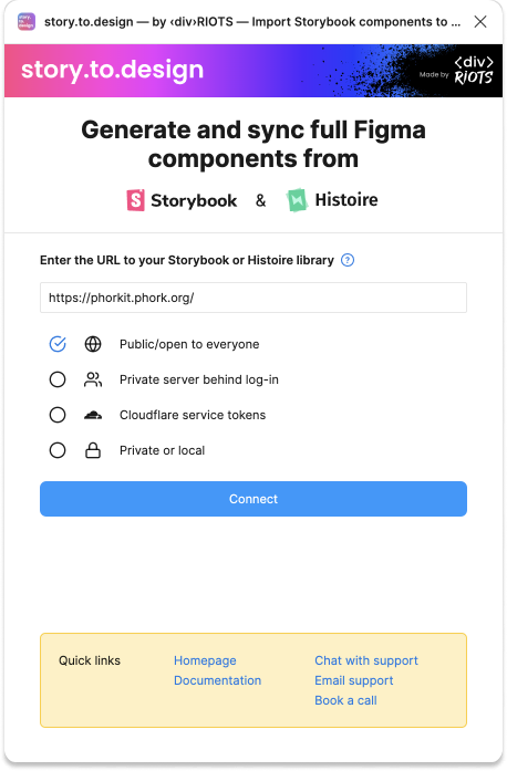
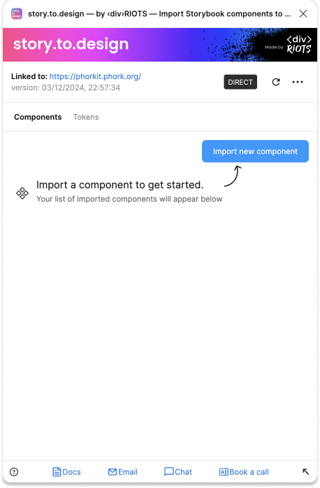
3. Import a component from stories
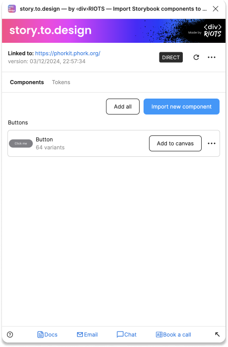
To import your first component, click on Import new component.
4. Select your component and story
Select which component and story to import. A button, for example, is a must-have.
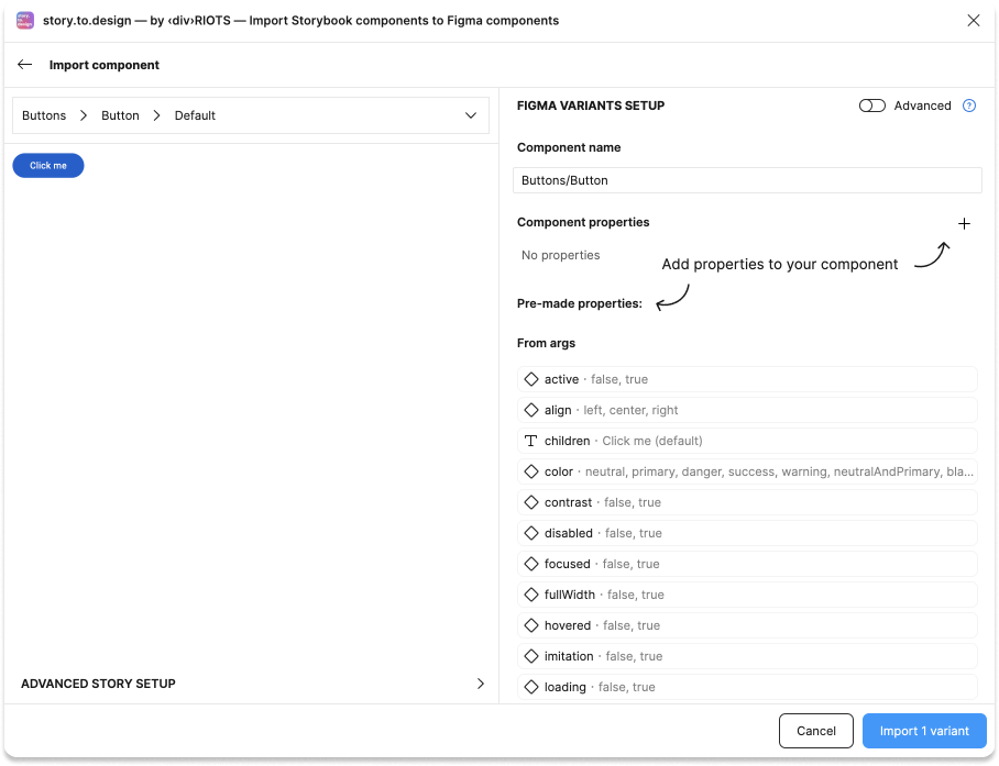
5. Set up your component’s variant properties
To set up all the variants your component will have, choose which properties to include in the import by either selecting them from the list of ‘Pre-made properties’, or by adding them manually via the plus icon.
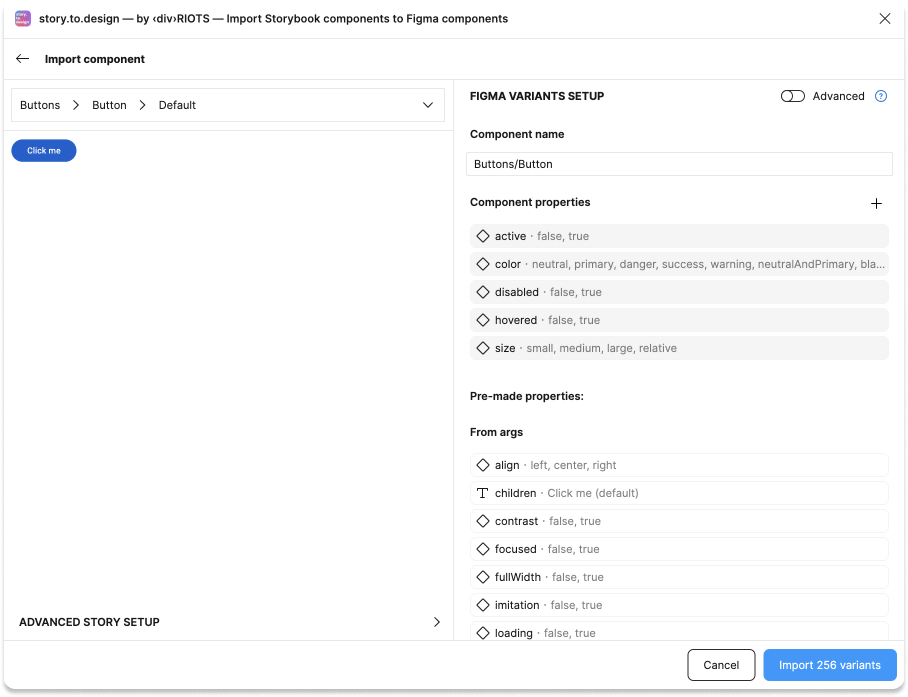
Once you’re ready, click on Import to start bringing your components from Storybook to Figma.
6. Add component to your Figma canvas
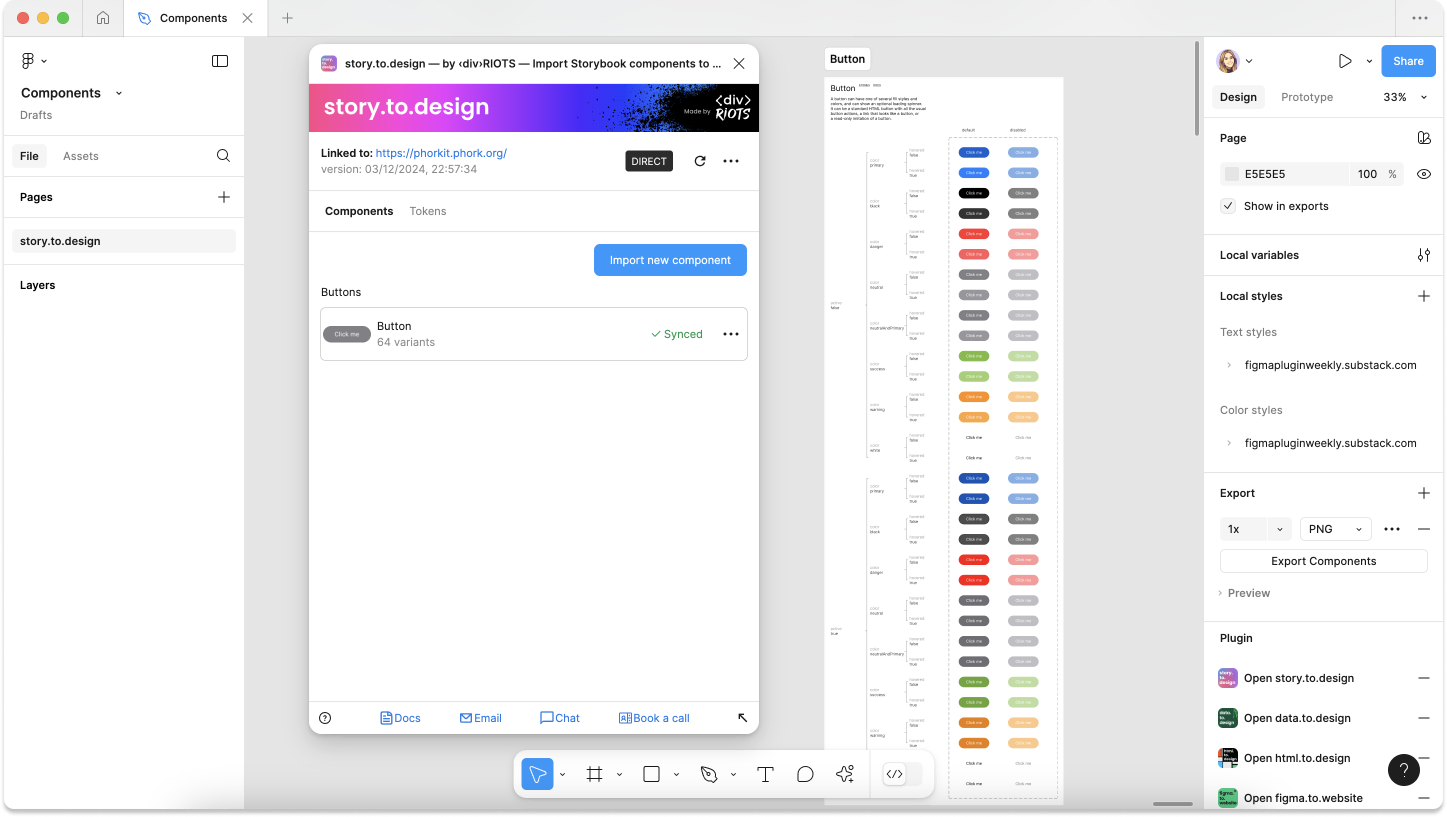
Once story.to.design has processed your chosen component and variants, you’ll see the component in your main list in the plugin. Click on Add to canvas to add this component and its variants to your Figma canvas. If you have multiple components in your list, you can also click Add all at the top of the screen to import all components into Figma at once.
Tip: You can also drag-and-drop the thumbnail of the component into the canvas.
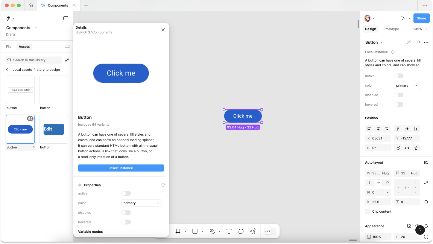
7. Component and variants created!
A new frame with your button component appears on the canvas together with any
documentation. The status of your component should change
to (Synced) as it is now in-sync and mapped to the coded component in Storybook, Backlight or Histoire.
8. Congratulations! 👏
You’ve successfully created your first Figma component that is directly linked to your
coded component in Storybook or Histoire. You’ll now find the component automatically added to the Assets panel and you can start using it in
your designs.