How to incorporate story.to.design in your workflow
Since launching story.to.design, we’ve gotten several questions from teams about how to integrate the plugin into their workflows:
“Design is first in our organization, where does story.to.design come in?”… “Are we supposed to let story.to.design override our Figma file?”… “Why code-to-design when everything starts with design?”
While design can tell developers what should be built at the very beginning (when defining a new component, for example), the way things need to be developed can also end up influencing the design. One can’t live without the other, and design system teams benefit most when designers’ assets match exactly what developers are using.
Thanks to story.to.design, when designers sit down to defining a new component, for example, they no longer have to sketch out the hundreds of variants by hand. Instead, the plugin gives them all these variants, synced with code, automatically.
Phase 1 - Build your design system
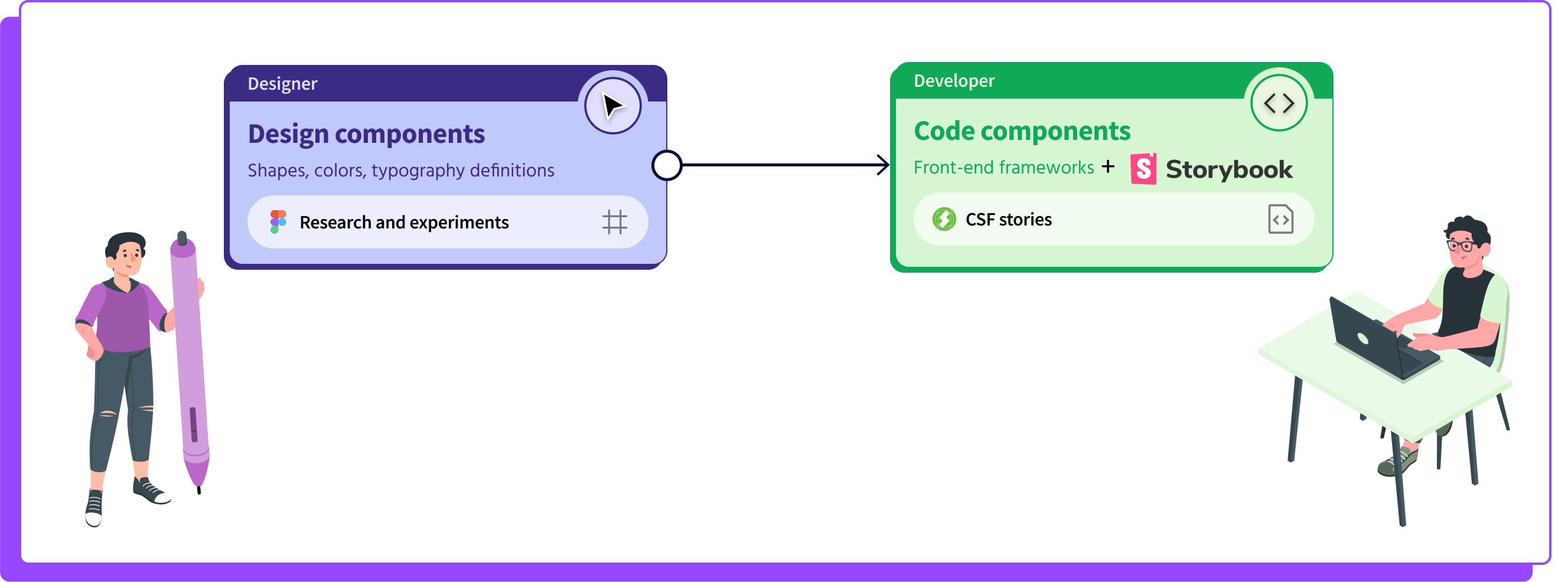
Chances are you already have a design system, or are in the process of building one. While you might assume that the components originally provided by the designer and the final developed components will both look the same in all their details, unfortunately, this is where differences start showing. And this is where story.to.design comes in.
Phase 2 - Bring components from code back to your design files
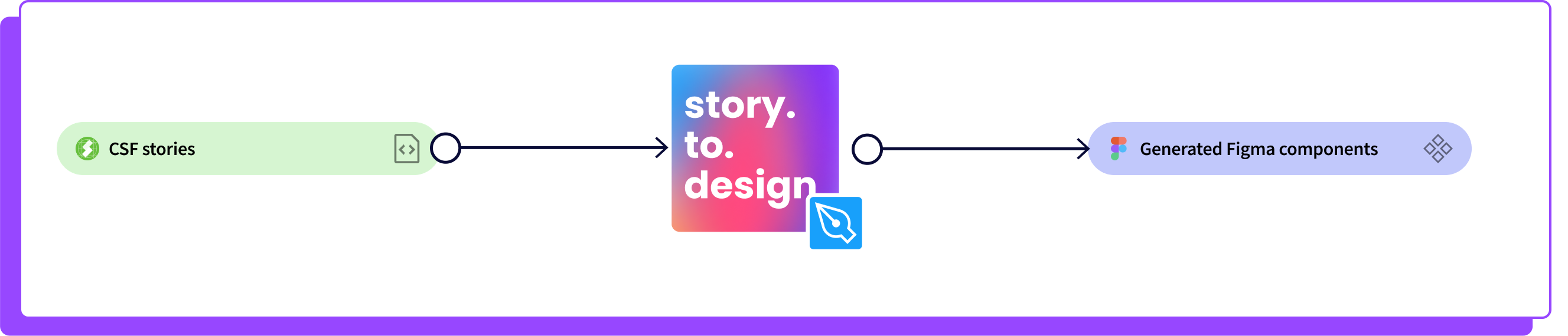
When components are documented as CSF stories written with args, story.to.design can automatically create fully-functioning Figma components with all their variants and prototype features, establishing a link between code and design.
Tip: we recommend creating a specific Figma file for all story.to.design components, separate from where you may be experimenting on new components. It should be treated as your main Figma UI library.
There are two main scenarios where a team might incorporate story.to.design:
Creating a new component:
- Open a new Figma file, separate from where you will, or already, keep the components generated by story.to.design.
- Design the minimum number of variants that you need to express this new component’s UI and behavior.
- Handover to development.
- Once the component is coded and ready in Storybook, Backlight or Histoire; let story.to.design create the full spectrum of variants in your main Figma library.
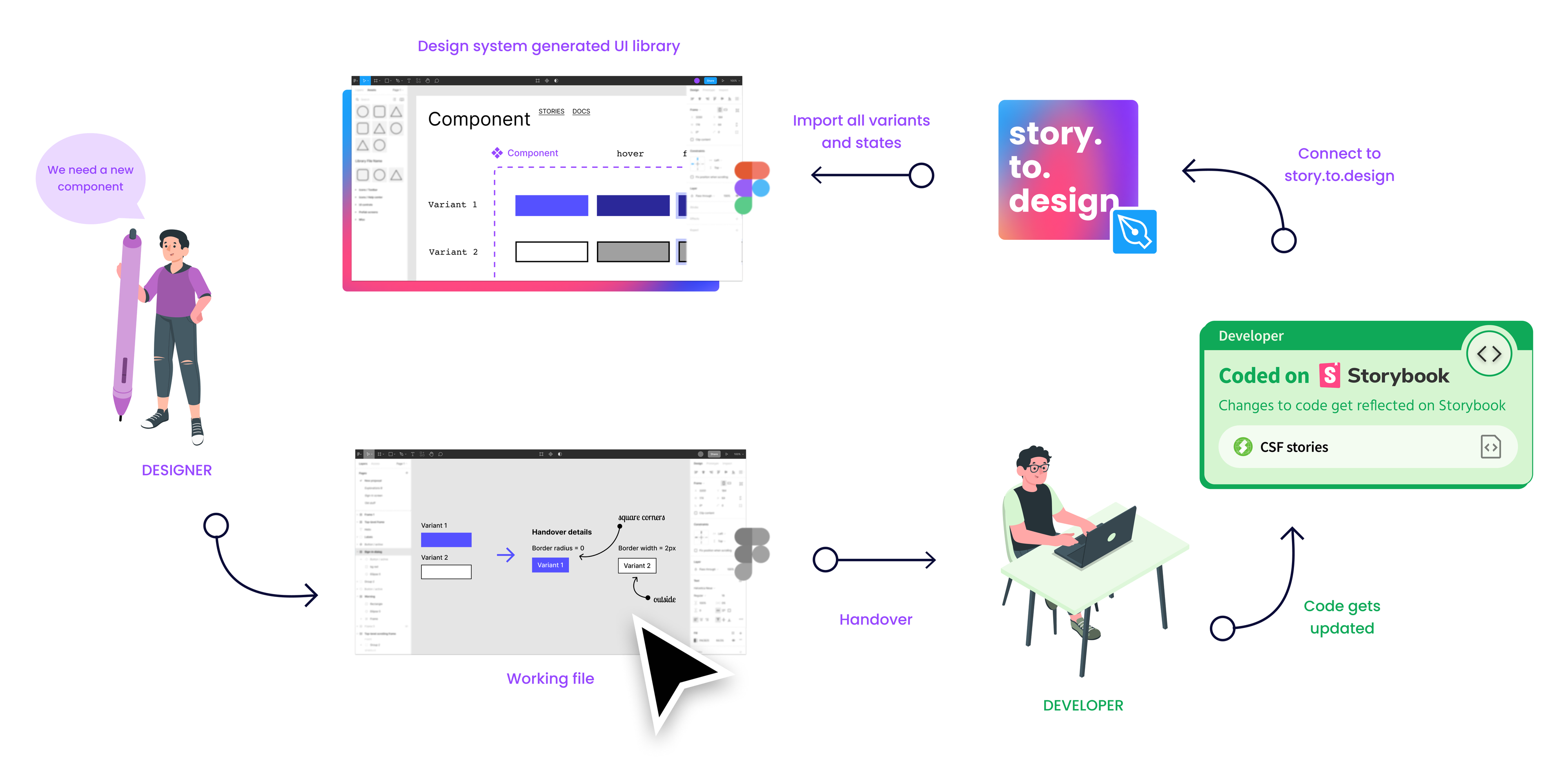
Making changes to an existing component:
- Copy the existing component and paste it to another Figma file (components generated by story.to.design will lose their connection with code if modified directly). Or, you can also use Figma’s branching feature.
- Make the necessary changes for this new component. There’s no need to update every single variant, only the relevant ones. The idea is that designers do the minimum amount of work possible when updating components.
- Handover to development.
- When ready, let story.to.design update the full spectrum of variants in your main Figma library, meaning that changes will be reflected automatically in all instances of that component. Designers no longer have to do this by hand!
Phase 3 - Keep design and code assets in sync
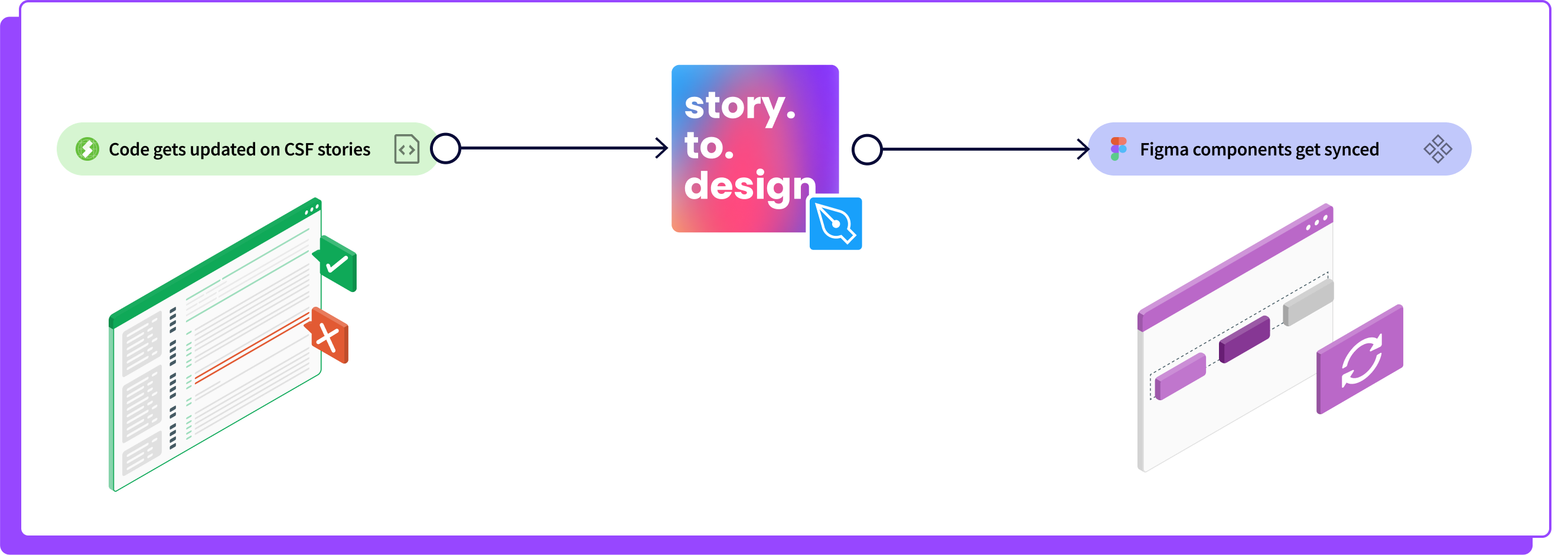
From this point on, because the Figma components have been automatically created and linked to Storybook, Backlight or Histoire; any changes made to the components’ code will also be automatically reflected in the designs. There’s no longer a need for the manual and repetitive Figma tasks of updating designs to match what has been done in code.
Tip: we recommend that you use story.to.design-generated components as master components, so that code updates are reflected across all instances automatically.
Phase 4 - Design with true-to-code components
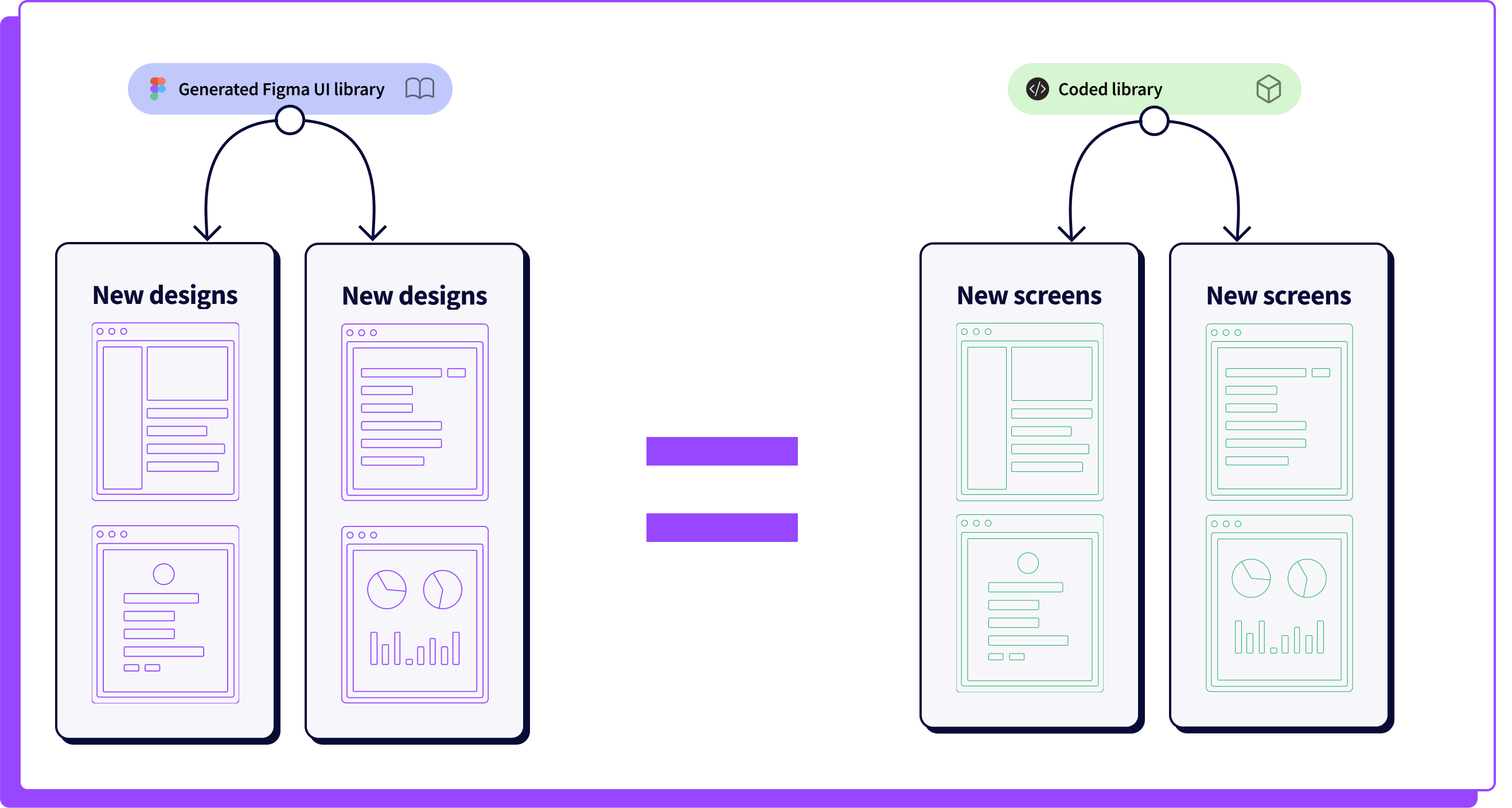
By closing the loop and bringing components from code to design again, designers will have fully aligned, true-to-code Figma UI libraries when starting new designs.
Tip: Do not directly edit the components generated by story.to.design. Any manual changes will override the original components and they will lose their connection with code.
While this article describes a complete workflow, the best part is you can incorporate story.to.design incrementally. There’s no need to import everything all at once. First use it for a few components or variants from your existing design system that are missing and grow from there. Because story.to.design lets you import and update components individually and incrementally, there’s no need to go all-in for 100% of your components right away. Start with what you want and go from there.
Should you need help finding the right way to adopt story.to.design for your team, don’t hesitate to email us at support+s2d@divriots.com.