How to keep development and design assets aligned
One of the most time-consuming parts of working on any design system is keeping development and design assets aligned. Developers are working in one place, with one set of tools, while designers are working with another. And for a design system to be an efficient source-of-truth for all design decisions, it’s important to keep both sets of assets in-sync.
While a well-defined process and regular communication between teams can help in achieving alignment, a lot of the work involves manual, repetitive tasks that can keep designers and developers from more meaningful tasks. In this post, we’ll cover a few strategies for keeping design and development assets aligned as you work with your design system.
Naming
Agreement on component naming is a must. Shared language is shared meaning, and when component names differ across design and development libraries, we waste time trying to communicate to someone on the other team which component we’re talking about.
Component names should be logical, scalable, simple and standardized. For more best practices, take a look at these naming conventions for design systems. Once we’ve defined these names, we need to make sure that they are the same across the different tools used by design system developers and designers.
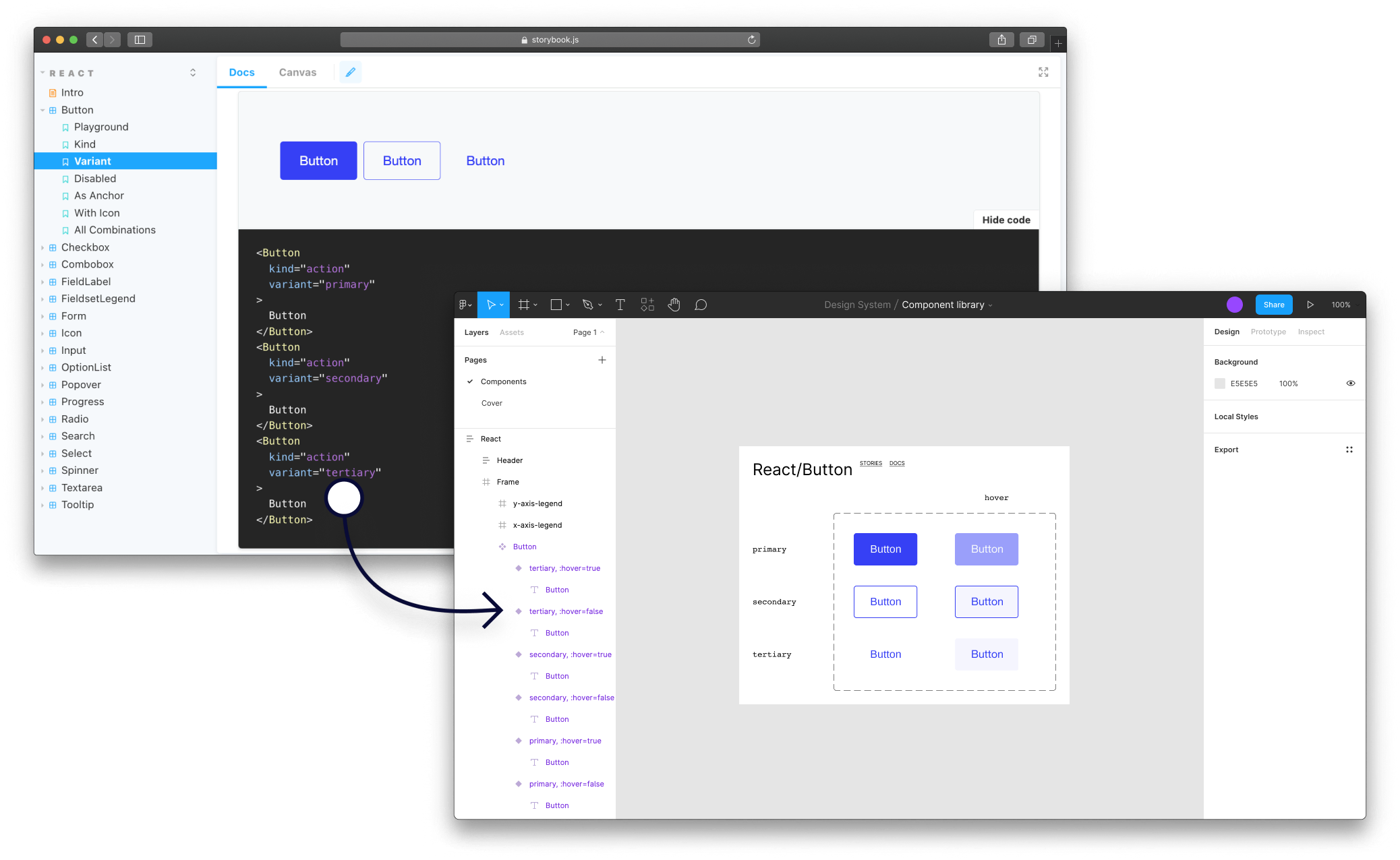
For example, if you’ve decided to name the third variation of your button Tertiary this should be how the component is displayed in code, Storybook, Figma and any documentation. Unfortunately, when this decision isn’t communicated properly, or agreed on by the whole team, inconsistencies start appearing. It can happen that the Figma file will display something like Button Tertiary, while in code the developer might have interpreted it as a link-button, due to its similarities to a link. Sometimes, even the use of capitalization in the component’s name can cause issues. While in some places the component name is Tertiary, in others it may be shown as tertiary. Consistency in a design system should extend to all parts of it, including how things are spelled.
story.to.design automatically transfers all component names defined in code and Storybook when importing components into Figma. This means that no manual upkeep of naming is required, and your Figma UI library will have the exact same component names as your Storybook library.
File organization
It’s important to have a clear and organized file structure for your design system. This will make it easier for you and your team to find and access the assets you need. However, like component names, the file structure should be mirrored from Storybook to Figma, so that both designers and developers are looking at the same component library in both places.
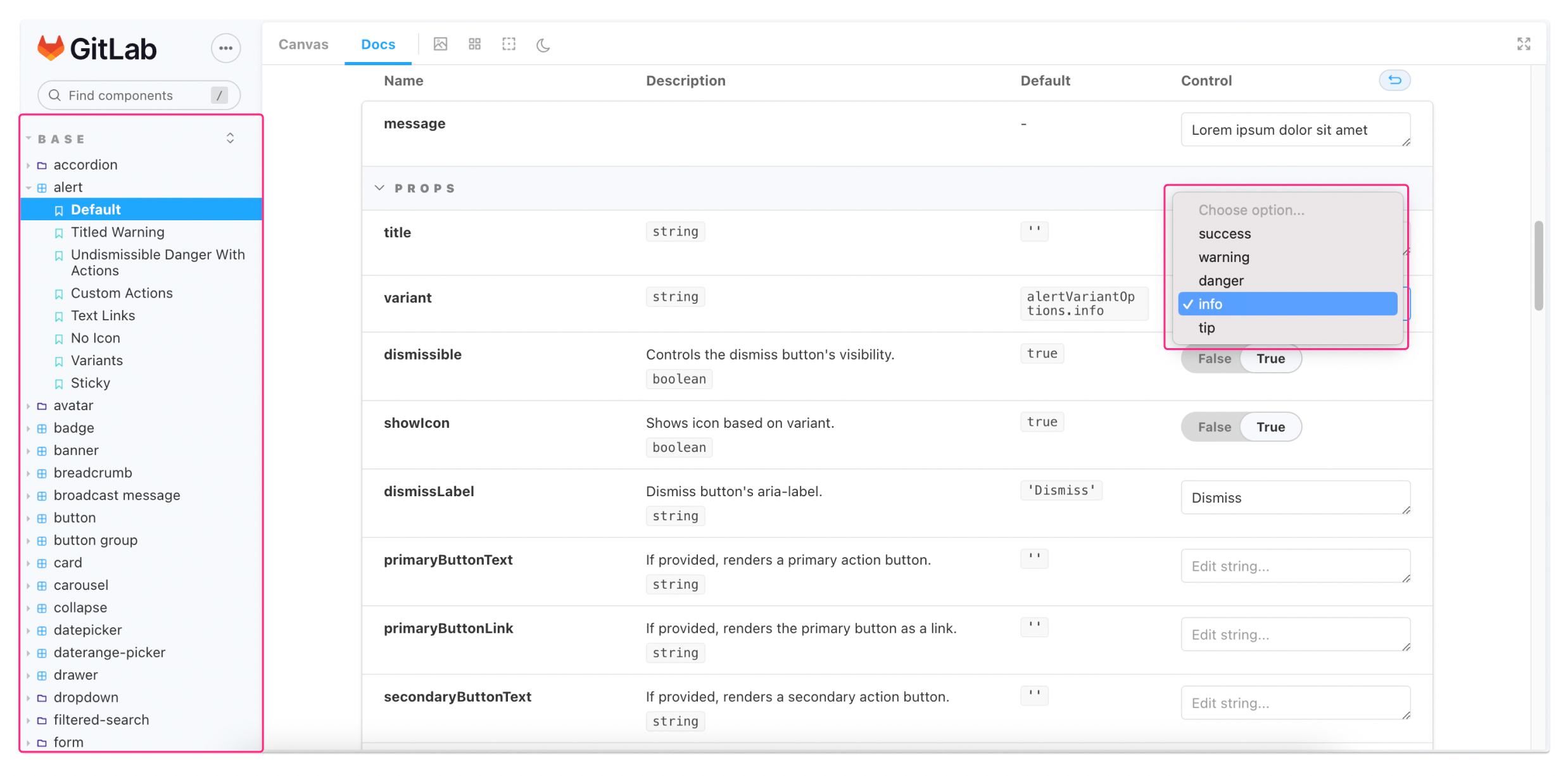
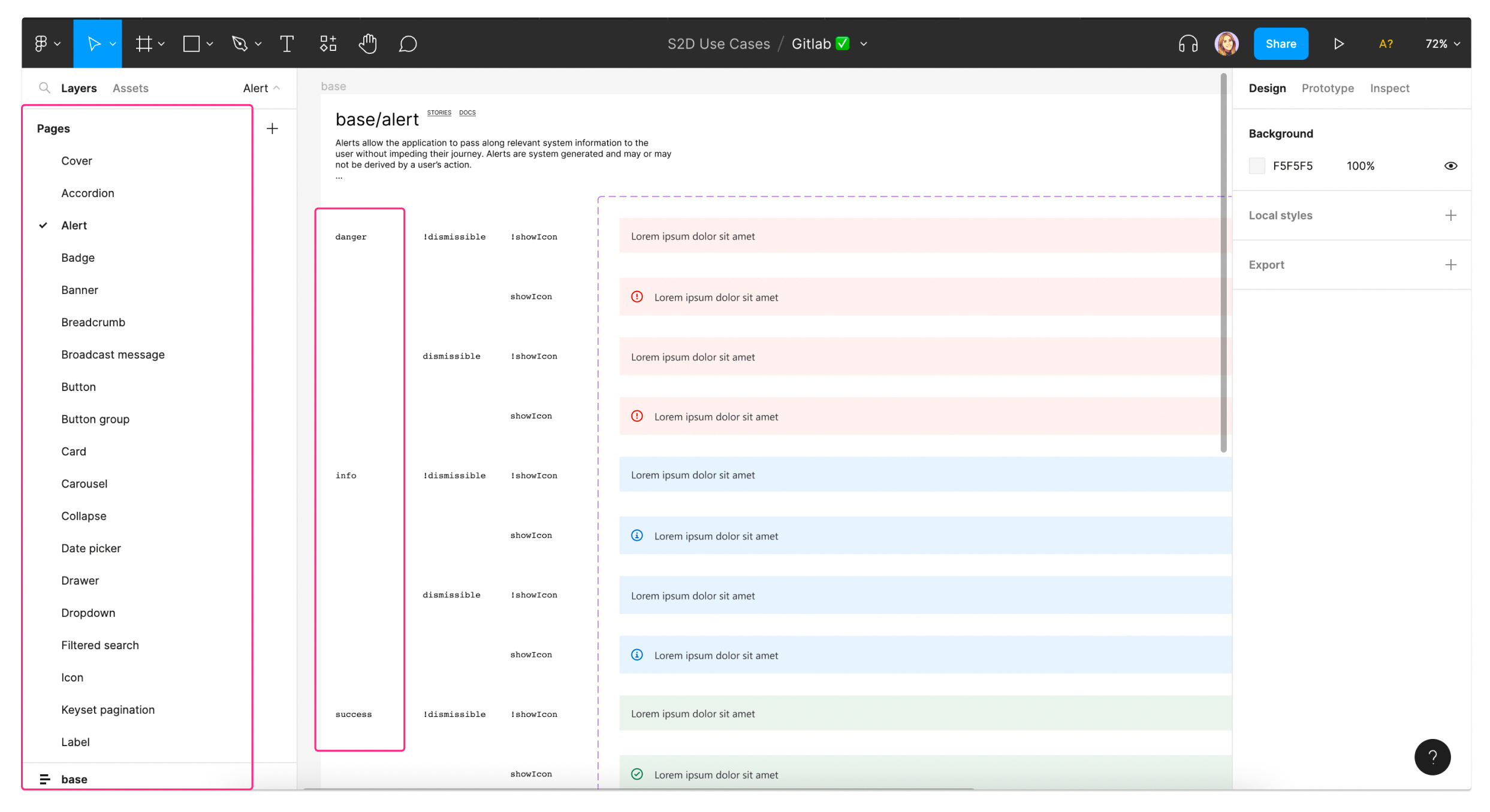
Let’s take an example. GitLab’s Storybook is organized into 7 sections, where the first one with all the main components is called Base. Within each section, the components are ordered alphabetically. If we take the alert component, there are 5 main variants: success, warning, danger, info and tip.
To mirror this file structure in Figma, story.to.design does it automatically. The plugin imports everything into Figma to match what exists in Storybook (even the documentation content!). This way, despite working in different tools, developers and designers have the same context and references when working with their respective UI libraries.
UI changes
While developers are used to version control systems and branching in their daily workflows, designers are only starting to implement them. For tracking changes in our design systems, version control is essential, however, it also has to be synced across both development and design assets in order to be effective.
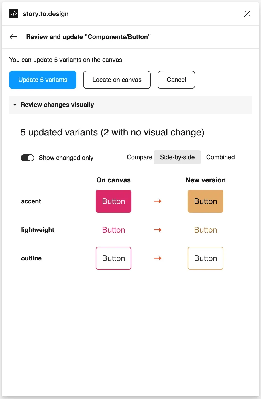
story.to.design can take care of versioning by always keeping your UI library in Figma up-to-date and in-sync with your Storybook. After importing your components from Storybook to Figma using story.to.design, the plugin will then automatically alert for any changes in Storybook code. This way, all you have to do is click ‘Update’ to bring in all changes into your Figma library. Check out our documentation about updates for more details.
Design systems can make our products better and more consistent, however they can also be messy and difficult to maintain. Alignment between design and development is key to avoiding some of the chaos, and while story.to.design can help streamline your workflow and remove manual tasks, regular communication across teams and a clear process are also crucial.
👋 Hi there!
We built the Figma plugin that keeps your Figma library true-to-code.
story.to.design imports components from Storybook to Figma in seconds.
Try it for free