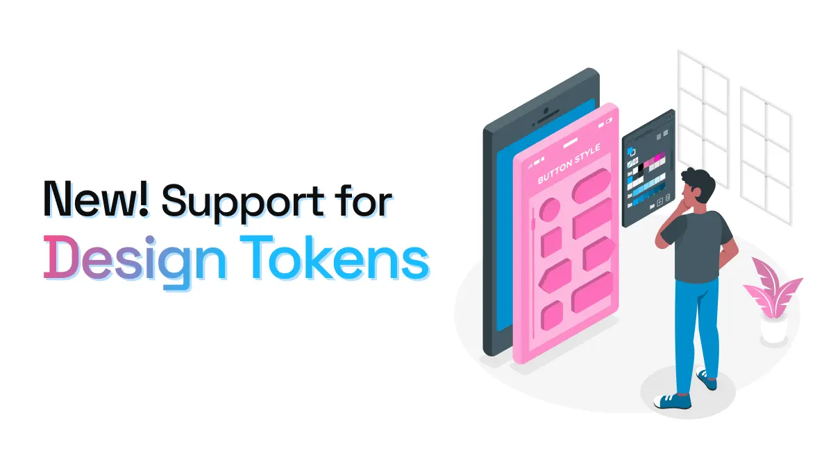
Introducing support for Design Tokens
A feature many of you have been waiting for: story.to.design now detects and imports Design Tokens from stories to Figma!
Until today, when importing components from Storybook to Figma, story.to.design always imported the correct styling, but wasn’t able to automatically convert these into Figma styles…
Now, the plugin comes with an exciting 2-in-1 feature to help you manage and sync your Design Tokens with code:
-
Map your Figma styles to imported components: story.to.design can now pick up the Figma styles used in components when we find something that matches (only colors for now). This means that any Figma styles or Design Tokens prefixed with
story.to.design, whether added manually or via Tokens Studio, story.to.design will automatically map and apply them to any imported components that use them. -
Import Design Tokens from code: story.to.design now also brings in the Design Tokens used for your components (again, only colors for now) to transform and apply them as Figma styles. This means that you can use story.to.design to import your Design Tokens from code and convert them into Figma styles, instead of inputting them manually. Also, if you update a Design Token in code, you no longer have to re-import the components to reflect the style changes. Simply update the Tokens tab in the plugin and the new styling will be mapped and applied to all relevant components!
Importing Design Tokens step-by-step
-
Once you’ve connected the plugin to your Storybook, Backlight or Histoire, it parses your stories to collect all CSS custom properties present.
-
These CSS properties then appear in the
Tokenstab, listed next to all current styles locally present in Figma. This way you can visually compare the current styles vs what is present in code, and decide whether or not to apply the styles detected from code. -
In a single click, the plugin will then convert all your CSS properties to Figma styles and they are automatically added to the Figma file. The plugin then maps all components’ fills and strokes with the styles present in your Figma styles. If you had already imported components into Figma previously using story.to.design, the plugin lets you find which tokens have been created, updated or deleted from code and compare them to your already-imported tokens. Once you click
Apply as styles, story.to.design will simultaneously reapply the new set of styles to all previously-imported components on the canvas.
This is currently an alpha feature in its very initial stages, and only supports CSS color properties for now.
What’s next?
While we’re just getting started with Design Tokens, we hope to incorporate other options such as W3C Tokens or Style-Dictionary in the very near future.
Try it out and tell us what you think!
👋 Hi there!
We built the Figma plugin that keeps your Figma library true-to-code.
story.to.design imports components from Storybook to Figma in seconds.
Try it for free