story.to.design - Generate a Figma UI kit from Storybook
tl;dr
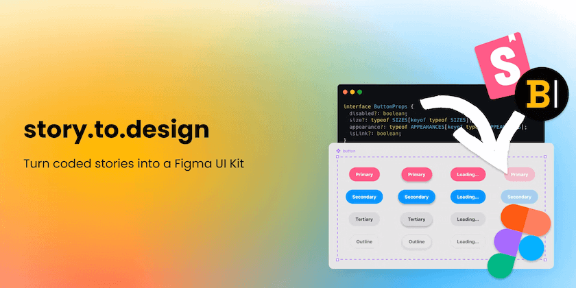
story.to.design generates and updates Figma UI kits from Storybook component library code. The plugin brings your components from Storybook to Figma, to automatically generate an up-to-date Figma library. story.to.design comes with built-in support for Figma variants so you don’t have to maintain those thousands of variants manually. They are automatically generated and updated when needed.
Some background
We’ve defined design systems as being based on 5 pillars:
- Design tokens
- Design kit (or UI kit)
- Component library
- Content design
- Documentation site

Design Kits live in tools like Figma and are used by Designers to design new solutions and UIs.
Component Libraries live in code repositories and are used by engineering to develop new features following new designs. Component libraries are usually backed by stories in Storybook.
Both follow the design system and are extremely similar. They help to align design and development as everyone talks the same language and uses the same system.
Why story.to.design?
If not maintained in sync, design and engineering misunderstand each other. Is this a new design that needs to affect code? Is this available on production today?
Maintaining both design UI kits and component libraries in code is not a small task.
When you start having hundreds of variants for a button, it’s a lot of labor to maintain.

A tiny code change in the design system can impact thousands of variants. It pushes the design team to architect UI Kit components in complex ways, sometimes hacking Figma to make maintenance bearable.
Design teams should not waste time maintaining the UI Kit in sync with code; they should focus on research for outstanding user experiences.
That’s why we created story.to.design.
Why generating from code-to-design when everybody tries to generate from design-to-code?
We believe that design tools are here to support creativity and research. It means maximum freedom to do, undo, redo, scratch, try, compare and repeat in every possible direction.
For design-to-code to work, a designer would need to comply with certain structural constraints that would allow proper code generation. These constraints are slowing down design process and limiting the exploratory possibilities.
We believe design tools need to keep the free form’s agility to deliver the best possible results and leave the technical implementation of the final output to engineering members.
Design tools should be limitless.
On the other end, there is more than enough information on the code side to generate the design UI kits. Minor code changes can have thousands of visual impact and can be easily reproduced into the design UI kit.
Creating design from code doesn’t add any constraints to the design and just removes the uninteresting labor of maintaining the UI Kit in sync with code.
How does story.to.design work?
- Install story.to.design Figma plugin.
- Paste the Storybook URL into the plugin to connect your Storybook to Figma.
- Select your stories and GO!
- The plugin will load and generate the corresponding components in Figma with the correct variants.
story.to.design isn’t tied to any framework. It works with stories in React, Angular, Vue, Svelte, Stencil, Lit… It even works with stories in React-Native design systems in Backlight!
Tired of updating your design UI Kit?
Install story.to.design plugin today!
Who are we?
We are ‹div›RIOTS — creators of tools for front-end teams. We embrace modern/multidisciplinary front-end teams with tools for developers, designers, UX Writers and Product Owners.
Our flagship product is Backlight and story.to.design is our new baby!
Learn more about us at https://divRIOTS.com.
👋 Hi there!
We built the Figma plugin that keeps your Figma library true-to-code.
story.to.design imports components from Storybook to Figma in seconds.
Try it for free