Best Figma plugins for design systems
Design systems allow teams to build a consistent user experience, deploy features more quickly, make rebranding changes more efficiently and free-up time to address challenging UX issues. Most design teams have a big part of their design system in Figma, whether it’s a UI library, general styles and guidelines or design tokens. Maintaining these parts of a design system up to date can be time-consuming and repetitive work that often keeps designers from doing what they do best: designing new experiences.
In this post, we’ve rounded up 14 of the best Figma plugins that can help designers build, grow and maintain their design systems. A lot of them automate the dull, manual work and some even help bridge gaps between teams, aligning code and design.
(Ordered alphabetically)
Batch Styler
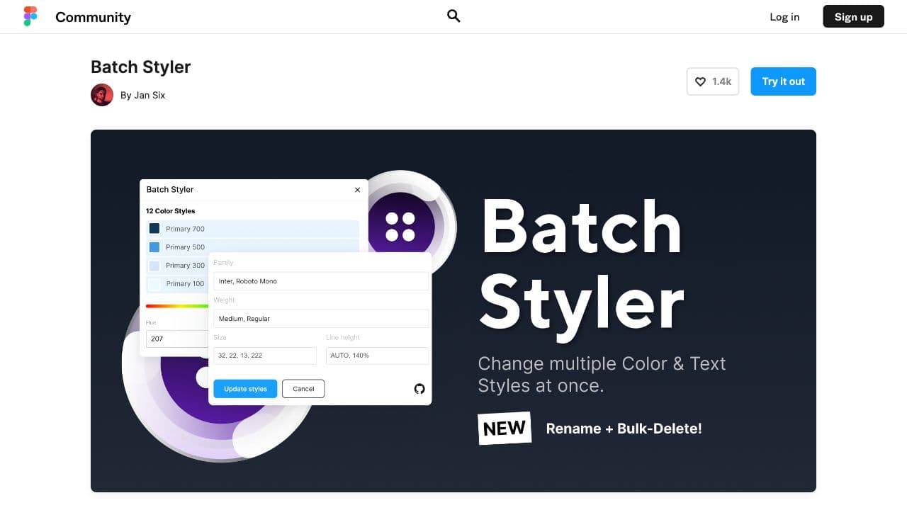
A plugin created by Jan Six and his team, Batch Styler is a huge time-saver. If you're managing dozens of color and text styles in your Figma UI library, Batch Styler reduces those repetitve, manual tasks to almost zero. You can change color and typography styles in one go, and update them everywhere they're used. The plugin also deletes styles, renames them and updates descriptions in a matter of a few clicks.
Design System Adoption
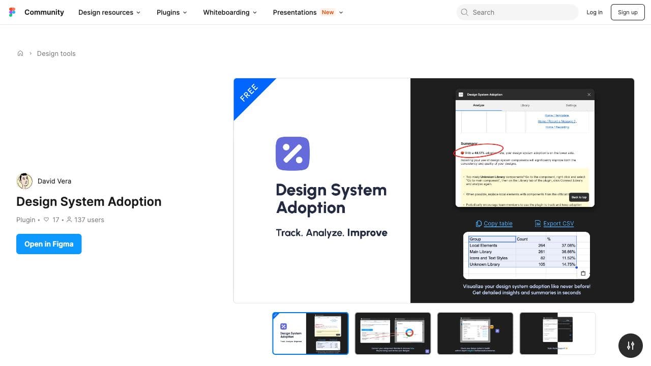
Design System Adoption measures exactly what its name states, making sure your designs are consistent and using your design system's components and styles. To start, you'll first need to connect your libraries to the plugin. Once connected, Design System Adoption will scan your files to give you a breakdown of which components are being used most, as well as your design system's overall adoption.
Design System Hub
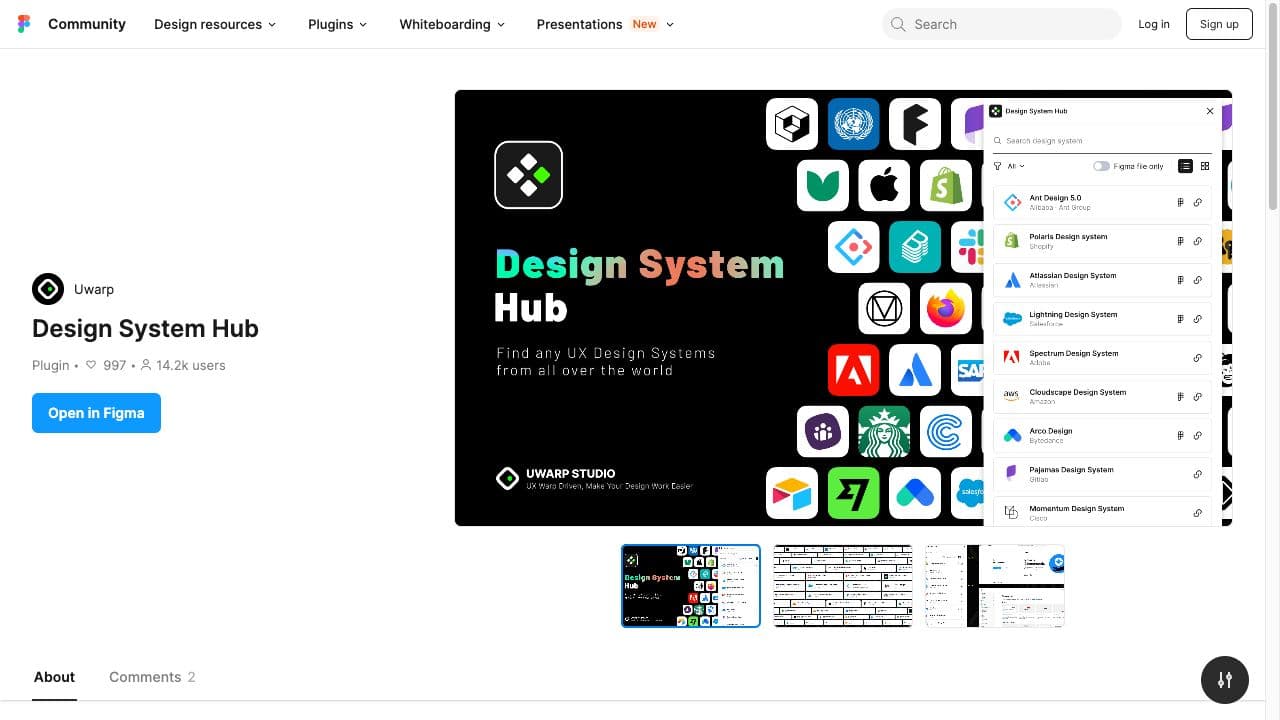
If you're just starting your design system and need some ideas to get started, it's always good to gather inspiration from what other companies and design teams are doing. The Figma plugin Design System Hub is a great resource for this early benchmarking phase. This plugin is essentially a library of more than 150 major design systems used by UX teams across the world. All design systems in the list come with a link to their website or library of resources, and some even come with a link to their Figma library. You can filter to only see design systems that have a Figma library available, or by device/platform.
Design System Organizer
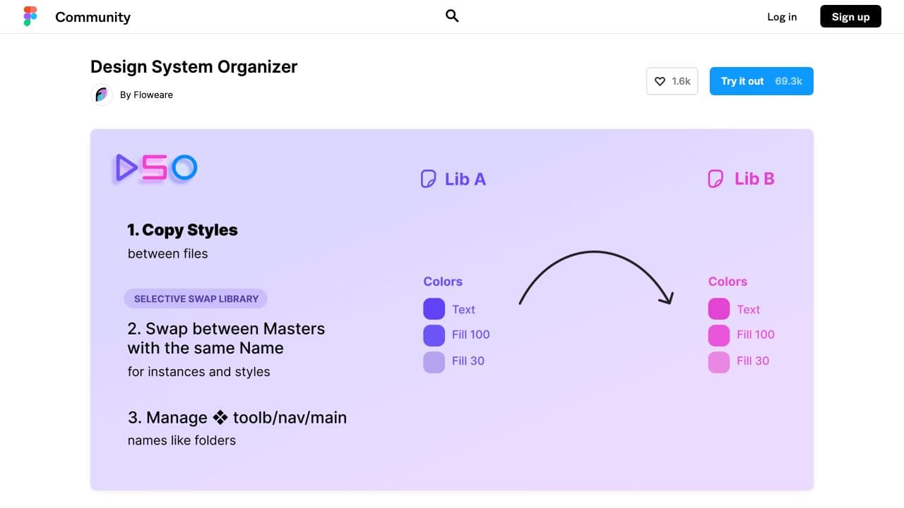
As its name suggests, this plugin helps keep your design system organized. The Design System Organizer manages multiple instances of Figma component libraries thanks to 3 key features:
- Copy styles from one file to another or combine multiple style files into a single one. This keeps your design system styles consistent over time.
- Bulk swap instances and styles between masters with the same name. This helps organize and move your master styles and components to the right place.
- Manage pathnames with /’s like folders to reorganize and clean up huge libraries with multiple names.
Eight Shapes Specs
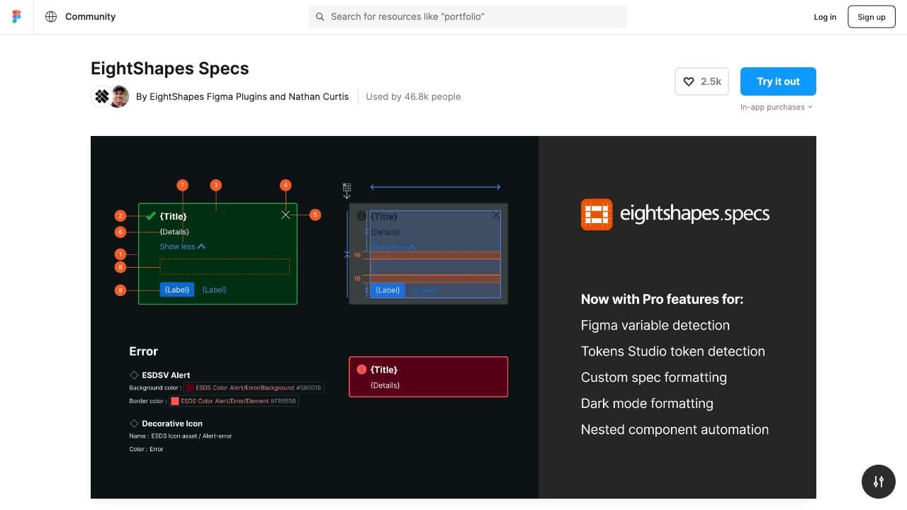
If you're creating design system documentation in Figma, you'll most likely need to annotate your components and layouts with their design specifcations. Eight Shapes Specs is a simple tool that automatically adds measurement, spacing and anatomy annotations to your designs. For anyone referring to your design system in Figma, having these annotations will be helpful both for design-dev handoff, and for understanding how a given component has been designed.
Gist
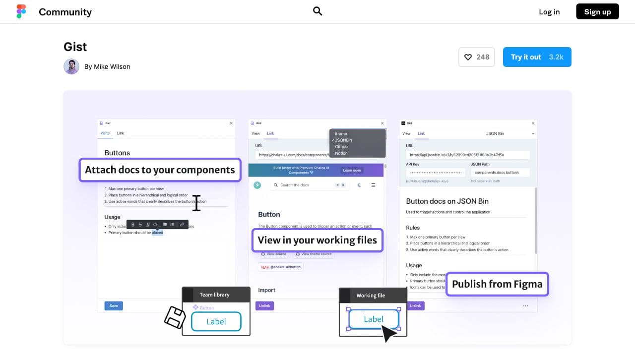
What’s a design system without its documentation? When working with a given component, it’s important for designers to be able to refer to the documentation easily, and it can be frustrating to have to leave the working file and search for a component’s documentation elsewhere. Gist offers a solution by attaching the documentation directly to the component in Figma. There are 3 ways to attach/create documentation using Gist:
- Writing the documentation in the plugin using Markdown.
- Linking a component directly to existing documentation that’s either in iFrame, Notion, GitHub or JSONbin.
- Publishing documentation written in the plugin to JSONbin or GitHub.
Instance Finder
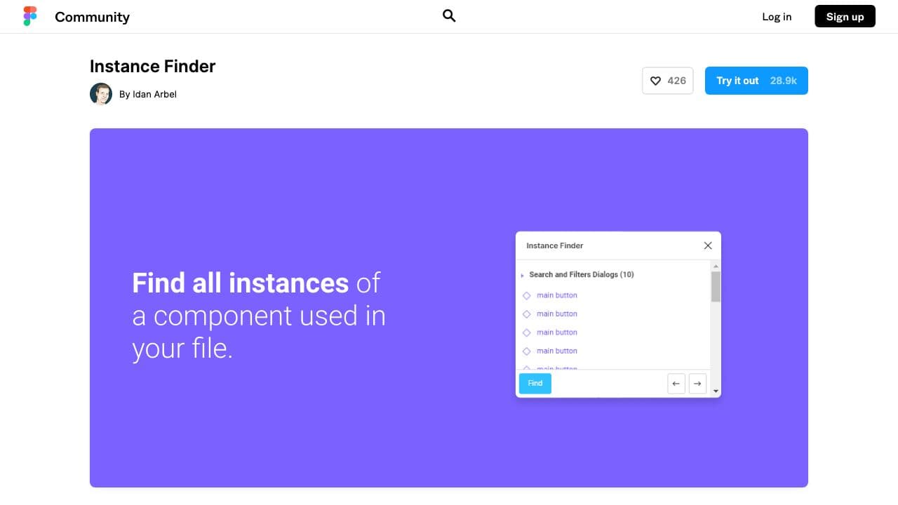
Sometimes design system teams need to know how often they are using a specific component. Instance Finder does just that. This plugin finds all instances of a specific component in a Figma file. Simply select which component you want to look up and the plugin searches all pages and frames to create a list of the instances used. The list is even split into the different pages for easier navigation, and clicking on any one of these instances will zoom in on it so you can find it.
Master
As a design project progresses, it’s very likely that you’ll have elements that you wished were components or would like to turn into components. However, this process is manual and time-consuming. Master is a Figma plugin that does it all for you. It can create, attach, clone and move components in a few clicks and without losing overrides. It’s useful when you want to turn a repeated element into a Figma component and link all equal elements to this master component.
Propstar
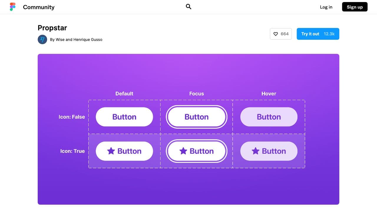
If you need to have a full overview of all components and their instances at a glance, the Propstar plugin is a must. The folks over at Transferwise created the plugin, Propstar, which generates all possible instances for your components in a nice, tidy table. You can even reorder properties and values to change the order and view of your table. It offers a simple way to automate the set-up of your UI library overview.
Roller - Design Linter
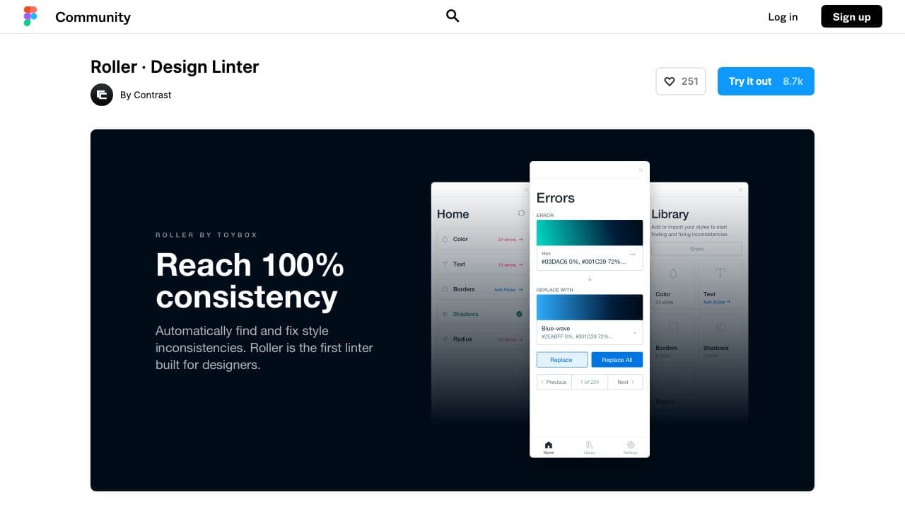
Consistency is one of the main goals of any design system, but how do you maintain this consistency in your ever-growing number of Figma files? Roller is the first ever design linter, helping designers to automatically find and fix style inconsistencies in Figma files. Once styles are added to the Roller Library, the plugin automatically detects inconsistencies on the page that don’t match the library. Designers can then replace these inconsistencies with the correct style from their library. Whether it’s for colors, text, borders, shadows or radii, Roller helps to ensure consistency between Figma and your design system.
story.to.design
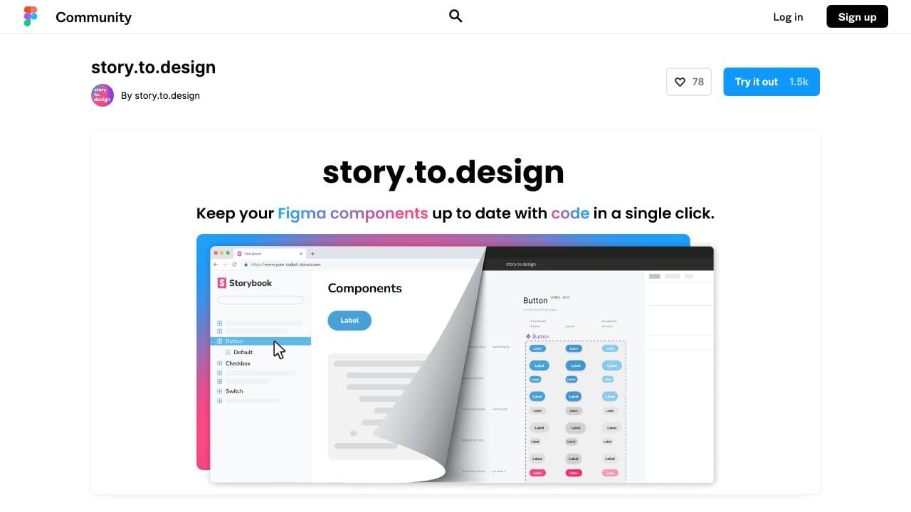
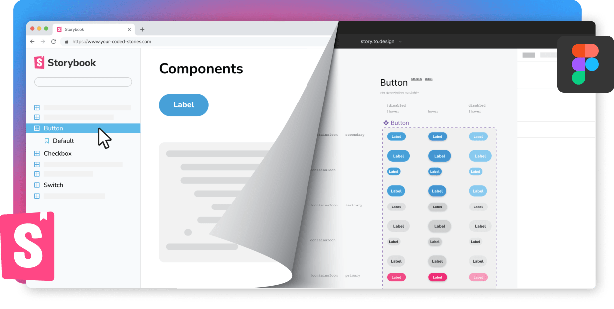
We’d like to throw our own hat in the ring! story.to.design can save designers hours of UI library maintenance. Our plugin automatically transforms coded Storybook components into a full Figma UI library in just a few clicks, and works with most frameworks and component libraries. It even orders all these components into labelled tables, accompanied by any documentation you have in Storybook. Import all coded components and their variants without having to create a single one by hand. The best part is, with every code change, story.to.design automatically keeps your Figma components in sync so that you’re designing with the latest, production-ready components, aligning development and design in a single click.
Tokens Studio for Figma
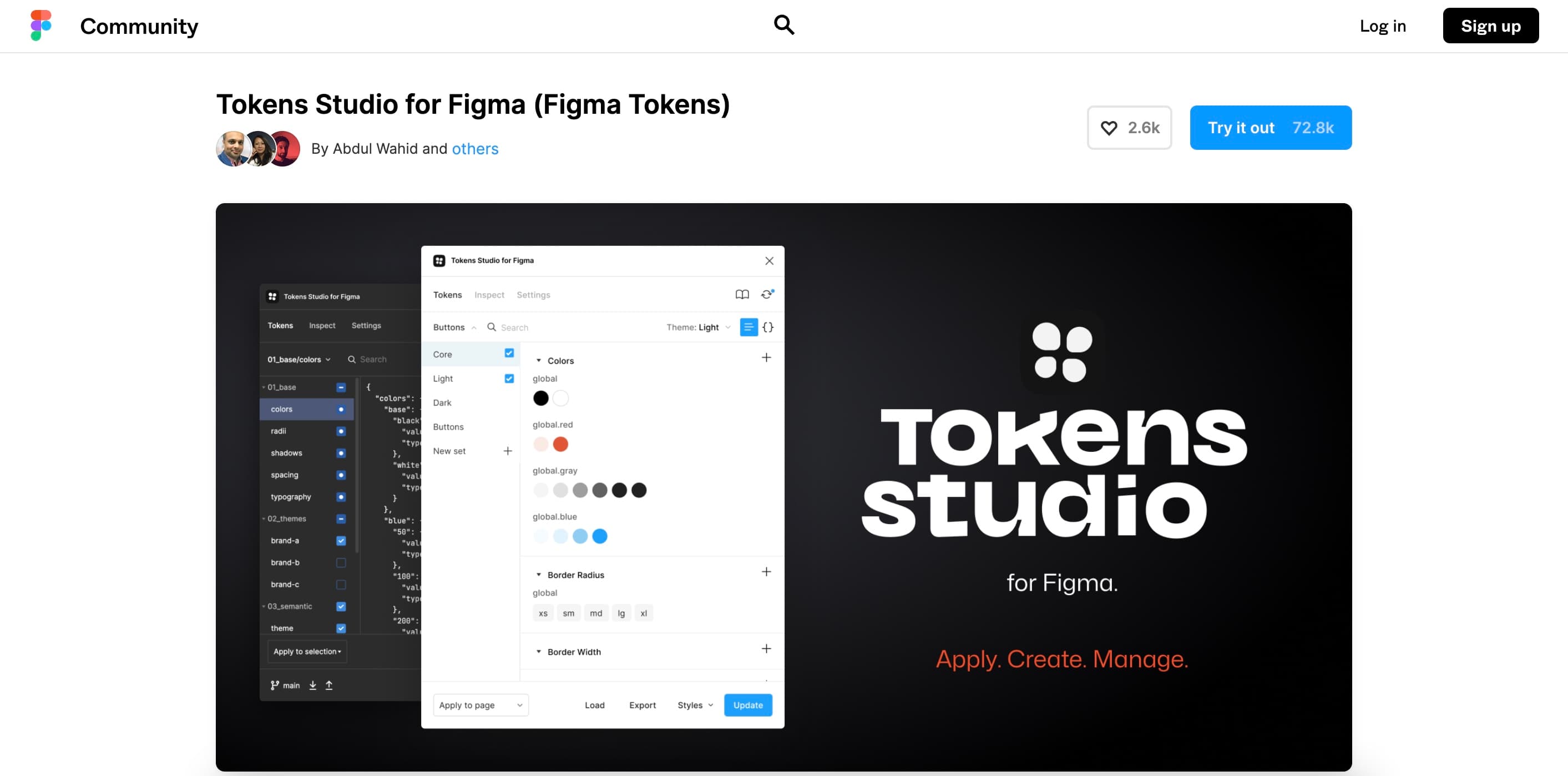
Design tokens are the foundation of any design system and Tokens Studio for Figma is THE plugin for managing your design tokens in Figma. It allows you to use design tokens such as border radii, spacer units, color and typography styles and apply them to a range of design options. Tokens Studio also allows you to change tokens and see these changes applied to either the entire Figma file or just a selection. There are two ways to generate design tokens: either with the plugin’s UI or using your own JSON file. You can even sync your tokens in Tokens Studio with an external source of truth such as GitHub or GitLab.
Typescales
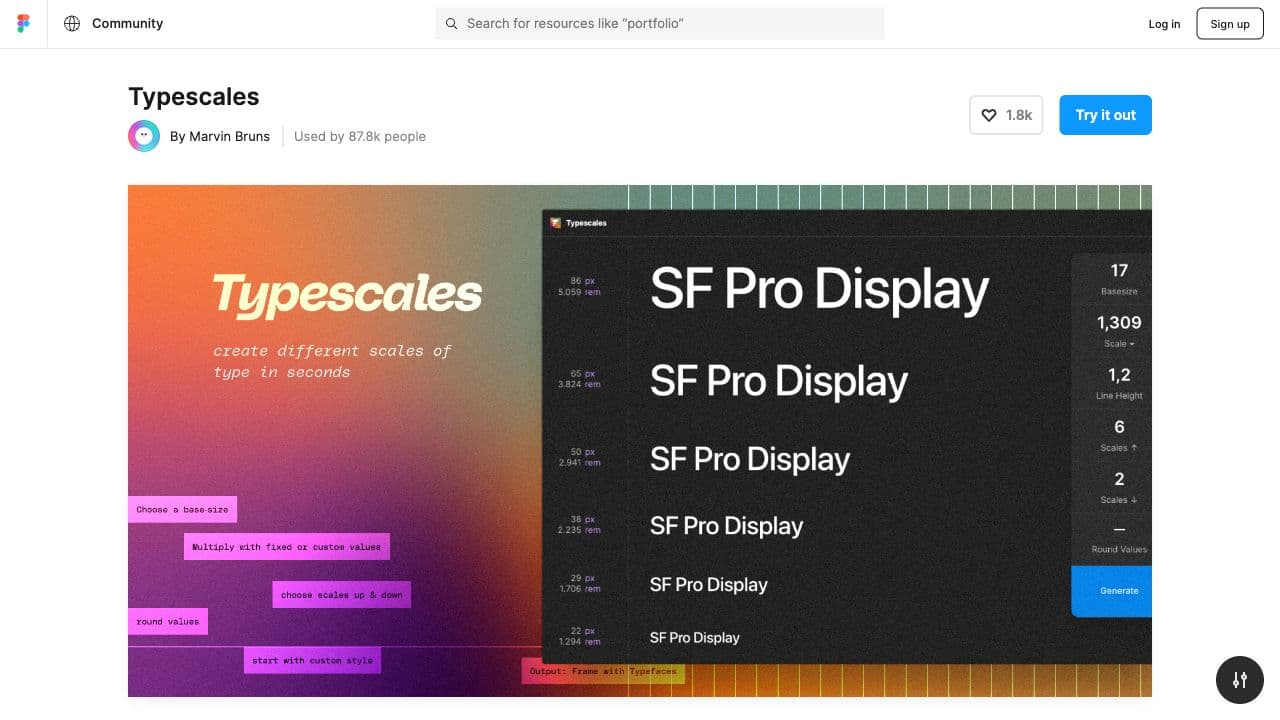
A plugin to manage your font library, Typescales quickly generates a modular typescale for your font. Modular scales in typography are used to create visual rhythm in font sizes. This plugin starts with a base-value to then create font size increments and decrements with whatever multiplier you set. A very simple plugin that automates one of those time-consuming design system tasks.
Typography Style Guide
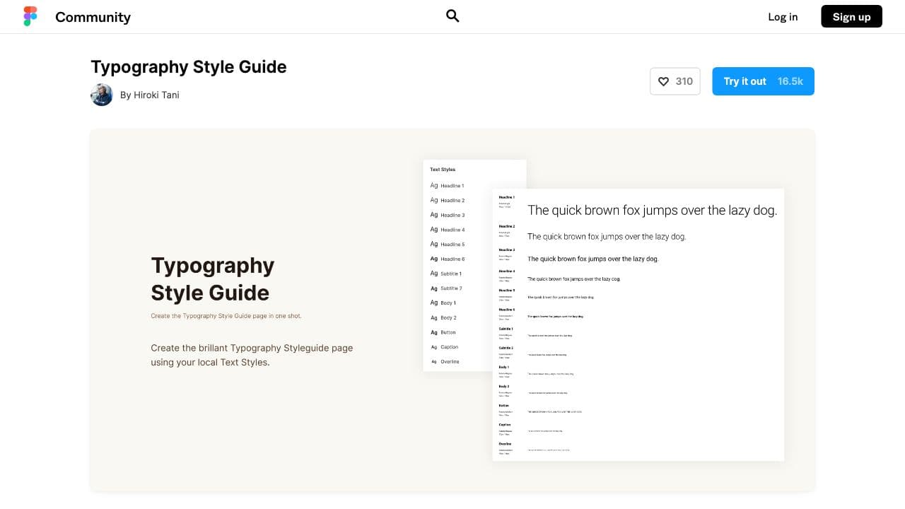
We love plugins that take time-consuming tasks and reduce them to a single click (or two). Typography Style Guide is one of those plugins. It collects all your local text styles to create a separate page for your design system's typography style guide. Simple, effective and a huge time-saver!
Which Figma plugins would you add to this list? Do you have a must-have plugin for managing your design system that we should know about? Let us know on X (previously Twitter) @story.to.design!
👋 Hi there!
We built the Figma plugin that keeps your Figma library true-to-code.
story.to.design imports components from Storybook to Figma in seconds.
Try it for free