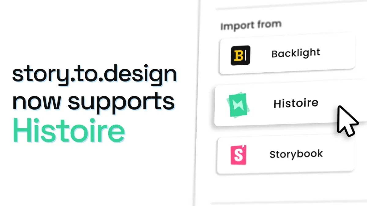
story.to.design now supports Histoire
Since launching, story.to.design has always supported Storybook and Backlight. But we knew that there were other platforms that teams were using to write and maintain the stories for their components. Today, we are pleased to announce that story.to.design now also supports Histoire as a source of stories to create Figma components from.
What is Histoire?
Histoire is an alternative to Storybook, specifically designed for:
Histoire was built from the ground-up to be a Vite-native story builder.
Learn more about why teams are turning to platforms like Histoire in their article Why Histoire or on the Histoire website.
What Histoire looks like
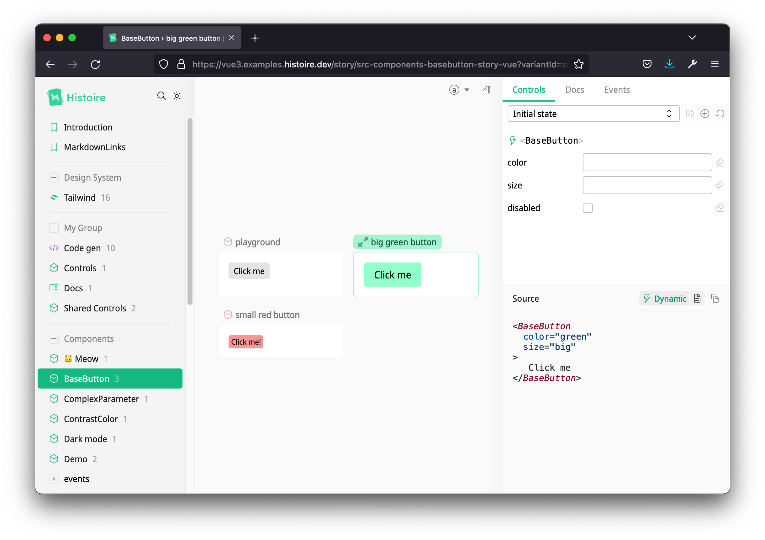
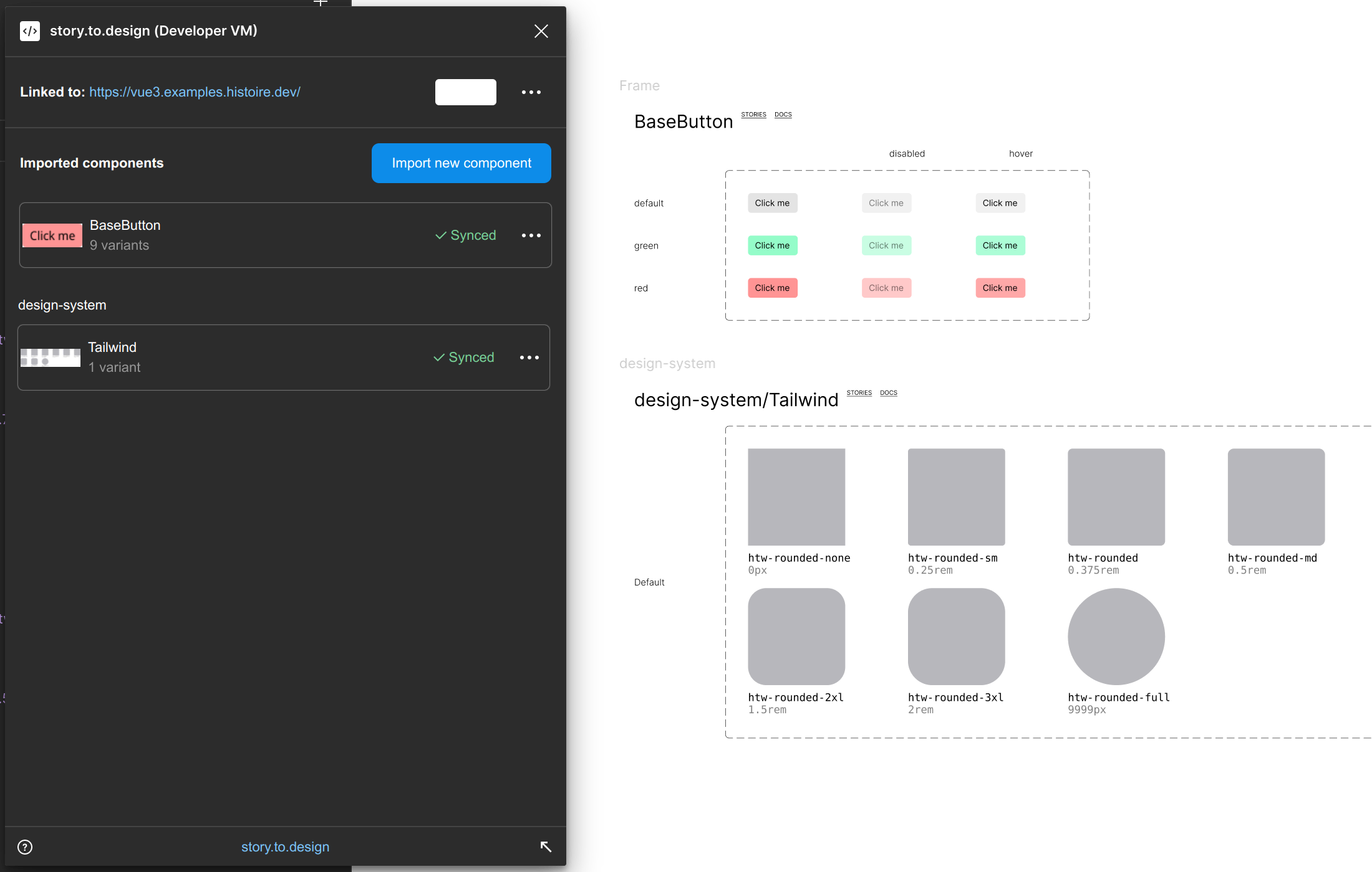
Available at https://vue3.examples.histoire.dev
The UI is similar to Storybook, and you will find your list of components and full story catalog in the side panel on the left.
How stories are defined
Vue 3
For Vue, stories are defined in a .vue single-file-component as illustrated below:
<script lang="ts" setup>
  import BaseButton from './BaseButton.vue';

  function initState() {
    return {
      disabled: false,
      color: undefined,
      size: undefined,
    };
  }
</script>

<template>
  <Story
    title="BaseButton"
    :layout="{
      type: 'grid',
      width: 200,
    }"
  >
    <Variant title="playground" :init-state="initState">
      <template #default="{ state }">
        <BaseButton
          :disabled="state.disabled"
          :color="state.color"
          :size="state.size"
        >
          Click me
        </BaseButton>
      </template>

      <template #controls="{ state }">
        <HstCheckbox v-model="state.disabled" title="Disabled" />
        <HstSelect
          v-model="state.color"
          title="Color"
          :options="[
            { value: undefined, label: 'Default' },
            { value: 'green', label: 'Green' },
            { value: 'red', label: 'Red' },
          ]"
        />
        <HstSelect
          v-model="state.size"
          title="Size"
          :options="[
            { value: undefined, label: 'Default' },
            { value: 'small', label: 'Small' },
            { value: 'big', label: 'Big' },
          ]"
        />
      </template>
    </Variant>

    <Variant title="big green button" icon="el:resize-full">
      <BaseButton color="green" size="big"> Click me </BaseButton>
    </Variant>

    <Variant title="small red button" icon-color="#F43F5E">
      <BaseButton color="red" size="small"> Click me! </BaseButton>
    </Variant>
  </Story>
</template>
Check out the result in this Vue example.
Svelte 3
Similarly, for Svelte, stories are defined in a .svelte file.
<script lang="ts">
  import { logEvent } from 'histoire/client'
  import type { Hst } from '@histoire/plugin-svelte'
  import BaseButton from './BaseButton.svelte'
  export let Hst: Hst
  let disabled = false
  let size = 'medium'
  let source;
  $: {
    source = `<BaseButton`;
    if (disabled) {
      source += ` disabled`;
    }
    source += `>Click me !</BaseButton>`;
  }
</script>

<Hst.Story title="BaseButton" {source}>
  <BaseButton {disabled} {size} on:click={event => logEvent('click', event)}>
    Click me!
  </BaseButton>
  <div style="margin-top: 6px;">
    <label>
      <input type="checkbox" bind:checked={disabled} >
      Disabled
    </label>
  </div>

  <svelte:fragment slot="controls">
    <Hst.Checkbox
      bind:value={disabled}
      title="Disabled"
    />
    <Hst.Select
      bind:value={size}
      options={['small', 'medium', 'large']}
      title="Size"
    />
    <pre>{JSON.stringify({ disabled, size }, null, 2)}</pre>
  </svelte:fragment>
</Hst.Story>

<style>
  pre {
    padding: 8px;
    background: rgba(0, 0, 0, .1);
    border-radius: 4px;
    margin: 8px;
    font-size: 0.8rem;
  }
</style>
Check out the result in this Svelte example.
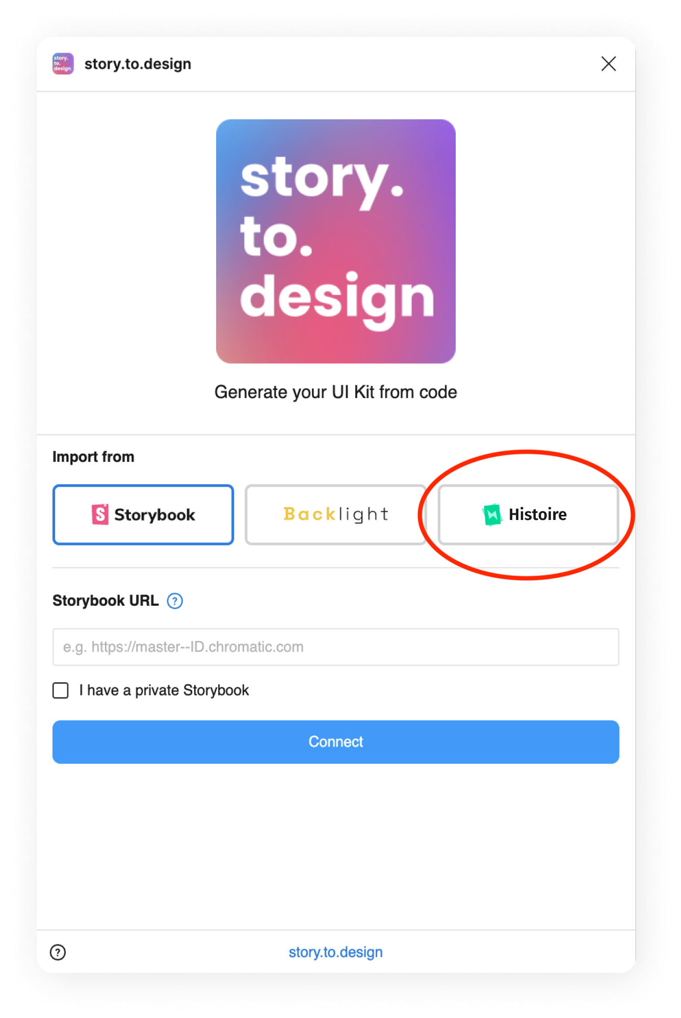
Histoire as a new source for story.to.design
story.to.design now supports an additional source for components, in addition to the existing support for Storybook and Backlight.
Figma variant selection
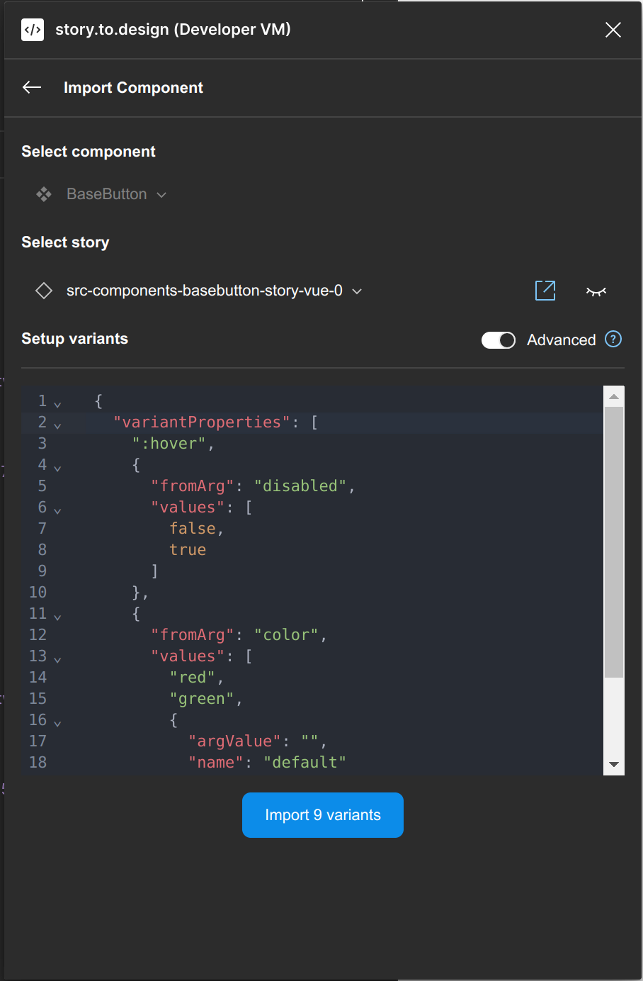
Histoire doesn’t use args the way Storybook does, so the a basic set-up of variants with the plugin is not available yet.
For now, in order to use Histoire with story.to.design, you’ll need to use the advanced mode to set up variants together with the variantProperties API.
From Histoire to Figma
After setting up your variants using the plugin’s advanced mode, plus the variantProperties API, your components can then be imported as native Figma components with all the variants you selected.
Currently only available in closed beta
Histoire support in story.to.design is currently only available in closed beta while we fine tune the integration.
If you’d like to have early access and be one of our beta users, please contact us at support+s2d@divriots.com. We are always keen on working with new users 🤗.
👋 Hi there!
We built the Figma plugin that keeps your Figma library true-to-code.
story.to.design imports components from Storybook to Figma in seconds.
Try it for free