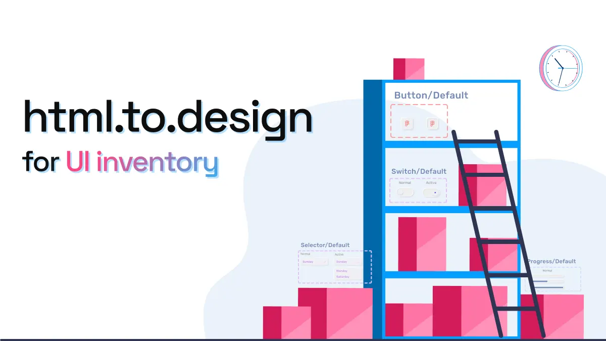
html.to.design for UI inventory
When a new designer joins a team, most of the time there is an existing product with all its components already live in a website or app. Before starting on any new designs, many newly hired designers will begin by creating a UI inventory with every part of the product they’ll be working on.
Currently, the way to create a UI inventory isn’t easy. Designers often have to take manual screenshots of the product, cut sections of it or highlight areas on top of the image. They end up doing an extensive amount of manual work that will soon be discarded. If they join a team that didn’t previously have a designer, they’ll probably end up having to build all design assets from scratch before they can even start their valuable contributions.
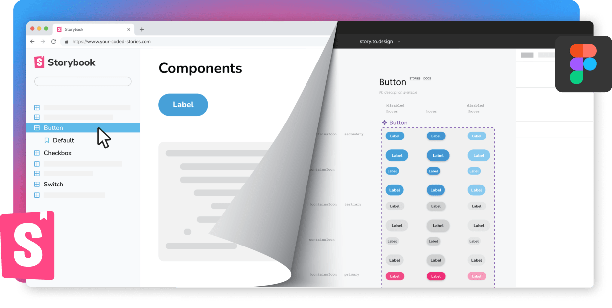
One way to accelerate the process of getting a new designer up to speed is to provide all code assets directly in Figma. story.to.design can hand over the essential UI library without wasting much time, converting components from Storybook to Figma. However, for this approach to work, the development team needs to have a Storybook already set up with their coded UI library.
For those working with a website and who don’t have an established design system, the div<RIOTS> team has recently launched a new plugin for you: html.to.design. This new Figma tool uses code.to.design technology and is able to capture an entire webpage in seconds to transform it into editable layers inside Figma.
A great use case for this plugin is to gather all elements for a designer’s UI inventory of a website. In the videos below, we’ve recreated what a new designer joining a company like Booking.com could achieve in a very short period of time, if tasked with creating the UI inventory for the live website:
Importing the website
First, the designer would import the entire website using the html.to.design plugin:
Separating buttons
The designer could get started with grouping the different types of buttons seen on the interface:
Getting all alerts together
In this example, we see that there are two types of alert messages. These could be grouped as “Alerts”:
Grouping types of cards
Another clear element to group are cards:
This could be done for all elements seen in the interface. Getting the UI pieces together and having them in an editable format not only makes the task much quicker, but also provides a useful resource that could be later transformed into a Figma library.
This is just the beginning, and it’s already exciting to see what the code.to.design technology can do to help all kinds of teams.
Curious to give it a try? Download the plugin from Figma community and let us know what you think via email or X (previously Twitter)!
👋 Hi there!
We built the Figma plugin that keeps your Figma library true-to-code.
story.to.design imports components from Storybook to Figma in seconds.
Try it for free