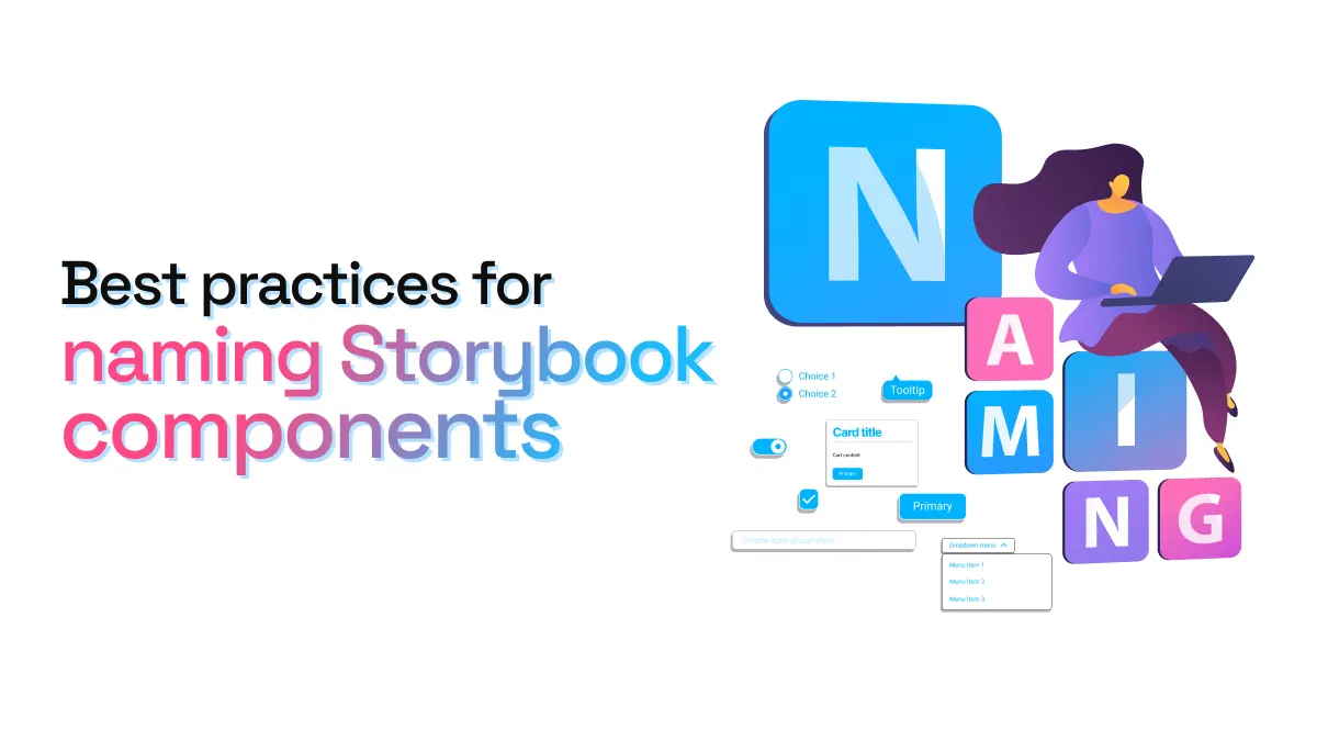
Best practices for naming Storybook components
Naming the components in your design system is a crucial task that, ideally, the whole team should agree on. Alignment across dev and design teams is only one of the several reasons why we should care about naming in our design systems.
If you’re setting up your Storybook, it’s likely you already have some components, or even a full design system, and have already thought about naming. Nevertheless, here are some best practices that can help you when naming components for Storybook:
1. Names should be logical, scalable, simple and standardized
Many teams use Storybook (or similar platforms like Backlight and Histoire) to expose their design system’s components in a web environment that everyone can interact with, even non-developers. This means that names need to be understood by any stakeholder looking at your Storybook. Names also need to consider your design system’s growth, so these basic guidelines might help:
-
Logical: Describe the component clearly, using a name that represents it. For example, the name Accordion describes the component visually and even how it works when a user interacts with it.
-
Scalable: Find names that allow for possible variations or additions to the component that could come in the future. For example, when categorizing text style sizes, it’s often best to use T-shirt sizing (S, M, L, XL) as there is always the possibility of adding more sizes in the future. Typically the main size will be M, so both smaller and larger sizes can be introduced as needed.
-
Simple: Keep names short and basic. 1-2 words is often enough for a component, and if more details are needed this can be done through the use of forward slashes to represent further categorization. Avoid long, unique names that might require someone to look it up or ask what it means.
-
Standardized: The best component names are those used over and over again in the industry. Button is a great example. It has become so standardized, it’s very hard to find any other name for this component. Websites like UI Guideline or Component Gallery are great resources for finding standard component names used across leading design systems.
2. Keep names consistent with documentation and code
When setting up your Storybook think about the names you’re already using for components in other parts of your design system, such as your code and documentation site. Maintaining consistency across all these different tools and design system artefacts can be time-consuming, but it’s key for making your design system accessible and easy to consume across different teams.
Maintaining the same component names in your Storybook is also key if you’re going to use story.to.design. When bringing components from Storybook to Figma to create your UI library, story.to.design automatically uses the same component names, and even documentation, as your Storybook. For designers and developers to speak the same language when talking about components, it’s key to use a single name everywhere.
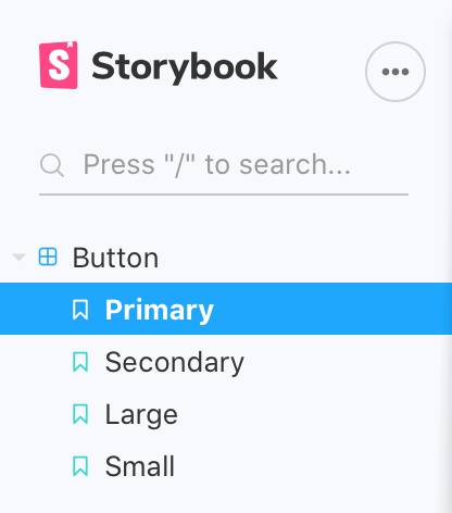
3. Consider file hierarchy and organization
Storybook’s current UI organizes your components in a left sidebar with expandable groups. Here are a few things to consider when naming components, given the way Storybook organizes them:
- The
titleof your component in thedefault exportwill dictate the name you see in the sidebar. Ideally, this should be consistent with the component name used in other areas/tools of your design system. - To group related components together, for example “Atoms”, use a separator (
/) in thedefault exportto tell Storybook how to group and organize your components. It’s recommended to name components according to your file hierarchy. - By default, Storybook orders your stories in the same order they were imported. If you want to sort components alphabetically, for example, you can override this sorting by adding
storySortto theoptionsparameters in yourpreview.jsfile. Learn more about sorting in Storybook’s documentation.
4. Think about the casing of your components’ names
There are four main casing styles when defining component names in code: camelCase, PascalCase, kebab-case and snake_case. Depending on the technology stack you’re using, you’ll most likely use one or another.
When defining your component names, simply keep in mind that Storybook automatically converts any casing style into title case or start case (myStory becomes “My Story”, for example). So, your component name should take this into account. You can read more about this in Storybook’s documentation.
5. Automate your Figma UI library for consistency
When using story.to.design to bring your components from Storybook to Figma, you don’t have to worry about inconsistencies. Our plugin imports components using the exact same names you define in Storybook. story.to.design also respects any hierarchy or grouping you have in Storybook, as well as the names of the different states and variants of each component. The best part? The names of your components’ states and variants are automatically added to Figma’s component management, so you have the same references in your Figma side panel as you do in Storybook.

Do you already have Storybook for your design system? What tips and best practices would you recommend when setting it up? Tell us on X (previously Twitter) or Discord so we can share them with the community!
👋 Hi there!
We built the Figma plugin that keeps your Figma library true-to-code.
story.to.design imports components from Storybook to Figma in seconds.
Try it for free