5 reasons every design team needs story.to.design
Most teams know how hard it is to align developers and designers, code and design. Keeping a Figma library in sync with the codebase is a lot of work. Developers will spend time carefully making a Storybook instance of live components, only for designers to find that what’s online differs from what they have in their design files. The back-and-forth between teams, countless screenshots and time-consuming library maintenance all keep designers from focusing on designing new features.
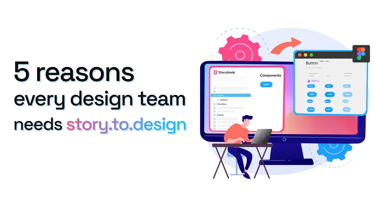
story.to.design does all this work for you. The plugin automatically imports components from Storybook to Figma, transforming stories into a full Figma UI kit or component library. In just a few clicks, design and code are seamlessly synced across your entire organization.
For those who still need some convincing, here are just a few ways your design team can benefit:
Fewer discrepancies between code and design
Developers and designers typically work with different sources of truth: one in Figma and one in code. This means developers and designers aren’t always seeing the same components. A change in code is not automatically rendered in Figma for designers, leading to discrepancies and confusion about which component is the latest version.
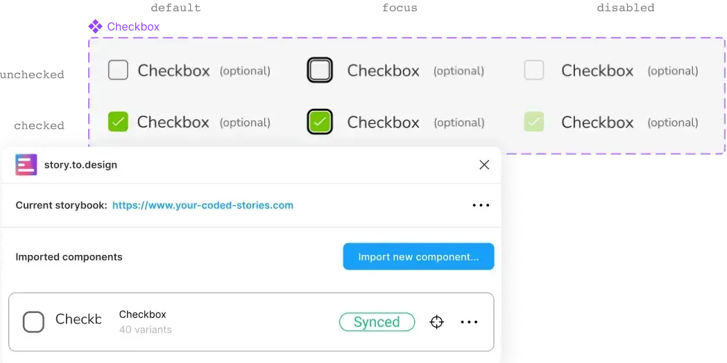
story.to.design helps avoid these discrepancies with the sync feature. Anytime code in Storybook is updated, the plugin can fetch those changes and automatically update the UI kit or component library in Figma. It makes collaboration easier, and allows teams to be more efficient, when developers and designers aren’t wasting time discussing discrepancies between code and design.
Design with components that look exactly like production
It’s often the case that designers are using components that don’t look exactly like what is coded, and therefore aren’t what the final user sees. Because of the two different sources of truth, one in Storybook and one in Figma, developers may update or change something in the codebase that designers aren’t aware of (unless communication between teams is seamless, which isn’t always the case). Also, because design teams can’t spend hours updating Figma UI kits by hand, components become out-of-date and out-of-sync with the coded version.
It’s important to design with components that look and work exactly as they would in production. Not only is it better for communication between developers and designers, but it also means designers have the “truest” components that replicate exactly what a user will see and use, improving the quality of their design work. story.to.design takes care of this by always keeping Figma components in sync with the latest version of code.
Faster designing and prototyping
Let’s face it: creating and maintaining a UI library in Figma is time-consuming. Having to create each component from scratch requires time and dedication that keeps designers from working on new solutions. The fact that story.to.design can automatically generate and maintain your Figma UI library for you frees-up designers to focus on more complex design work. Imagine having a full library done in under 2 hours?
Also, having production-replica components ready-to-go in Figma means designers can be faster and more efficient designing screens and prototyping solutions. The same components being used by developers are also being used by designers, which means less time wasted checking whether a component is up-to-date or not. Designers can be confident they have the right UI kit, without having to create these components by hand.
Easier design system updates across tools
Design systems are costly to build and difficult to maintain. And when you factor-in maintenance across different tools and platforms, the cost and time commitment is even higher (some all-in-one design system tools, like Backlight, try to solve this).
story.to.design brings alignment across at least two design system tools: Storybook and Figma. The possibility to sync an entire Figma UI library to the codebase can save design system teams tons of time and manual work. Designers no longer need to check Storybook in the browser to compare components, as the exact same components are inside their familiar environment. It also means a design system’s source-of-truth is more evenly spread across code and design.
Speak the same (component) language as developers
Another important benefit of using story.to.design is the bridge it creates between designers and developers, especially when it comes to the language used around a design system. By importing your components from Storybook into Figma using story.to.design, you also bring in the same component naming and documentation. This way, when designers and developers discuss and work together on a design system, they have the same references and will be more likely to use the same names for components.
This brings important collaboration perks to the team like alignment, clearer communication, less confusion, and greater efficiency.
The best way to discover why your team needs story.to.design? By giving it a try! Install the plugin and try it out for free.
👋 Hi there!
We built the Figma plugin that keeps your Figma library true-to-code.
story.to.design imports components from Storybook to Figma in seconds.
Try it for free