story.to.design supports the new Storybook 10
Storybook’s latest release, Storybook 10, comes with major improvements to modern JavaScript standards, testing capabilities, and developer experience. Let’s dive into what’s changed and how it can benefit you and your workflow.
What’s new with Storybook 10?
Storybook 10 is Storybook’s latest major release that embraces modern JavaScript and continues to enhance component development. Some of Storybook 10’s key improvements include:
✂️ ESM-only
Storybook 10 is now ESM-only, fully embracing modern JavaScript standards. This is the only breaking change in this release, making the upgrade path smooth for most users.
🧩 Module automocking for easier testing
Enhanced module automocking capabilities make it easier to test your components with less boilerplate and better TypeScript support.
🏭 Typesafe CSF factories Preview for React
New typesafe Component Story Format (CSF) factories provide better type safety and improved developer experience when writing stories for React components.
💫 UI editing and sharing optimizations
Improved UI with better editing capabilities and optimizations for sharing components, making collaboration more seamless.
🏷️ Tag filtering exclusion for sidebar management
Advanced tag filtering options give you better control over your sidebar, making it easier to organize and manage large component libraries.
🔀 Svelte async component support
Native support for Svelte async components, expanding the framework compatibility and making it easier to work with modern Svelte patterns.
Check out the full list of improvements on Storybook’s official announcement.
How do I upgrade to Storybook 10?
To upgrade to Storybook 10, type the following command in your terminal:
npx storybook@latest upgradeThis will automatically upgrade your Storybook dependencies to the latest version and run a series of automigrations.
Check out Storybook’s migration guide for the full process.
What does this mean when using story.to.design?
Our aim is to make story.to.design future-proof, and to always keep it up to date with Storybook’s latest releases. This is why story.to.design already includes full support for Storybook 10.
Regardless of whether you decide to upgrade or not, story.to.design will continue to work for you exactly as it did before. We support Storybook versions 6 and above, ensuring compatibility across a wide range of projects.
👋 Hi there!
We built the Figma plugin that keeps your Figma library true-to-code.
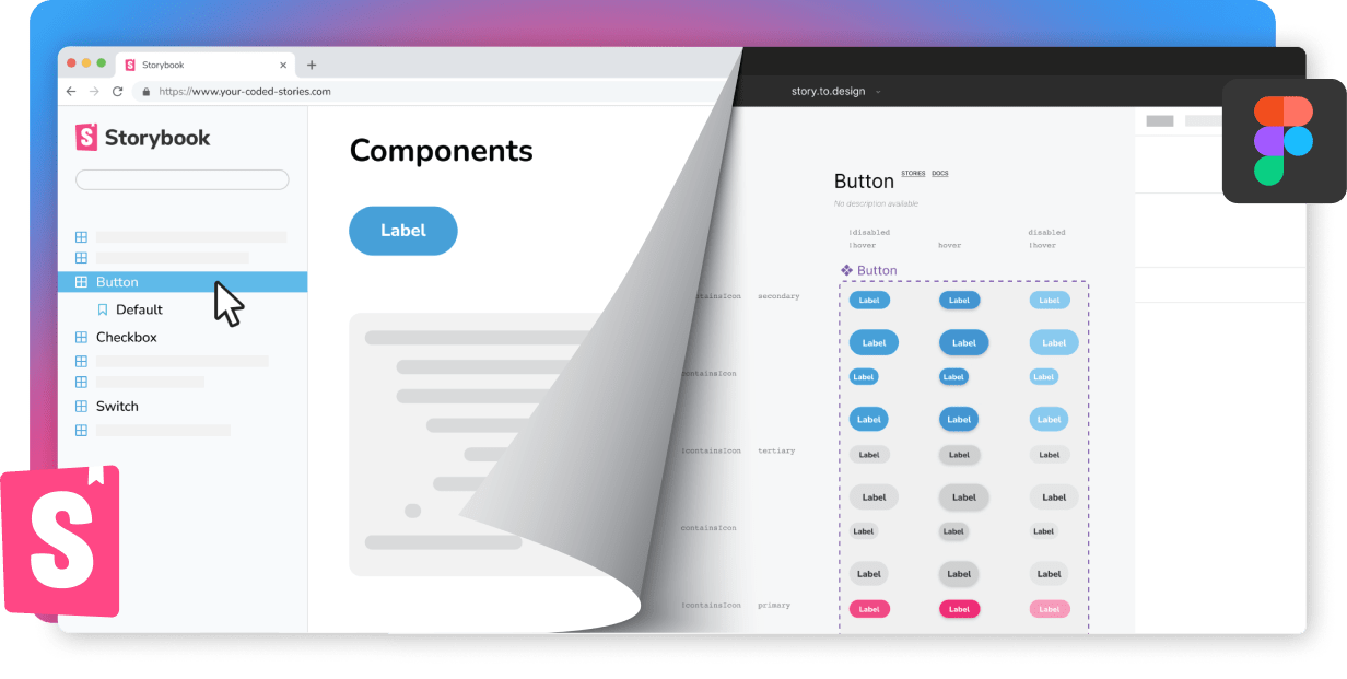
story.to.design imports components from Storybook to Figma in seconds.
Try it for free