story.to.design supports the new Storybook 8
Storybook’s latest release, Storybook 8, comes with an array of improvements to both compatibility and performance and is now in beta for everyone to try. Let’s dive into what’s changed and how it can benefit you and your workflow.
What’s new with Storybook 8?
Storybook 8 is Storybook’s latest iteration, released this month, that aims to provide a seamless environment for all frontend developers. Some of Storybook 8’s main improvements include:
🚀 Enhanced performance
A new default compiler, auto-generated controls for React projects and a new —test flag all lead to faster, better performance.
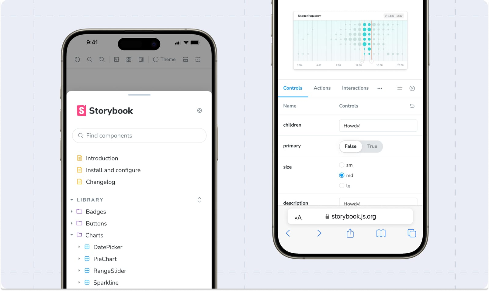
📱 New mobile UI
A full makeover for Storybook’s mobile UI makes it easier to navigate.
📸 Automated visual tests
Storybook 8 now comes with an official visual testing add-on for Storybook so you can run visual tests of your stories without having to commit changes.
🔬 Improved test utilities
Storybook 8 streamlines two existing test packages (@storybook/jest and @storybook/testing-library) into a single, more powerful testing library: @storybook/test.
⚛️ Storybook for React Server Components
Storybook 8 officially introduces experimental RSC support, initially limited to Next.js projects.
👋 No more React dependency
Storybook 8 removes the prior React dependency through smarter bundling, which is only the beginning of a series of improvements for non-React users.
🧩 Ecosystem updates
Major release = several dependency changes.
Check out the full list of improvements on Storybook’s official announcement.

How do I upgrade to Storybook 8?
To upgrade to Storybook 8 beta, type the following command in your terminal:
npx storybook@next upgradeThis will automatically upgrade your Storybook dependencies to the latest version and run a series of automigrations.
Check out Storybook’s migration guide for the full process.
What does this mean when using story.to.design?
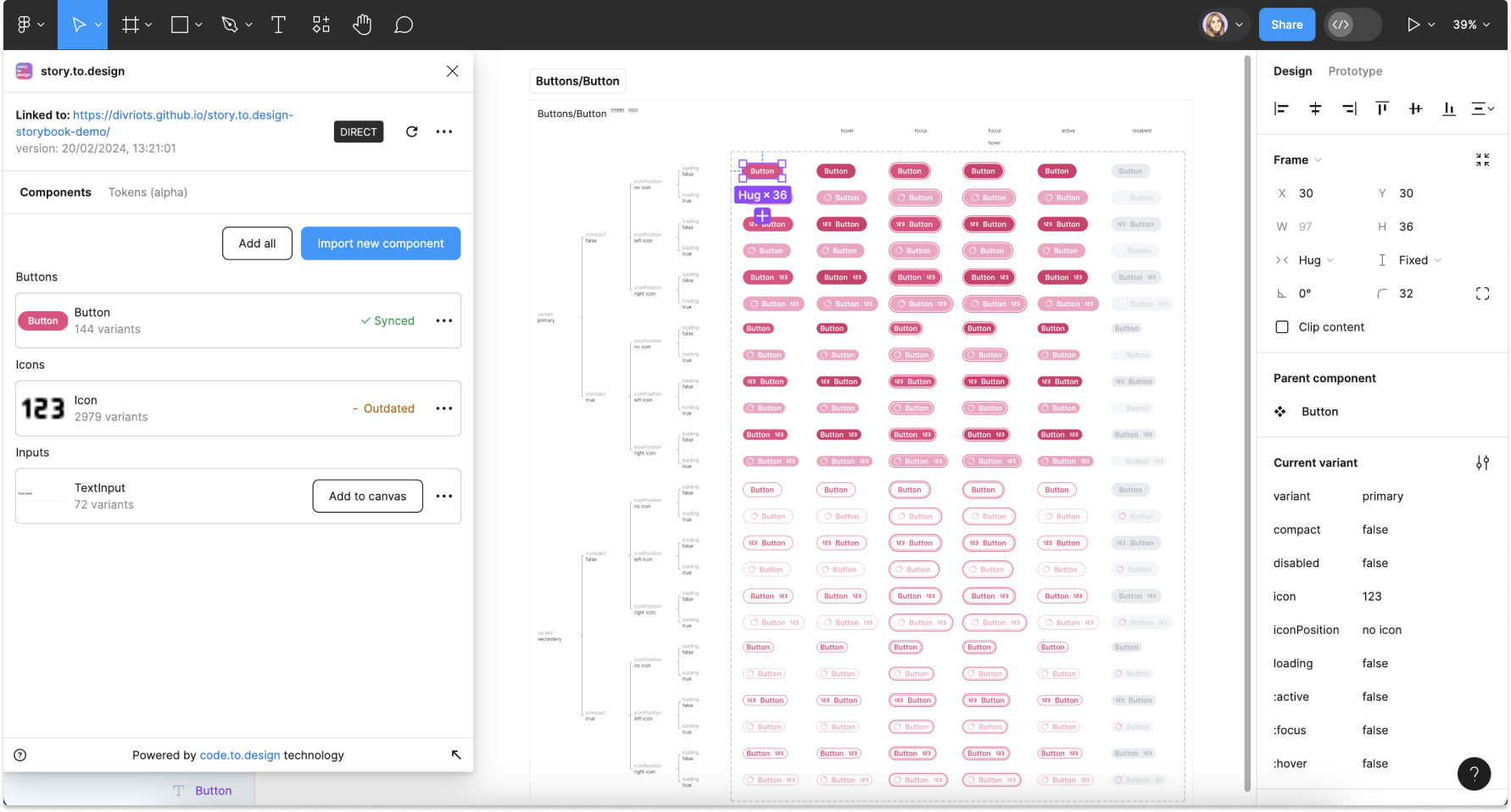
Our aim is to make story.to.design future-proof, and to always keep it up to date with Storybook’s latest releases. This is why story.to.design already includes full support for Storybook 8, even if it’s still in beta right now.
Regardless of whether you decide to upgrade or not, story.to.design will continue to work for you exactly as it did before.

If you’d like to take Storybook 8 on a trial run and see how it works with story.to.design, feel free to test it out with our demo Storybook here. And if you see any glitches when using Storybook 8 with story.to.design, please contact us to let us know.
👋 Hi there!
We built the Figma plugin that keeps your Figma library true-to-code.
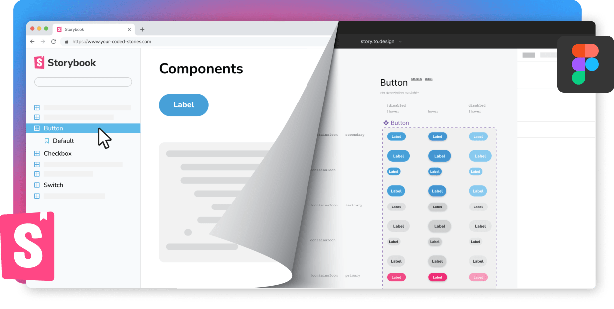
story.to.design imports components from Storybook to Figma in seconds.
Try it for free