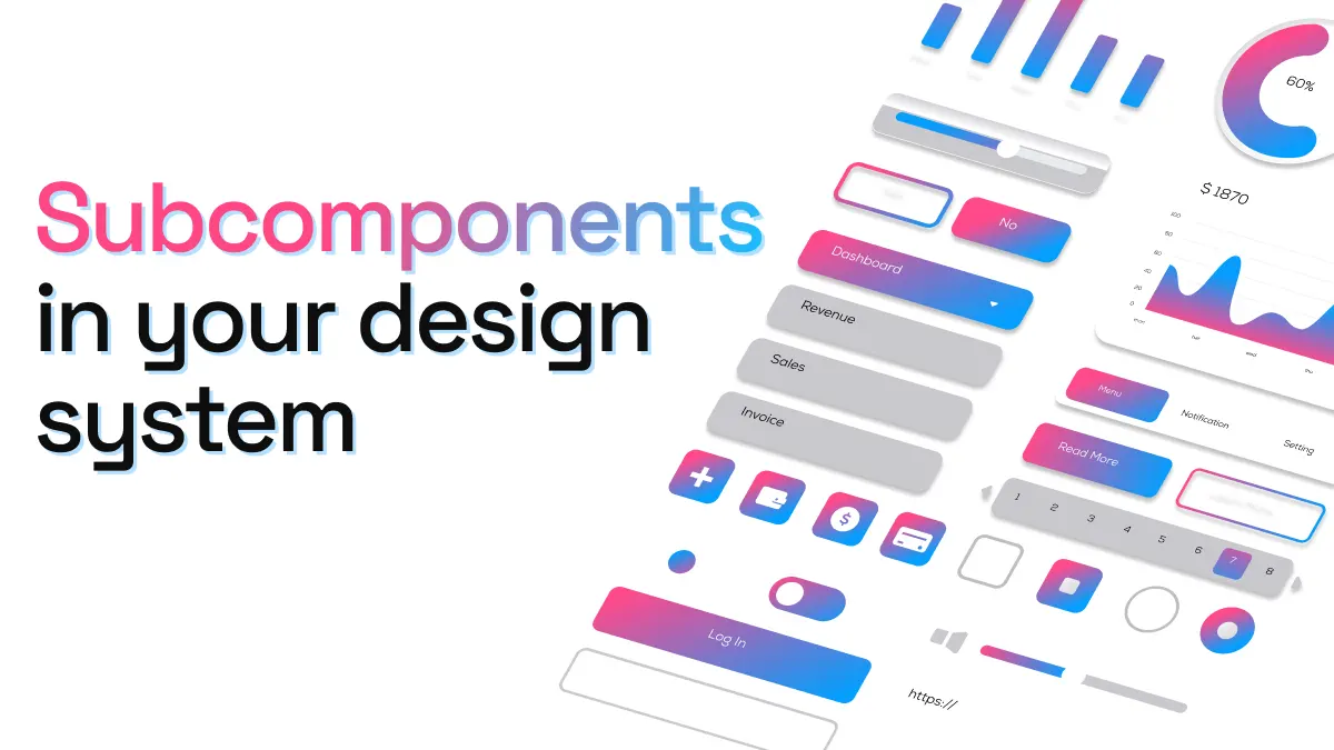
Subcomponents - How to make your design system more flexible
One of the most frustrating situations a design system team can face is when designers detach components in order to create something the system can’t offer. While design systems try to cover a wide variety of interfaces, features and user needs, it is impossible to cater to every single one.
This is where subcomponents come in. Instead of limiting regular components to only a few variations (a situation which forces most designers to detach the component), subcomponents allow you to combine two components together, exponentially increasing the possibilities and flexibility.
What are subcomponents?
Subcomponents are smaller, existing components that are combined or present inside other components. Components nested within another component. In the words of Nathan Curtis…
“A subcomponent is an independently composable UI component with a well-defined API intended for use only within a specific parent component or context.”
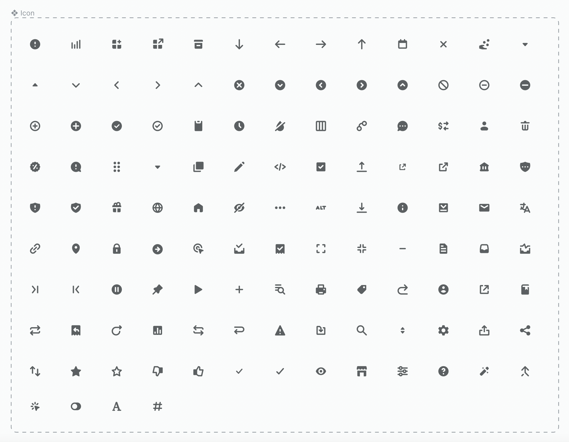
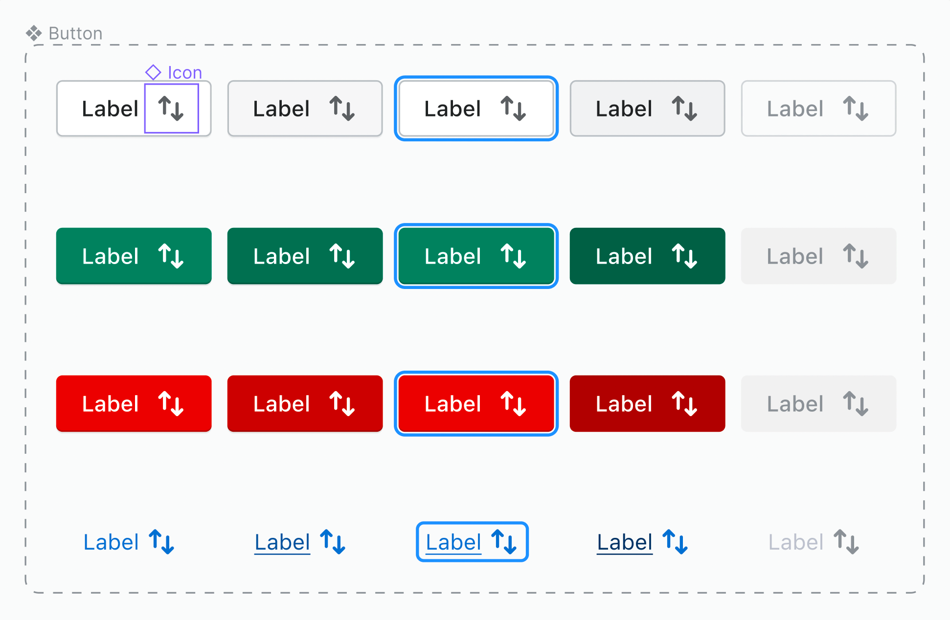
Let’s take an example: a button with an icon. The component is a button, but includes an icon component inside it. In this case, the icon becomes a subcomponent of the button. Because icons can be used in so many different components, they are commonly applied as a subcomponent.
The key to architecting more complex components with the use of subcomponents is flexibility and adaptability. Design system consumers should be able to easily combine subcomponents so that they fit their design needs for various use-cases. This allows teams to create unique and innovative designs without sacrificing the consistency and quality of the design system.
How to go about creating subcomponents
Designing and implementing subcomponents can be challenging. It requires careful consideration as to how they will work together and fit within the overall design system. There are two main steps to take when defining subcomponents:
1. Identify the most simple components
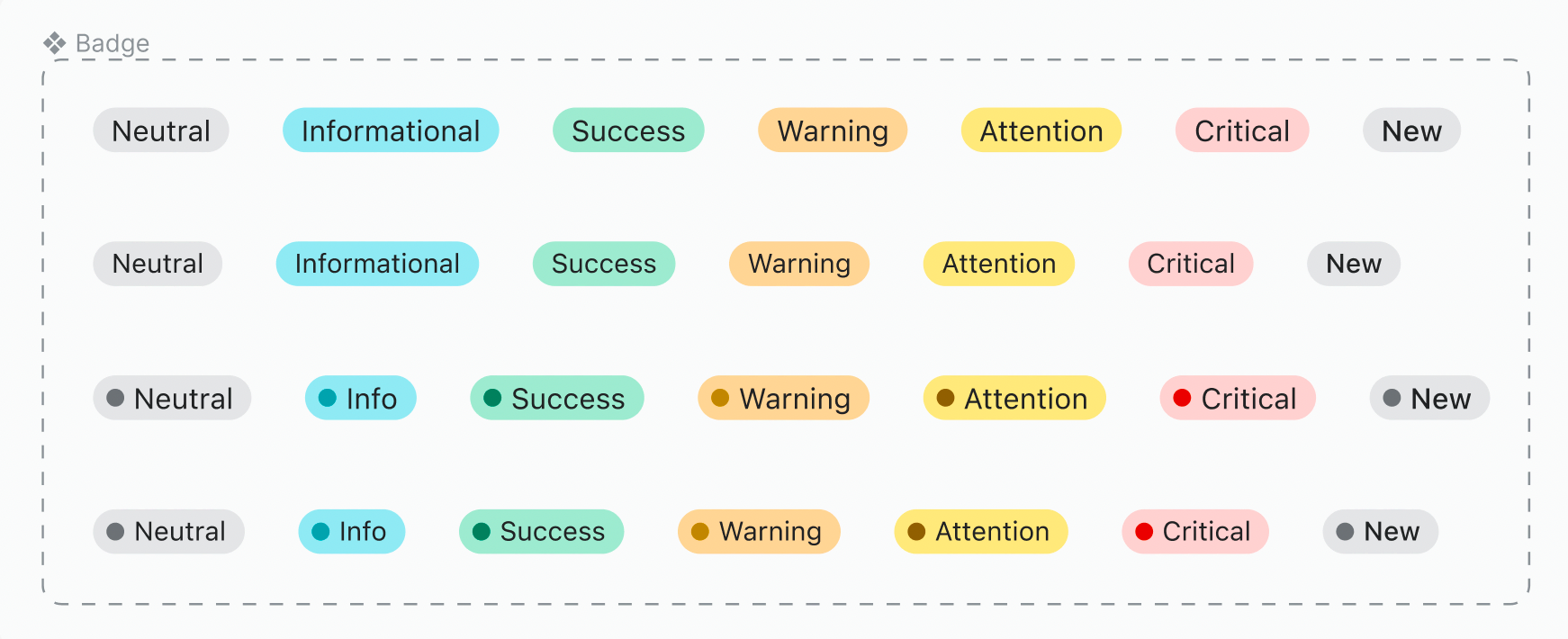
Start your design system with the smaller elements that can’t be divided, or aren’t made of anything that’s reusable. Taking an atomic design approach and starting with the smaller components will simplify the creation of more complex components later on. For example, a Badge is a very simple element made up of only background and text. Other examples of simple components are: icon, avatar, input label, etc.
2. Make sure to reference the smaller items when building complex components
While in the process of expanding your design system, look at the existing simpler components and make sure to reuse them within the new ones being created.
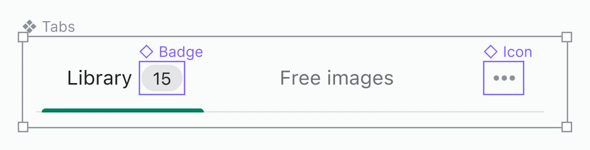
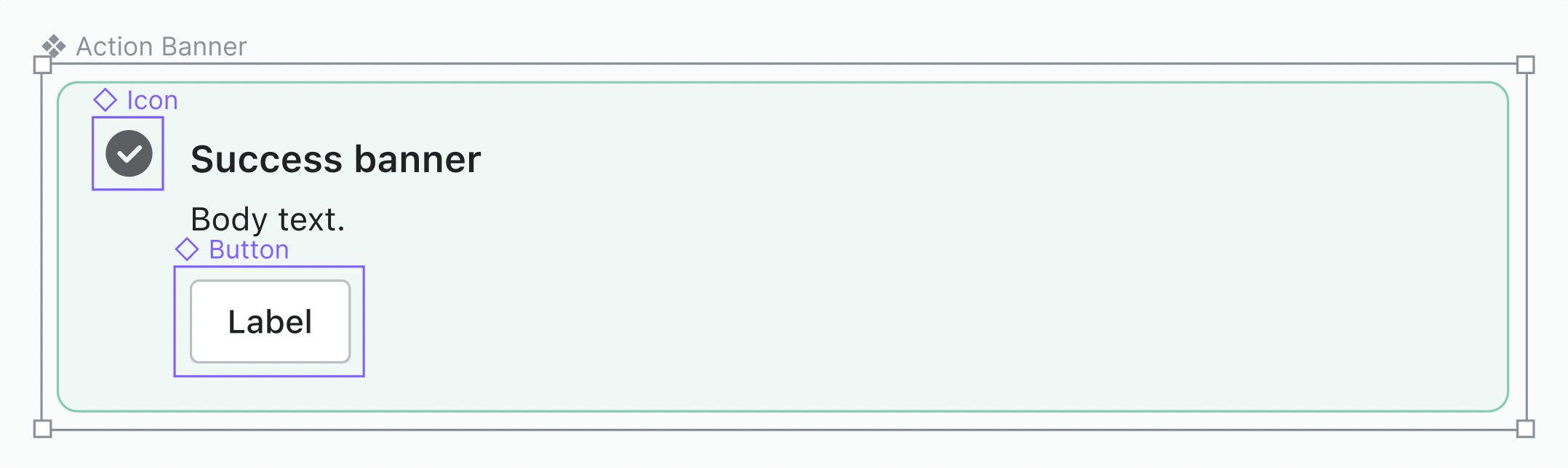
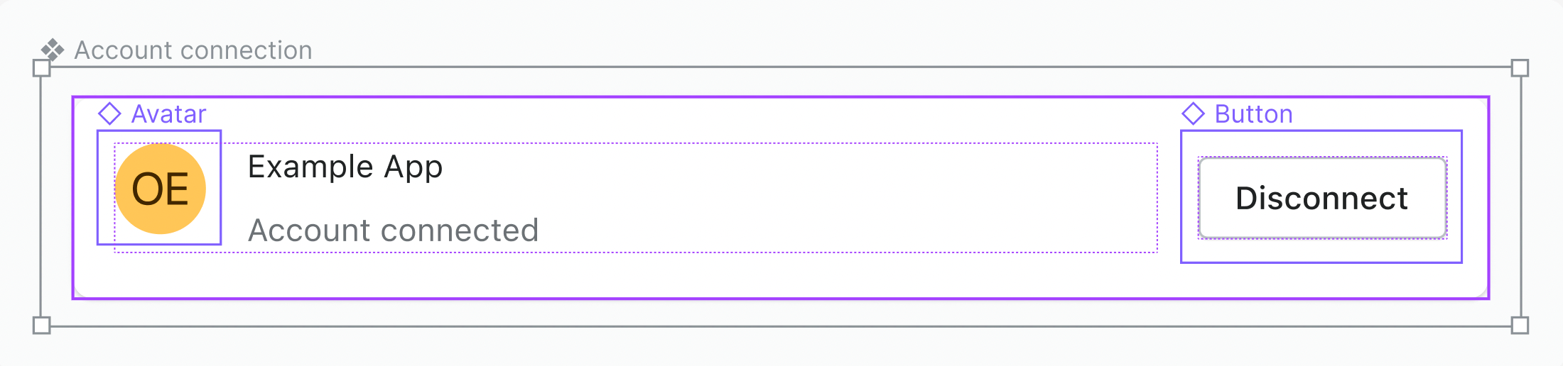
Even a Button can be a complex component, as seen in the example above where it includes the icon as a subcomponent. But by itself, it can also be a reusable element for even more complex components like Action banner or Account connection:
Having all available components well-documented and easily accessible to all members of the design and development team is key to making sure everything is being reused properly. Moreover, explaining the architecture of the more complex components will enable designers and developers to access all possibilities of the design system without having to detach or rebuild components.
If you’re having trouble creating complex components with subcomponents in Figma, story.to.design can help. When importing components from Storybook to Figma, the plugin automatically detects any subcomponents and generates them for you.
Benefits of subcomponents
Having a consistent set of small, highly reusable elements within a design system allows teams to easily and quickly use them as subcomponents, creating new forms of components without having to start from scratch (or worse, detach!). This not only saves time and resources, but also ensures that the user experience remains consistent across different parts of the product.
Here are just a few benefits of subcomponents:
- Greater flexbility. Subcomponents can support many more cases with a set of smaller parts.
- Designers have more control. Design system consumers can take more control of what they are designing, without feeling stuck in a system that doesn’t always work for them.
- Less work in the long run for the design system team/maintainers. Because design system consumers are using subcomponents to solve for their unique needs, they are less reliant on the design system team.
- Fewer one-time components. Thanks to subcomponents, design system teams can avoid creating components that only solve a single need or use-case.
- Scalability and exploration. Design system users have more “tools” in their toolbox to explore and create with, leading to a more scalable system that encourages innovation.
Overall, subcomponents can be essential in making your design system more flexible and scalable. They provide building blocks so that design system consumers can solve problems themselves, without overburdening the design system team or feeling stuck.
👋 Hi there!
We built the Figma plugin that keeps your Figma library true-to-code.
story.to.design imports components from Storybook to Figma in seconds.
Try it for free