Component Story Format 3.0 is now supported by story.to.design
story.to.design supports the new Component Story Format 3.0 (aka CSF3) that will be the default way to write stories in Storybook 7.
What is Component Story Format 3.0?
CSF3 has been in beta for 18 months and now it’s officially here.
CSF3 will be the default way to write stories in Storybook 7.
Improvements include:
- ♻️ Spreadable story objects to easily extend stories
- 🌈 Default render functions for brevity
- 📓 Automatic titles for convenience
- ▶️ Play functions for scripted interactions and tests
- ✅ 100% backwards compatible with CSF 2
story.to.design supports both CSF2 and CSF3.
Example with CSF3
// RegistrationForm.stories.js

import { RegistrationForm } from './forms/RegistrationForm';

export default {
  title: 'forms/RegistrationForm',
  component: RegistrationForm,
};

export const EmptyForm = {
  // render: (args) => <RegistrationForm {...args} />, -- now optional!
  args: {
    /* ... */
  },
  parameters: {
    /* ... */
  },
};

export const FilledForm = {
  args: {
    email: 'marcus@acme.com',
    password: 'j1287asbj2yi394jd',
  },
};
For an in-depth description of CSF3’s features and rationale, and exactly how it differs from CSF2, please see the original Storybook post and the recent CSF3 announcement.
Turn your CSF3 stories into Figma components with story.to.design
You can directly enrich your CSF3 stories
with an s2d parameter to define the mapping to Figma properties.
It can be done by simply mapping story args to Figma variant properties:
export const Button = {
  ...
  parameters: {
    s2d: {
      variantProperties: [
        "size",
        "disabled"
      ],
    },
  },
};
or by using more fine-grained definitions with the variantProperties API:
export const Button = {
  ...
  parameters: {
    s2d: {
      variantProperties: [
        {
          "name": "Progress",
          "values": [
            { "name": "0%", "withArgs": { "value": 0, "min": 0, "max": 100 } },
            { "name": "25%", "withArgs": { "value": 25, "min": 0, "max": 100 } },
            { "name": "50%", "withArgs": { "value": 50, "min": 0, "max": 100 } },
            { "name": "75%", "withArgs": { "value": 75, "min": 0, "max": 100 } },
            { "name": "100%", "withArgs": { "value": 100, "min": 0, "max": 100 } }
          ]
        },
        {
          "name": "Size",
          "values": [
            { "name": "Small", "withArgs": { "size": "s" } },
            { "name": "Medium", "withArgs": { "size": "m" } },
            { "name": "Large", "withArgs": { "size": "l" } }
          ]
        }
      ]
    },
  },
};
> See the variantProperties API for more examples.
Imports can also be done manually
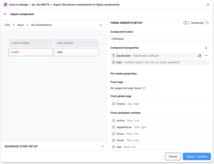
You also can create the Figma variants from CSF3 stories directly in story.to.design by importing manually.

This is automatically based on stories’ arg definitions.
> Read documentation for more details.
Ready for CSF3?
CSF3 is a significant improvement to story definitions.
More concise, more readable, more powerful.
CSF3 is the way to build your next stories and get them into Figma components with story.to.design!
👋 Hi there!
We built the Figma plugin that keeps your Figma library true-to-code.
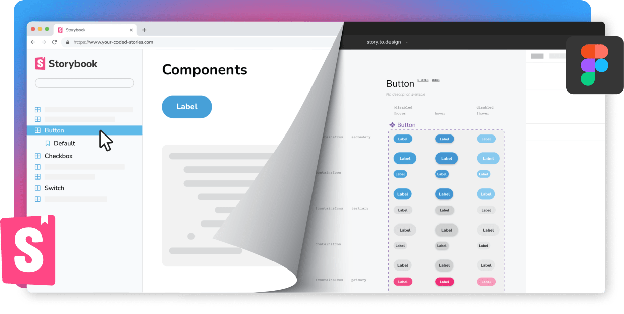
story.to.design imports components from Storybook to Figma in seconds.
Try it for free