story.to.design: a designer’s take
What is story.to.design?
A designer’s take
Working with cutting-edge technology, as a designer, often feels like being a crazy scientist in a lab, mixing chemical elements together to see what works and what explodes. It’s exciting and intriguing, trying to find the limits and how to overcome them. Our lab is at divRIOTS, where we’re trailblazing the design system universe, coming up with solutions like Backlight, style-dictionary to Figma and now story.to.design as our latest one. In this article I’ll share a designer’s perspective as to why a code-first tool like story.to.design makes sense in product development and building design systems.

story.to.design started from the need to bring development and design closer together. In a design system team, one of the criteria for success is the parity between code and design. There are many aspects that help achieve that: having a good feedback loop, practicing good communication, using design tokens, and much more. Ultimately, the team benefits the most when the assets for designers match exactly what the developers have at their disposal.
It’s quite a manual process to keep those two worlds aligned, that’s why we thought there must be a way to automate this process, and created story.to.design. When one hears of tools trying to automate the import/export between design and code, the general direction is to try to turn the design assets into generated code. But if you’ve tried any of these tools and you’re a developer, you’ve probably noticed that the code output is far from perfect, often unusable in the long run. This still represents a big gap in the market, and we’re still not able to generate one from the other, but what if we’re going about it the wrong way? Wouldn’t it make more sense to bring the code to design instead? Since at divRIOTS we’re focused on the engineering side of design systems, this is exactly how we went about it with this new plugin.
What comes first? Design or development?
One of the most prevalent questions in the modern digital product world, especially for design systems, goes back to the old question: “What came first? The chicken or the egg?”. While the UI design can tell developers what should be built, the way things need to be developed can also often end up defining the design, forcing it to work around development. The one certainly can’t live without the other.

For the automation of a design system, we’ve come to the conclusion that the source of truth should live in the code. After all, it’s the code that represents what actually gets in the hands of final users. This is why our approach sees development coming first, as weird as it may sound for a designer to be advocating for a “code-first” approach. That’s not to say that design wouldn’t have input when defining the design system; quite the opposite! Even if the process often starts with design, at some point things need to come together, and if that can initiate from the code, there are better chances for a long lasting success.
Steps to build a design system
A designer will draw and prototype a component in a tool like Figma in order to decide on the styles and behaviors that would make a component look the way it should look, to fit the brand definitions and to be useful. This is probably the very first step of building the design system after the need for such component has been identified. Once those definitions are ready, it’s time to trigger the process of design-development handover.

After delivering the designs and requirements to development, the components will be coded and finally they need to be showcased for reference and usage. The design decisions around this component, and the technical information on how to use it in the application is what gets turned into the documentation of the design system. There are many examples of good documentation sites that can help teams understand how to display this information.
However, to only document components with simple descriptions often isn’t enough. Users of a design system need to be able to play around with these components, experiment with their behavior and test them. To achieve this kind of documentation the team needs to write CSF stories that enable the live display of components. There are great tools for developers that enable this step of the process, like Storybook or Backlight. A design system’s documentation is the best way to distribute it to other teams in the company for use in the final product. Having a good design system enables teams to build great digital products, and sets a good foundation for the future. A design system in place means a brand can change over time without the cost of rebuilding everything.
In summary, the general process for building a design system is:
-
Identify the need for a component in your product 🕵️♂️
-
Design the component to fit the brand and define the interactions 🎨
-
Hand it over to developers so they can turn it into code 🚚
-
Document it with a live version ✍️
-
Distribute the design system to the rest of the company 📣
-
Build amazing products 🎯
This process looks great on paper. One could assume that by the time we’re on step 4 the component that the designer provided at step 1, and the vectors available to the designer to continue their process of designing the product, will both look the same in all their details. Unfortunately, this is where things start to deviate and where differences start showing.
The problem with not having designers’ and developers’ assets in perfect sync is that these details eventually come out in the final product, resulting in a poorer experience for the final user. Plus, it can cause frustration when a designer spends countless hours coming up with the perfect design for the product, only for the final delivery after development to not look the same.
Preventing discrepancies
We’ve established that the component starts with design, however it needs to be circled back in after the development process. Turning those components into code can present some challenges on what was initially designed, therefore we can determine that the final result from code becomes the source of truth.
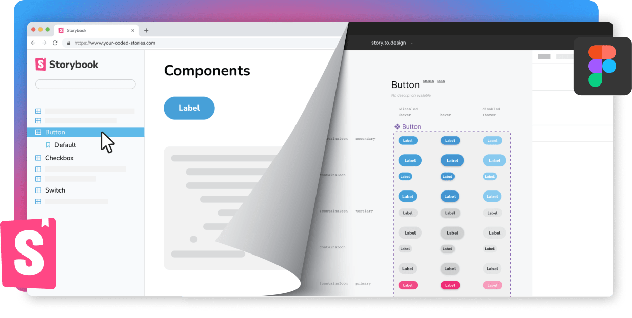
story.to.design comes as a solution to connect the two worlds back together. Once the components are documented in stories, they can be drawn as vectors in Figma in an automated way, establishing the sync between code and design. From this point on, any changes made to the code of the components will automatically be reflected in the designs. The manual and repetitive Figma tasks of updating the designs from what has been done in code can now be eliminated, enhancing even further the development-design alignment.
This plugin also solves the problem of development being ahead of design. Sometimes a component gets coded before it was ever drawn in Figma. With story.to.design, it can be created directly into a design asset, making the entire process even faster.

What’s not to love?
Maintaining both design UI kits and component libraries in code is no easy task. And if they aren’t maintained in sync, misunderstandings can arise between designers and developers. “Is this a new design that needs to affect code?” “Is this available on production today?”
As a designer, a tool like story.to.design saves me tons of time in updating UI kits to stay in sync with code, allowing me to focus instead on researching and designing for better experiences. A single, small change in code will instantly update the possibly hundreds of variants of components in my Figma UI kit, taking away the dull and time-consuming work of updating them manually. What’s not to love?
👋 Hi there!
We built the Figma plugin that keeps your Figma library true-to-code.
story.to.design imports components from Storybook to Figma in seconds.
Try it for free