Introducing the variant properties API
Background
Earlier this year, we introduced story.to.design: a solution to create Figma components from Storybook or Backlight and keep them up-to-date automatically.
story.to.design maps Storybook args into variant properties in Figma, and you define this mapping in the plugin when importing a component.
Introducing “variantProperties API”
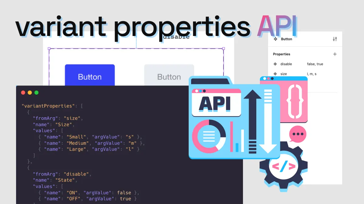
Today, we are introducing the variantProperties API to programmatically define the Figma variant properties that you want for a particular story.
Example:
"variantProperties": [
  {
    "name": "Progress",
    "values": [
      { "name": "0%", "withArgs": { "value": 0, "min": 0, "max": 100 } },
      { "name": "25%", "withArgs": { "value": 25, "min": 0, "max": 100 } },
      { "name": "50%", "withArgs": { "value": 50, "min": 0, "max": 100 } },
      { "name": "75%", "withArgs": { "value": 75, "min": 0, "max": 100 } },
      { "name": "100%", "withArgs": { "value": 100, "min": 0, "max": 100 } }
    ]
  },
  {
    "name": "Size",
    "values": [
      { "name": "Small", "withArgs": { "size": "s" } },
      { "name": "Medium", "withArgs": { "size": "m" } },
      { "name": "Large", "withArgs": { "size": "l" } }
    ]
  }
]
This translates into a Figma component with Size and Progress variant properties.
| Story arg name | Story arg type | Figma variant property name | Figma variant property values | |
|---|---|---|---|---|
min | number | → | N/A | N/A |
max | number | → | N/A | N/A |
value | number | → | Progress | 0%, 25%, 50%, 100% |
size | s, m, l | → | Size | Small, Medium, Large |
Before the variantProperties API, this wasn’t possible. As the control of min and max default values couldn’t be overriden,
and with value being a number, story.to.design couldn’t create variant property values for it.
Thanks to the new variantProperties API, there are many more possibilities, as it allows you to create the Figma variant properties that you want with the exact component args that you want. Learn more in our documentation.
Define the variants directly in code
These variant properties can now be directly defined in Storybook code so you don’t have to import and define components in the Figma plugin.
Enrich the stories that you want to use as Figma components:
export const Playground: StoryObj<ButtonProps> = {
  ...
  parameters: {
    s2d: {
      variantProperties: [ /* Figma variant properties definition here */ ],
    },
  },
};
This will automatically load the component in our Figma plugin.
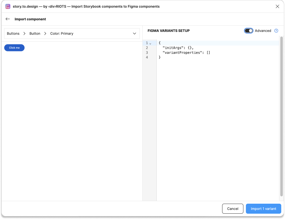
Define the variants when importing manually
You can also define the variantProperties by using the plugin’s new Advanced mode.
Learn more about the variantProperties API
Take a look at the variantProperties API documentation page for more details.
If you need help, reach out to us on Discord!
👋 Hi there!
We built the Figma plugin that keeps your Figma library true-to-code.
story.to.design imports components from Storybook to Figma in seconds.
Try it for free