Storybook to Figma

Generate and sync full Figma components from your code.

Works with

  • Storybook
    storybook-logo/defaultCreated with Sketch.
  • &
  • Histoire.dev

11000+

Users

1000000+

Variants generated so far

Connect your stories to Figma in 3 steps

100+ components to create in Figma? Thousands of variants to maintain? story.to.design does it for you.

  1. 1

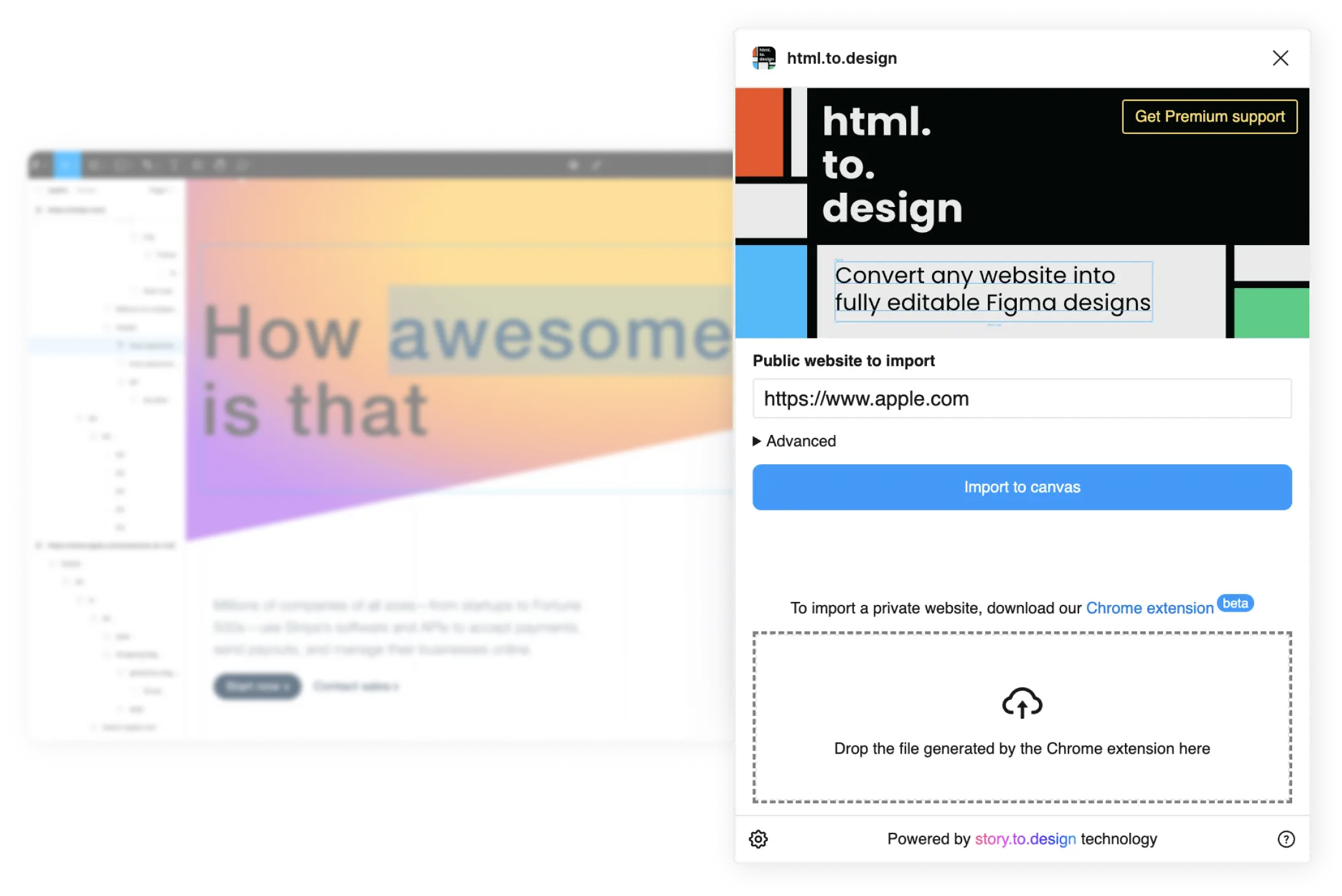
    Connect your Storybook, Backlight or Histoire
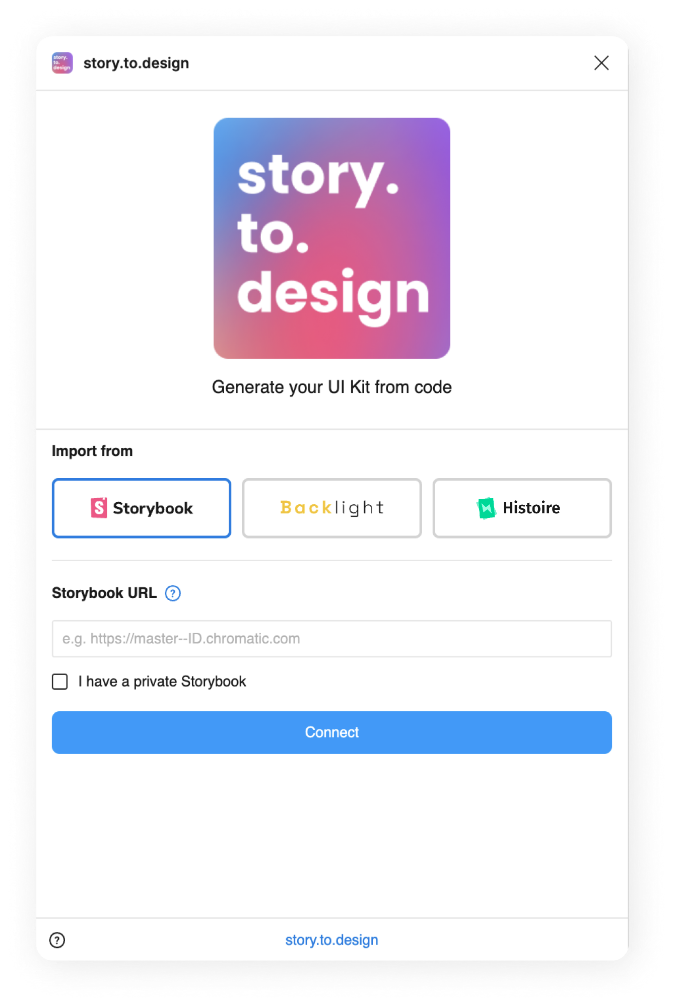
    screenshot of the story.to.design plugin showing the field where to paste your Storybook link to connect to it
  2. 2

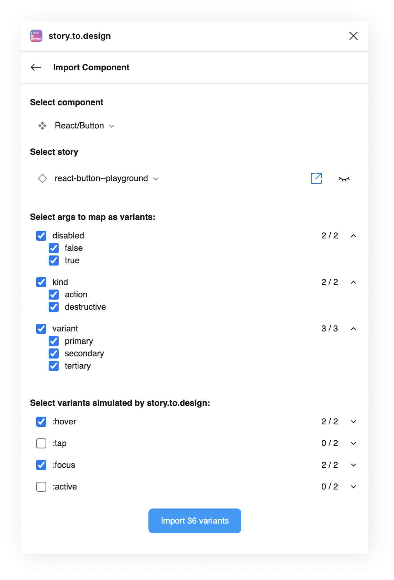
    Select components and variants

    screenshot of the story.to.design plugin showing the list of the components found in the provided Storybook, with some selected for import
  3. 3

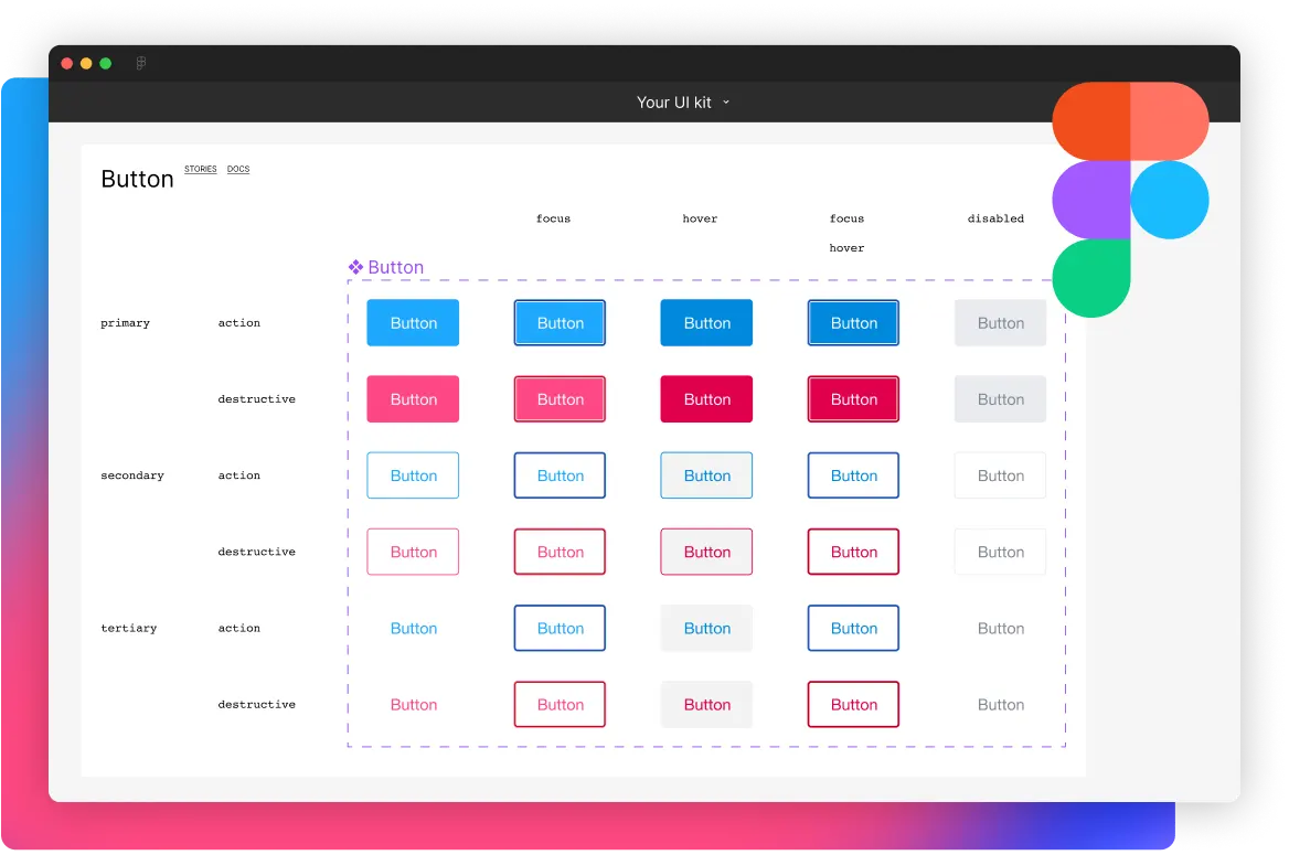
    Generate components in Figma

    screenshot of Figma with the UI kit result from the import

Keep Figma in sync with Storybook,
no maintenance required

Want to update hundreds of variants with the latest changes? story.to.design brings all code updates from Storybook to Figma in a click.

Quick updates

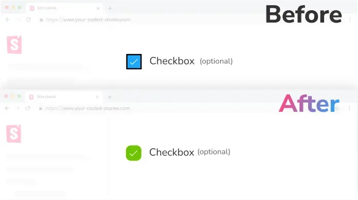
Get notified any time the code changes in Storybook and update your Figma designs in a click.
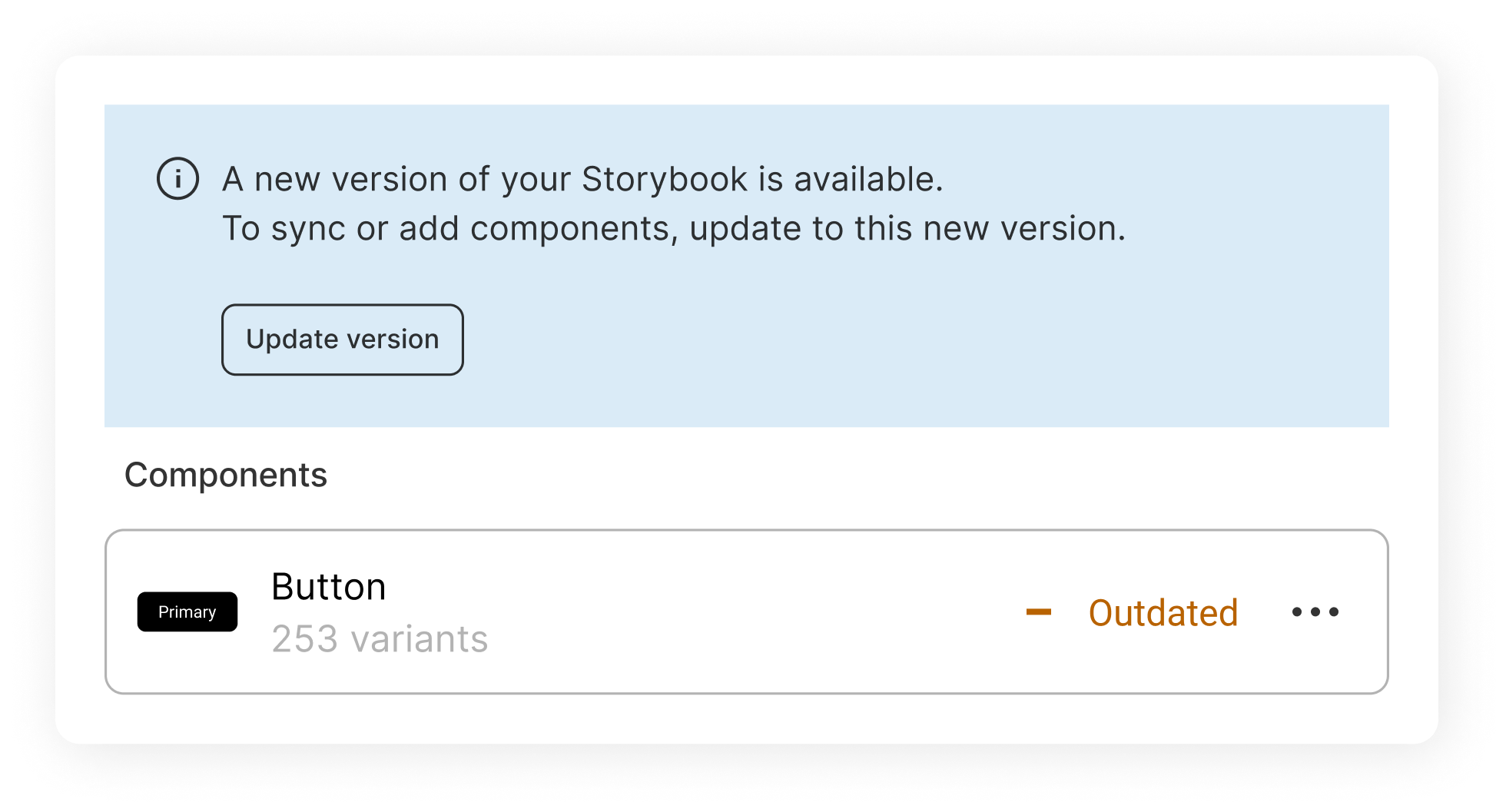
Screenshot of the story.to.design plugin showing an outdated checkbox component

Visual reviews

Review updates visually before bringing them from Storybook to Figma, for design and code that's always aligned.
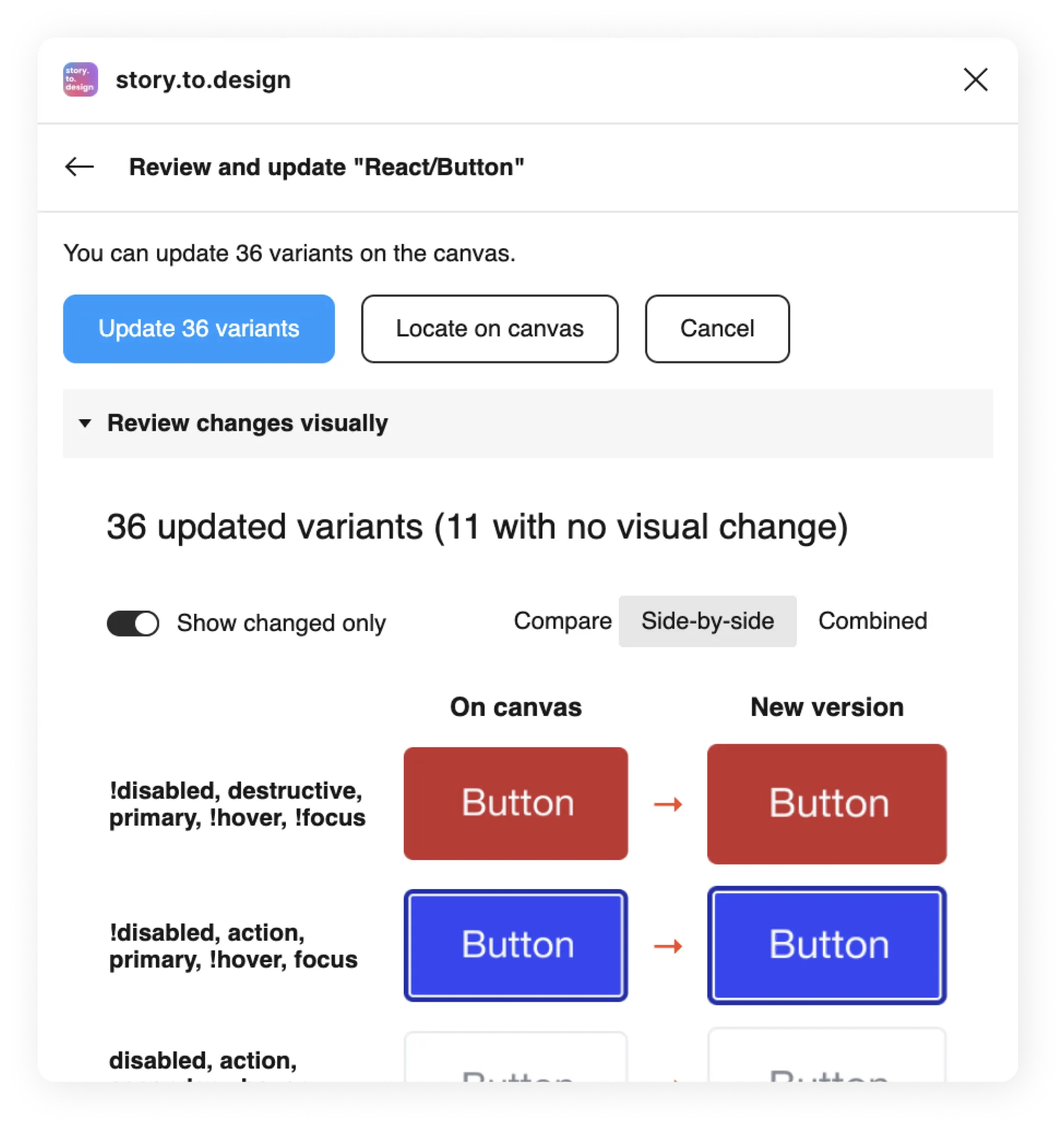
Screenshot of the story.to.design plugin showing synced checkbox component and its variants

Features our users love

A card component with all layers highlighted and auto-layout showing.
Generate quality Figma layers with auto-layout
story.to.design generates high-fidelity Figma layers with auto-layout, whenever possible.
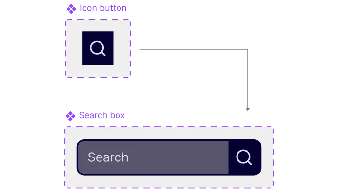
screenshot showing an icon button component and its searchbox sub component
Import nested components
story.to.design automatically detects and links nested-components for you. Your UI kit has never been so complete.
Learn more >
screenshot of before and after of a component change.
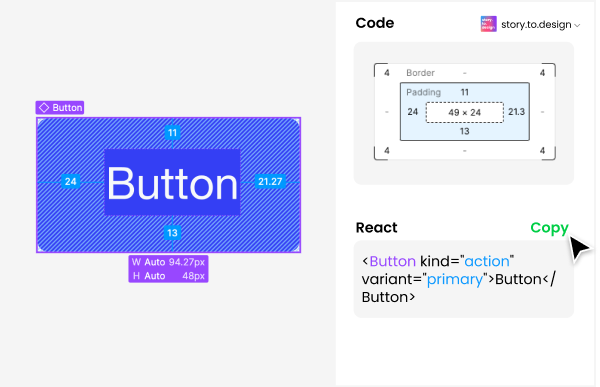
Enhance Figma's Dev Mode
story.to.design provides code snippets for the components used in designs, complete with all properties and attributes to use in your app.
Learn more >
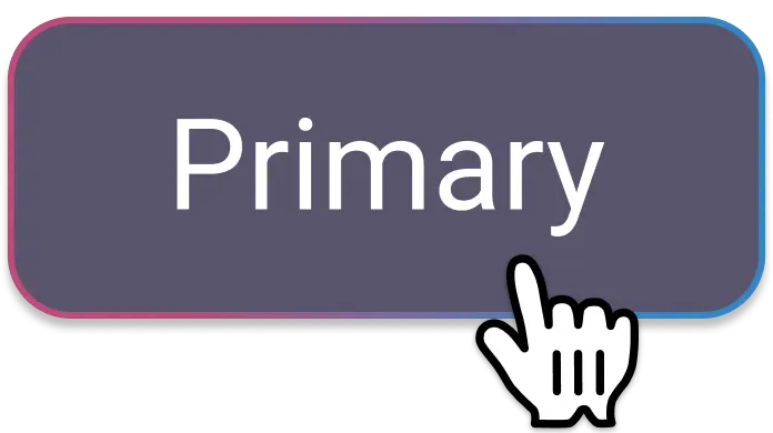
hand pointer over a button labelled 'Primary'
Simulate states
Simulate your components' pseudo-states automatically: hover, tap, active and focus.
Learn more >
A set of 2 style-guides with two different styles.
Multi-brand support
story.to.design supports Storybook "globals" to select themes. Import multiple brands as different variants, components or in different Figma files.
Learn more >
A desktop, a laptop and a mobile illustrated with a component inside them in different viewport sizes.
Responsive components
story.to.design can capture components in different viewports. Breakpoints are configurable, too.
Learn more >
screenshot of before and after of a component change.
Iterate with Local mode
Connect to your local Storybook with Local mode for fast iterations of your components.
Learn more >
Lit, React, Angular, Stencil, HTML, CSS, Svelte and Vue logos
Works with any story framework
HTML/CSS, React, Vue, Angular, Svelte, Stencil, Lit... If you have stories, it works.

What people are saying

Testimonials from users around the world.

Aligns design and code

“We want to align design and code and story.to.design looked like the perfect tool for us to use from the ground up.”

Photo of Joshua Hailpern

Joshua Hailpern

Head of Design at Neo.Tax

Mind-blowing

“I’m blown away... Exactly what I and many on my team have been looking for.”

Photo of Quentin Renard

Quentin Renard

Engineering Director at AREA 17

Single source-of-truth

“My team believes our code is the source-of-truth and that story.to.design can help our design process to realize this.”

Photo of Dag Frode Solberg

Dag Frode Solberg

Senior Developer at Bekk

Interesting workflow

“The workflow is interesting, especially for teams with no designers or when they’re misaligned with development.”

Photo of Laís Kantor

Laís Kantor

Senior Product Designer at Covantis

Powerful

“I didn’t know story.to.design would be that powerful.”

Photo of Alfredo Perez

Alfredo Perez

UI Engineer at SailPoint

Impressive

“story.to.design looks impressive to me.”

Photo of Marija Silinska

Marija Silinska

Senior Product Designer at Emergn

Exceeds expectations

“It’s doing even more than I was expecting.”

Photo of Amanda Bloomfield

Amanda Bloomfield

Senior UI Team Lead at SproutLoud

So impressive

“It’s so impressive to see the components coming through, I’m over the moon!”

Photo of Brent Schneider

Brent Schneider

Senior UX Designer at Ad Hoc

Spot-on

“What ‹div›RIOTS is doing with story.to.design is really spot-on! The code to design approach is gutsy.”

Photo of Magnus Brodén

Magnus Brodén

Design system PM at Arbetsförmedlingen

Pricing

Team

$149 per month

One licence for the whole team.

Try for free

No credit card required

Agency

Contact us

Tailor-made pricing for your need.

Contact us


Stripe climate program We contribute 1% of all purchases to fight climate change through the Stripe Climate program.

Get started with story.to.design

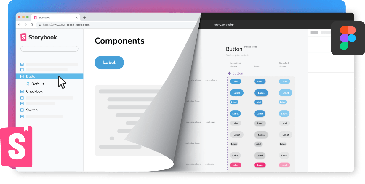
Screenshots of a component in Storybook and in Figma