Storybook to Figma
Generate and sync full Figma components from your code.
Works with
-
Storybook
&
-
Histoire.dev
Generate and sync full Figma components from your code.
Works with
- Storybook &
- Histoire.dev
11000+
Users
1000000+
Variants generated so far
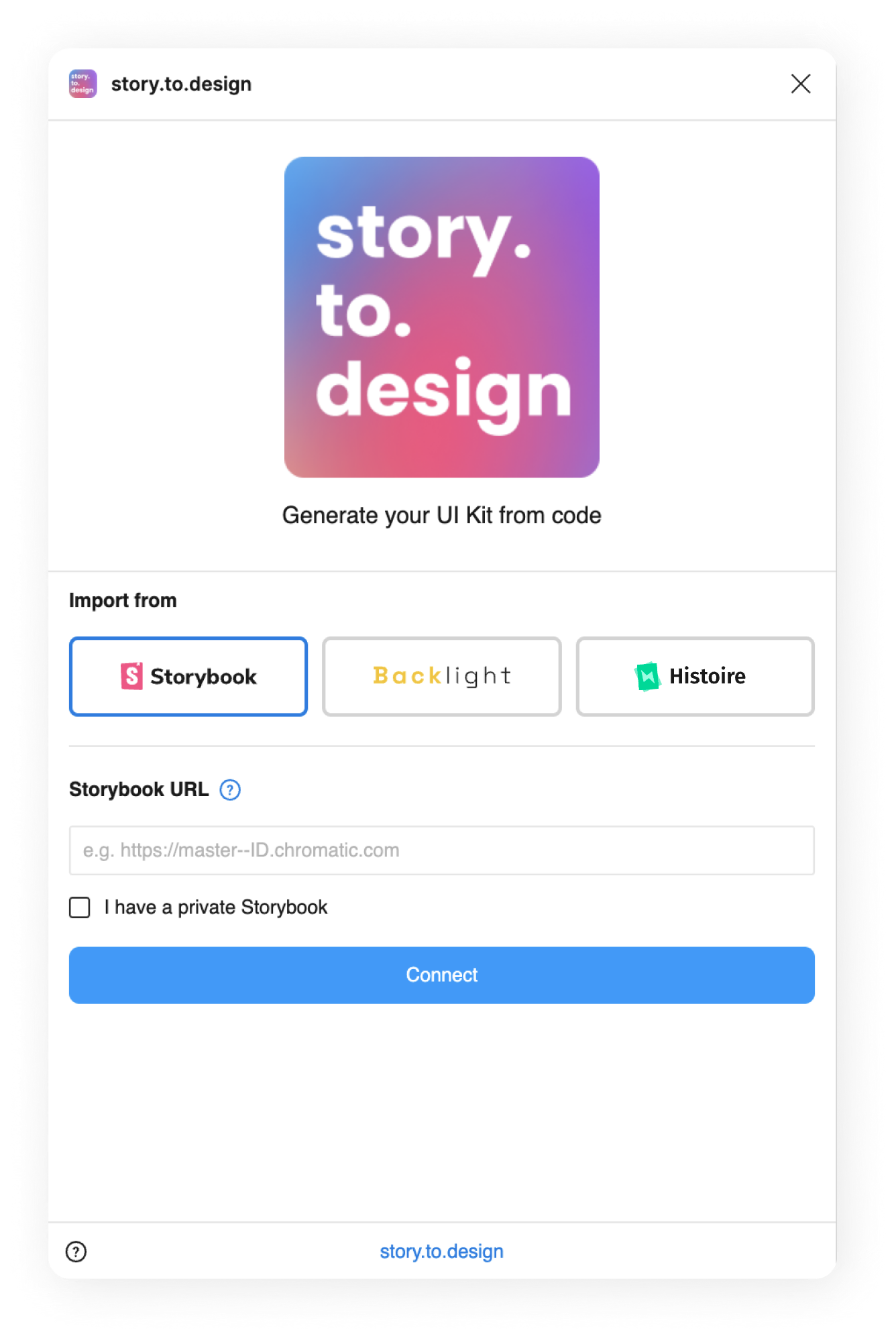
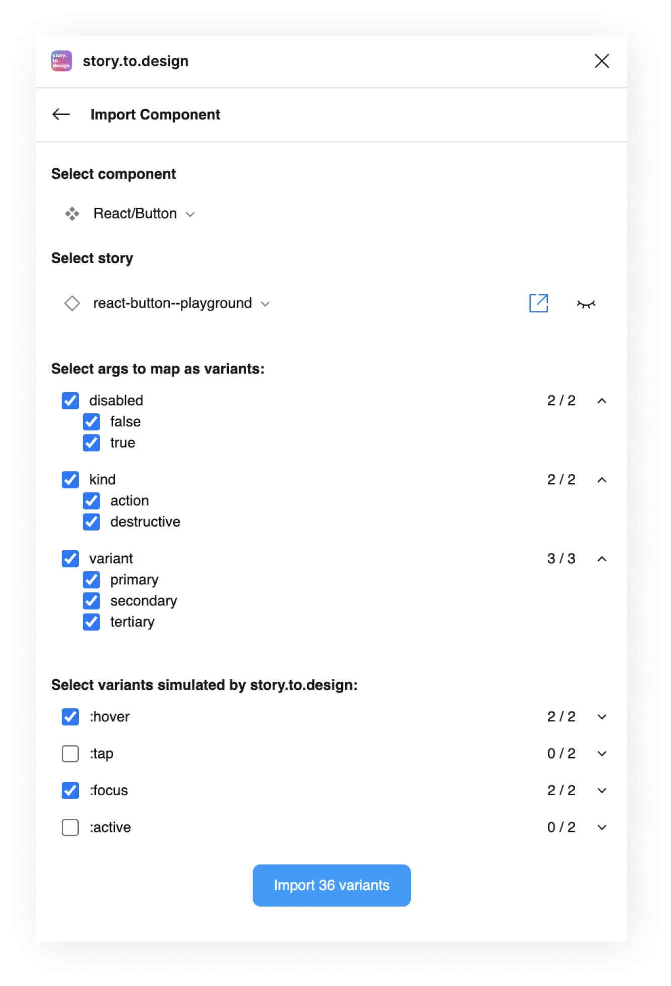
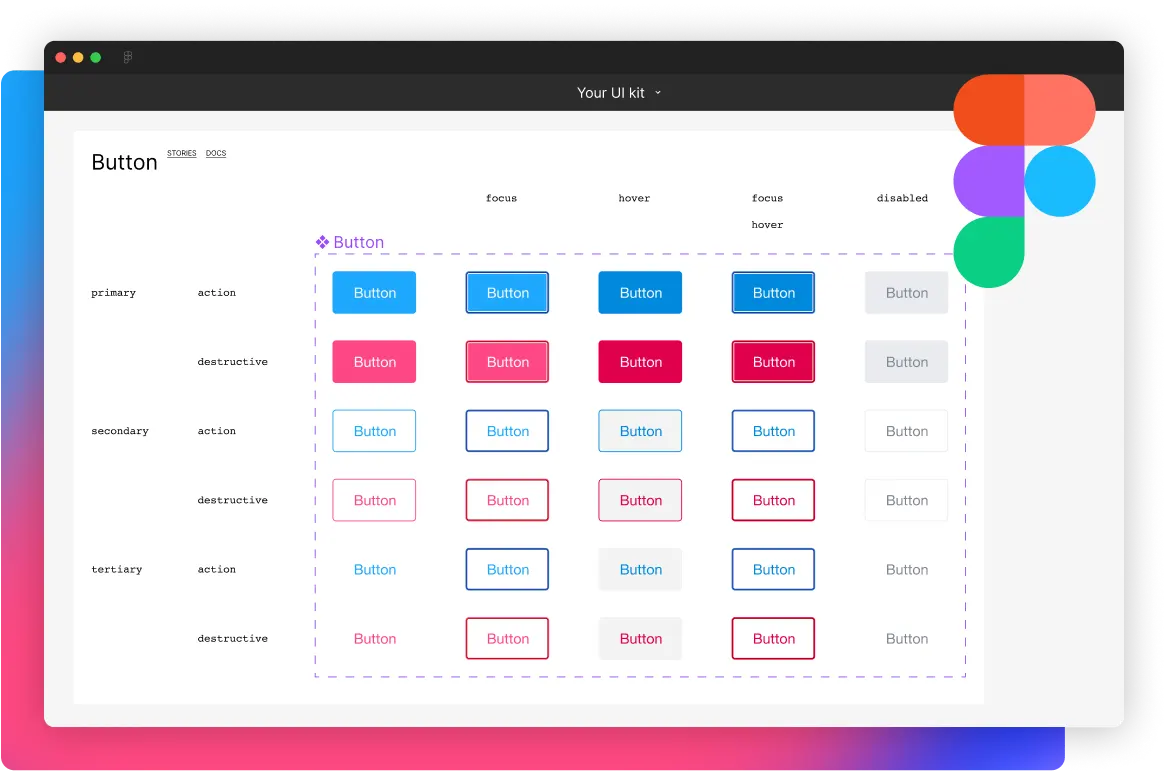
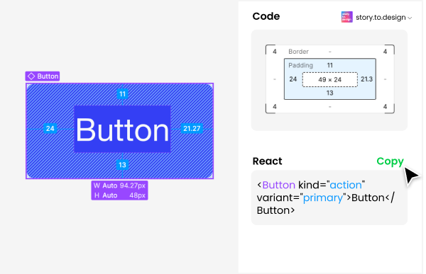
Connect your stories to Figma in 3 steps
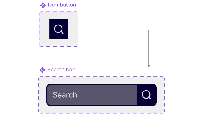
100+ components to create in Figma? Thousands of variants to maintain? story.to.design does it for you.
-
1
Connect your Storybook, Backlight or Histoire
-
2
Select components and variants
-
3
Generate components in Figma
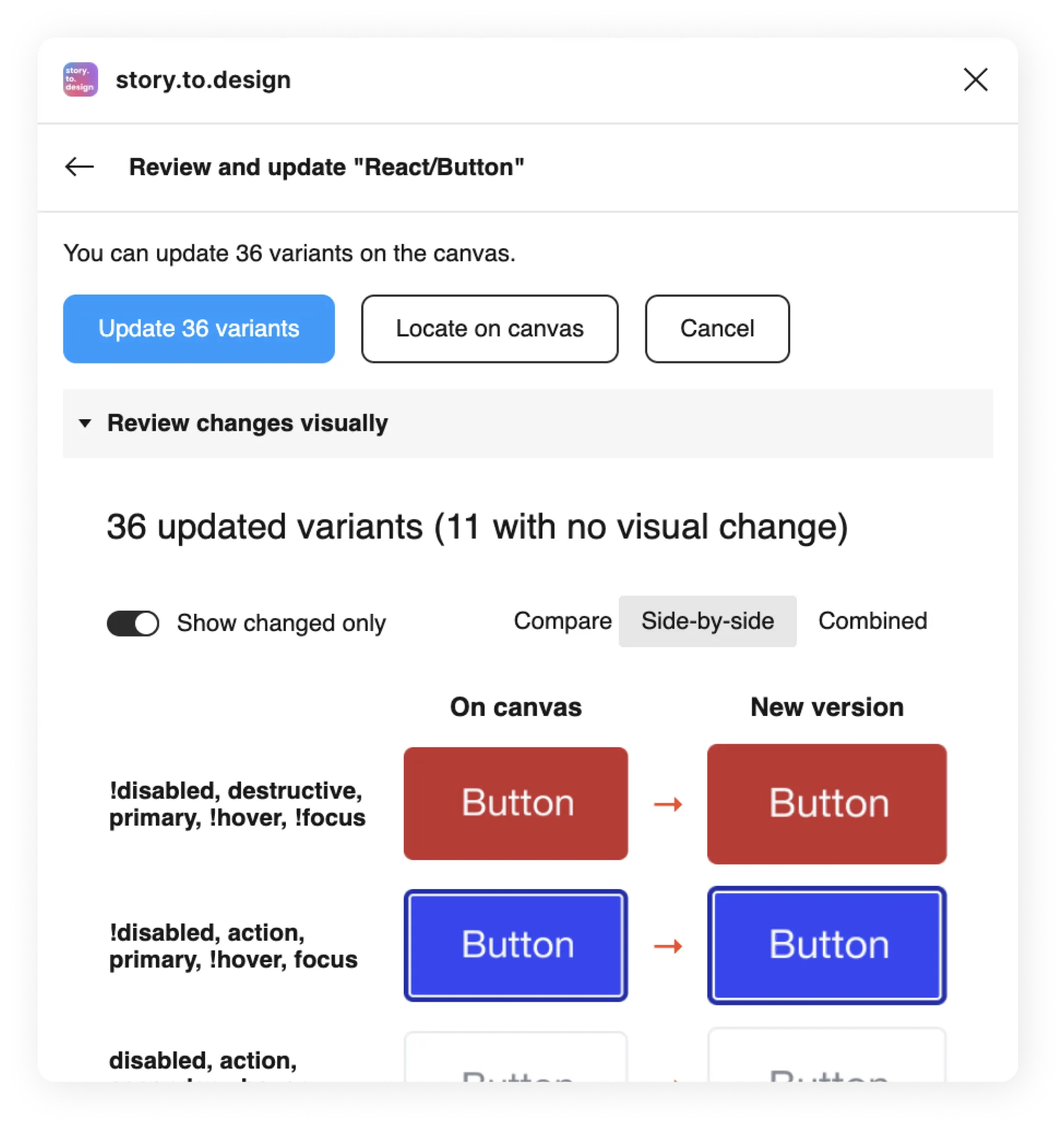
Keep Figma in sync with Storybook,
no maintenance required
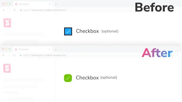
Quick updates
Get notified any time the code changes in Storybook and update your Figma designs in a click.

Visual reviews
Review updates visually before bringing them from Storybook to Figma, for design and code that's always aligned.
Features our users love


What people are saying
Testimonials from users around the world.Aligns design and code
“We want to align design and code and story.to.design looked like the perfect tool for us to use from the ground up.”

Joshua Hailpern
Mind-blowing
“I’m blown away... Exactly what I and many on my team have been looking for.”

Quentin Renard
Single source-of-truth
“My team believes our code is the source-of-truth and that story.to.design can help our design process to realize this.”

Dag Frode Solberg
Interesting workflow
“The workflow is interesting, especially for teams with no designers or when they’re misaligned with development.”

Laís Kantor
Powerful
“I didn’t know story.to.design would be that powerful.”

Alfredo Perez
Impressive
“story.to.design looks impressive to me.”

Marija Silinska
Exceeds expectations
“It’s doing even more than I was expecting.”

Amanda Bloomfield
So impressive
“It’s so impressive to see the components coming through, I’m over the moon!”

Brent Schneider
Spot-on
“What ‹div›RIOTS is doing with story.to.design is really spot-on! The code to design approach is gutsy.”

Magnus Brodén
Pricing
Team
$149 per month
$199 per month
One licence for the whole team.
- 1 Storybook
- Unlimited users
- Faster processing
- Unlimited components
- Legendary support
No credit card required
Agency
Contact us
Tailor-made pricing for your need.
- 2+ Storybooks
- Unlimited users
- Faster processing
- Unlimited components
- Legendary support
 We contribute 1% of all purchases to fight climate change through the
Stripe Climate
program.
We contribute 1% of all purchases to fight climate change through the
Stripe Climate
program.
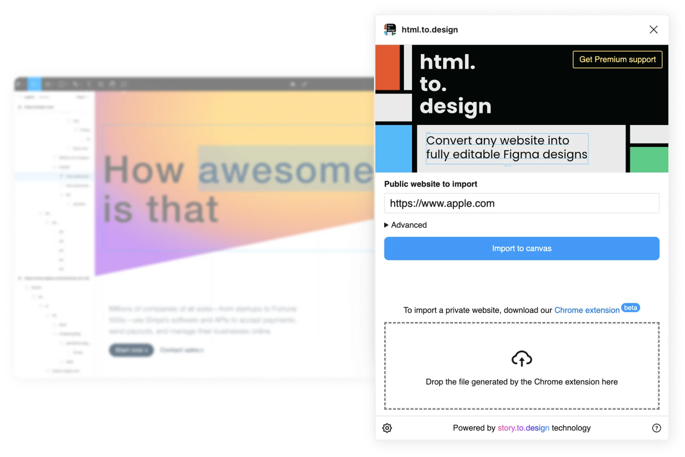
Get started with story.to.design
